Typography

Introduction
Our typography is a visual representation of our brands Tone of Voice, reflecting the beautiful, creative spirit of the Fresha industry supported by a reliable tech platform.
Overview
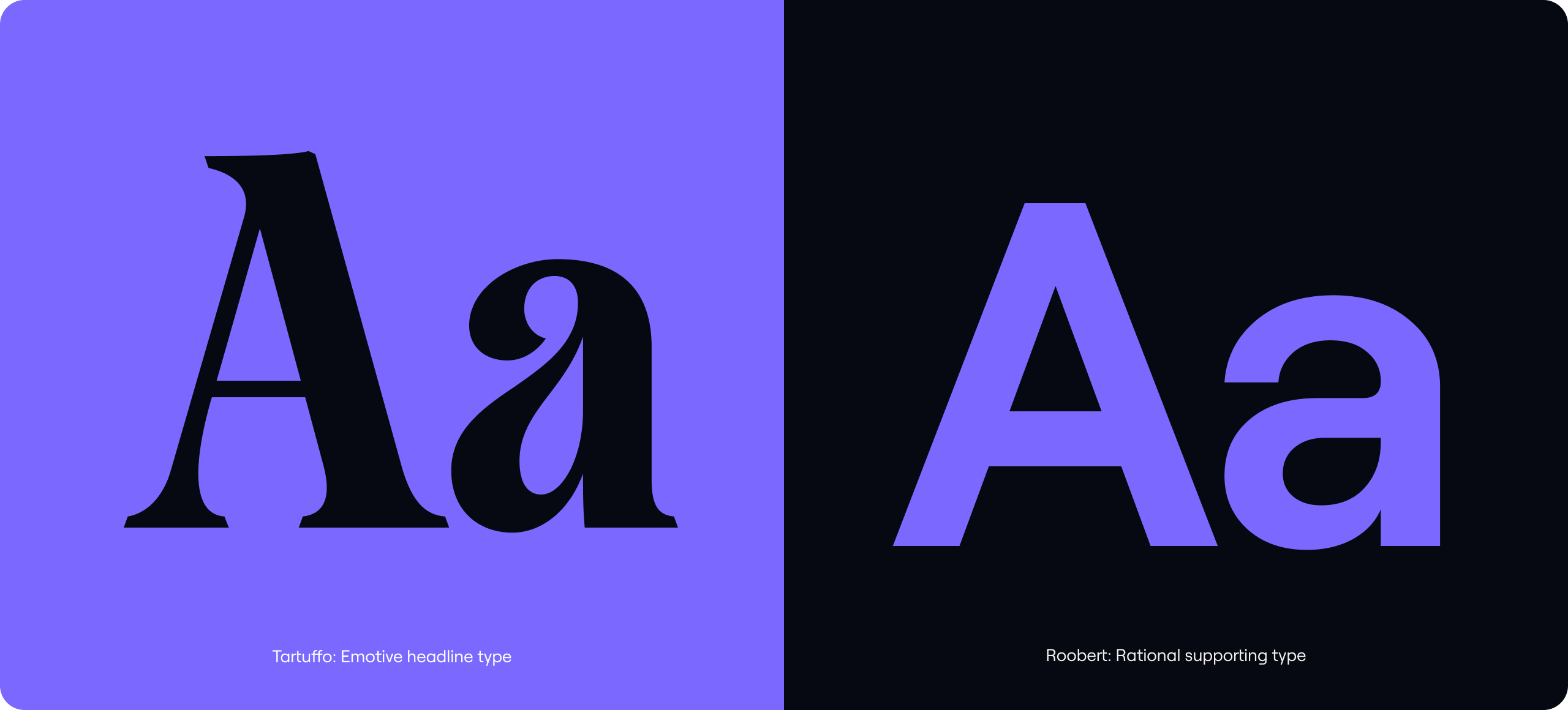
Our two core typefaces provide us with plenty of flexibility. We use our emotive headline font Tartuffo, to convey joyful and welcoming messaging. We use our supporting rational font, Roobert for functional messaging.
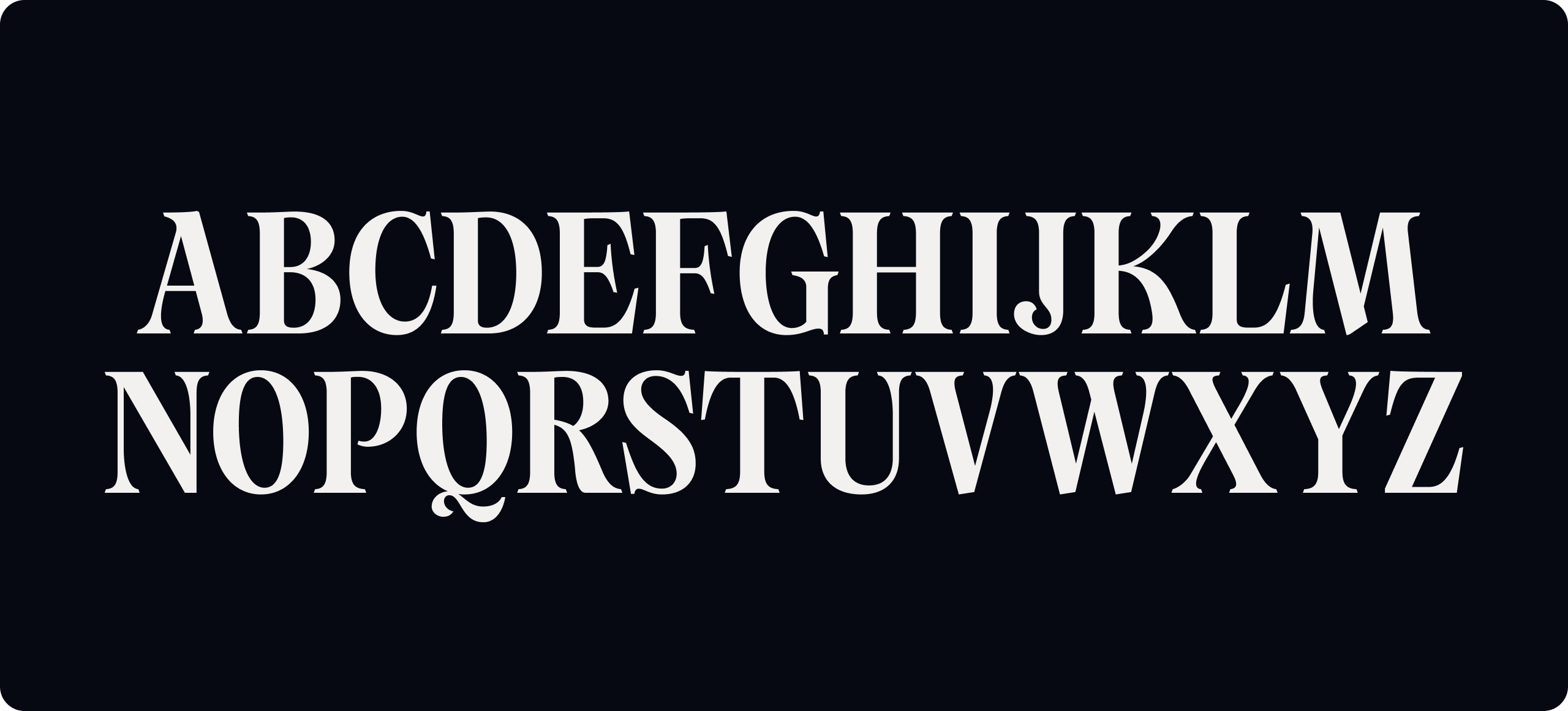
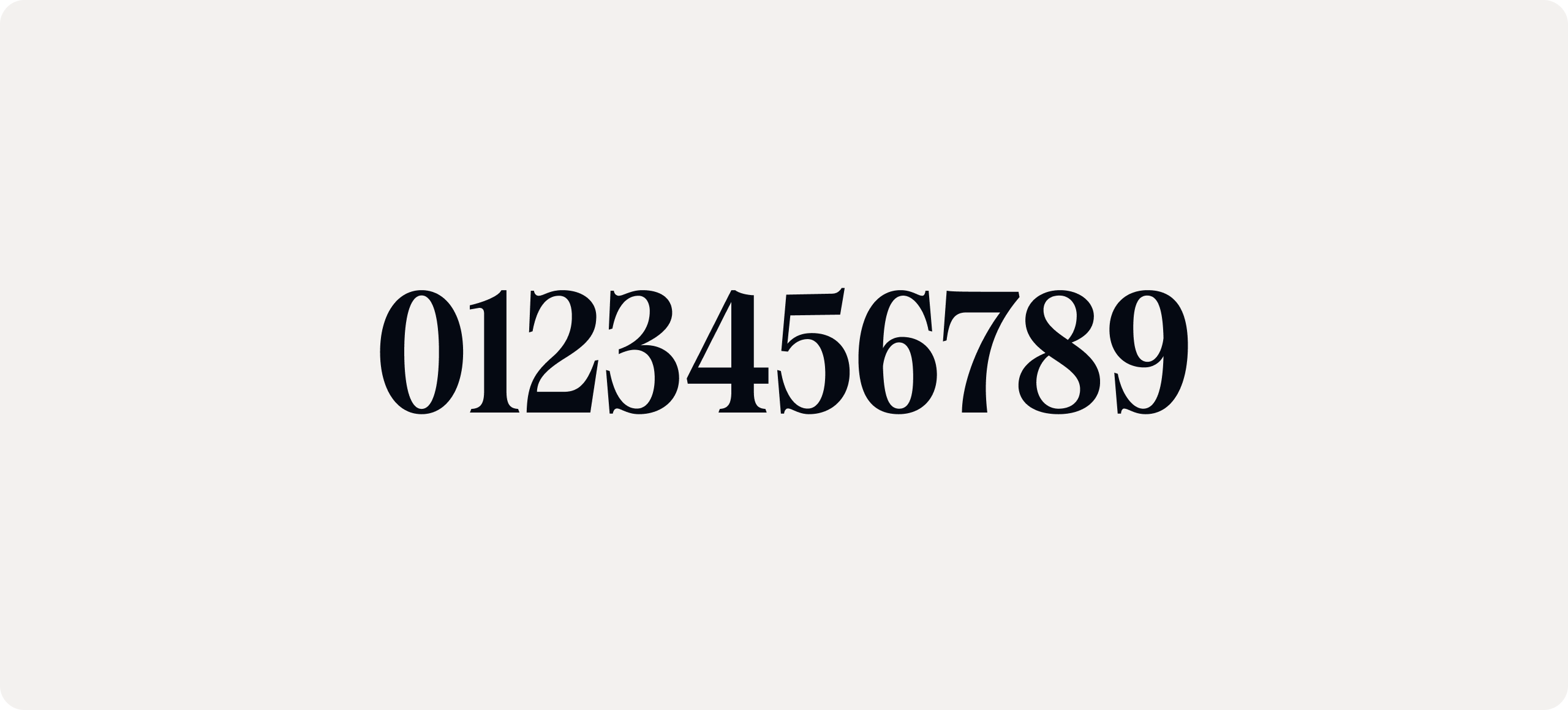
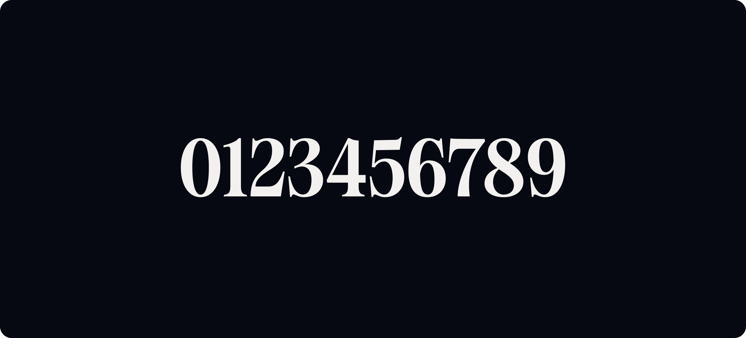
Emotive type
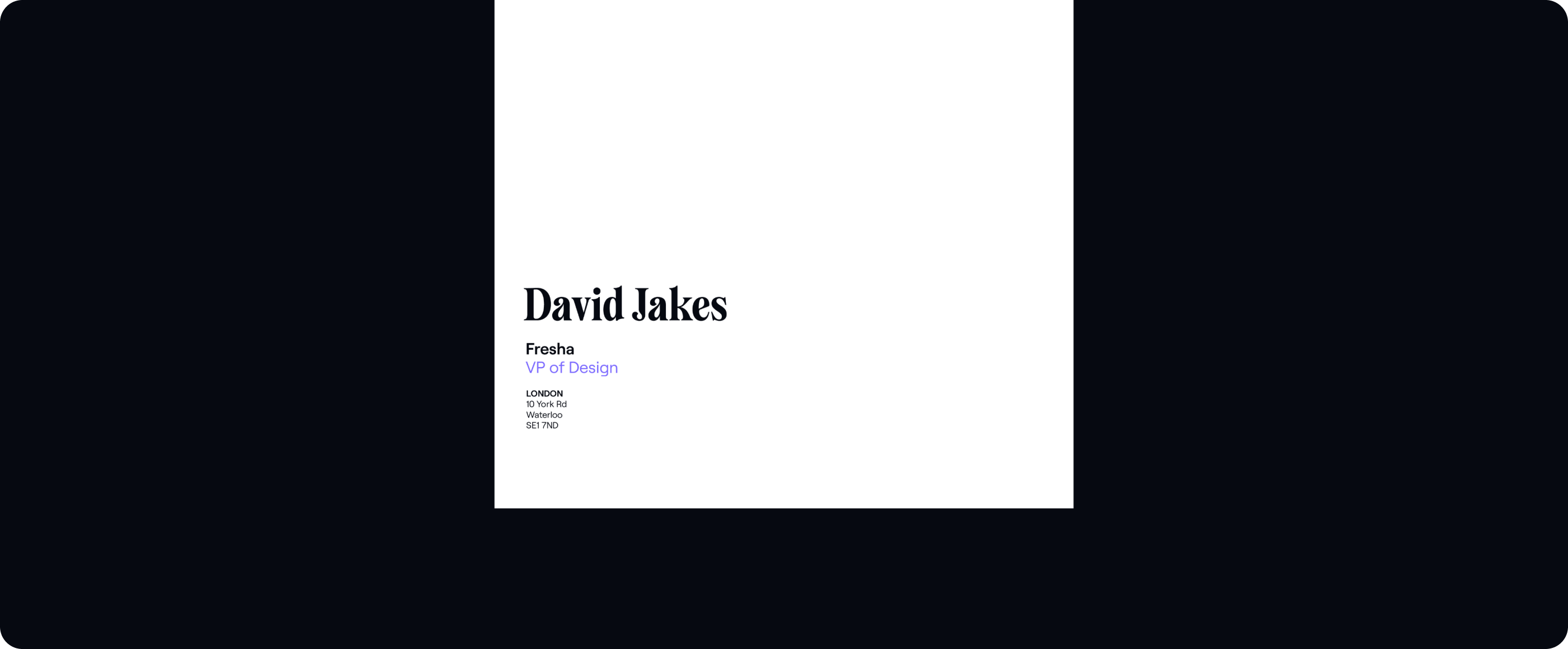
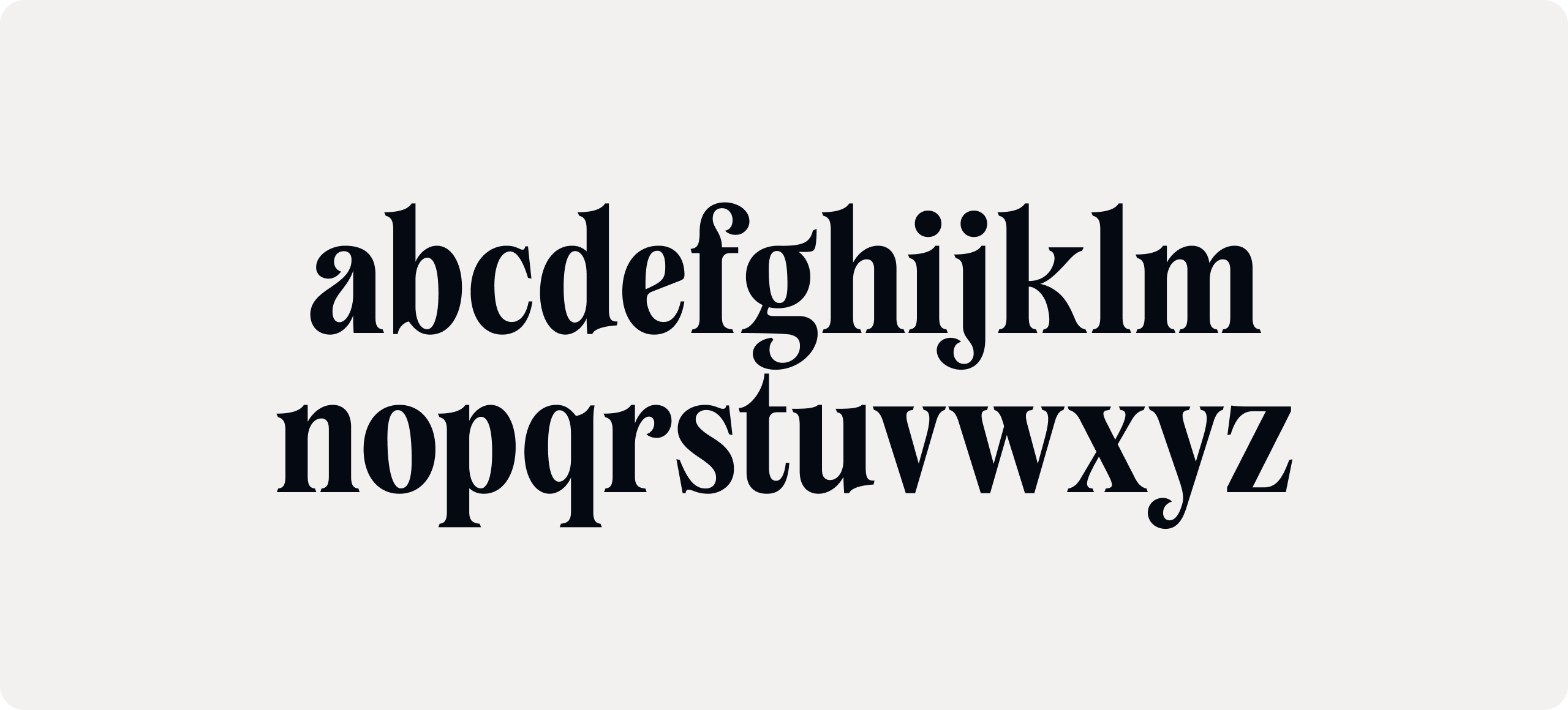
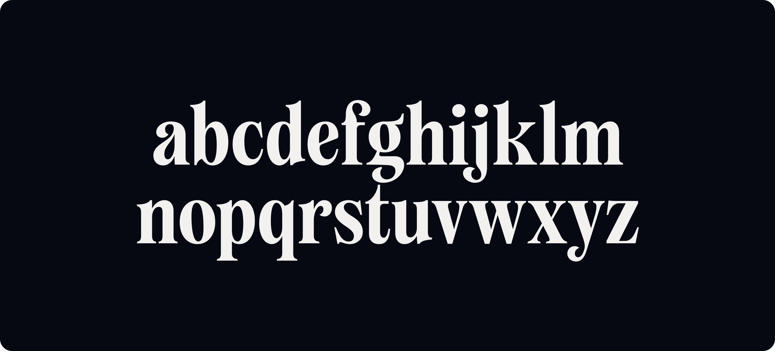
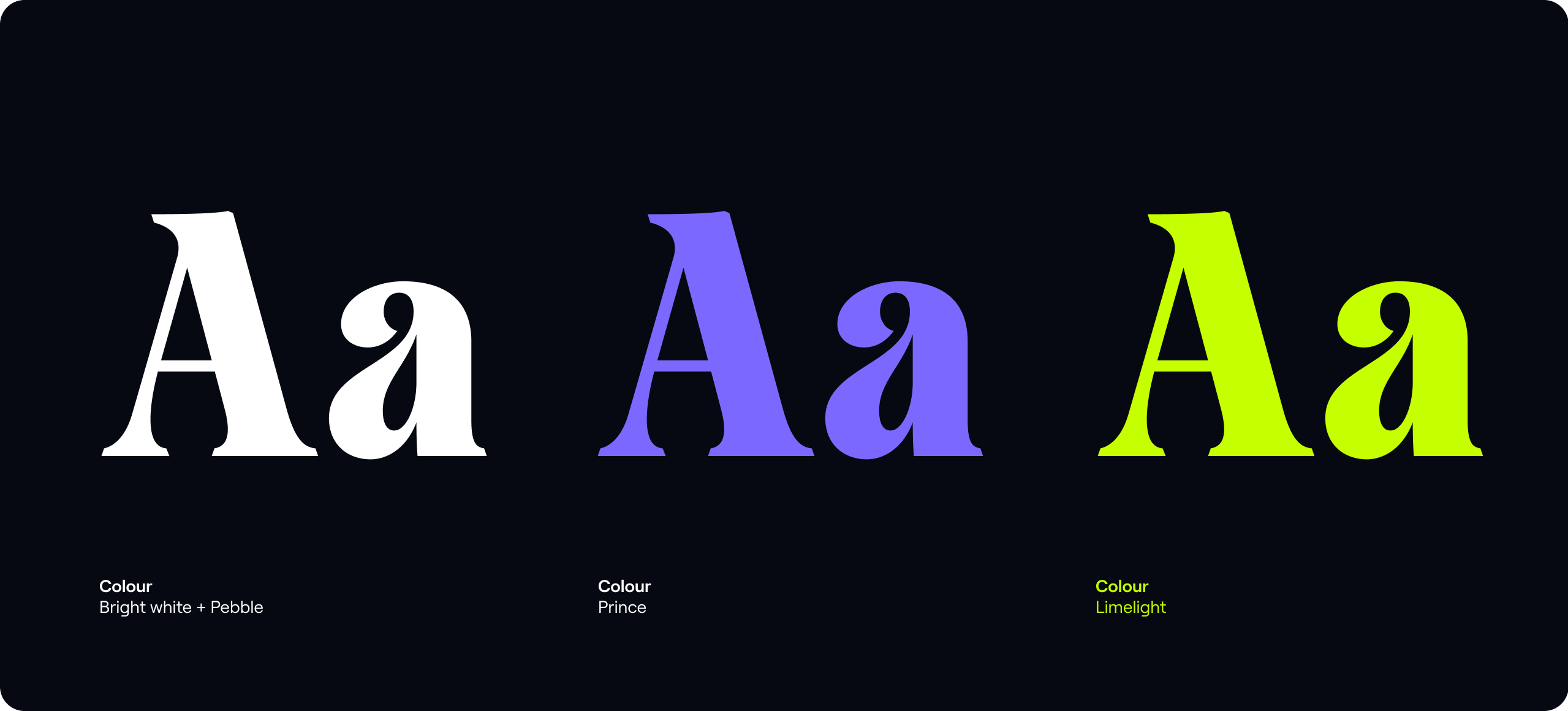
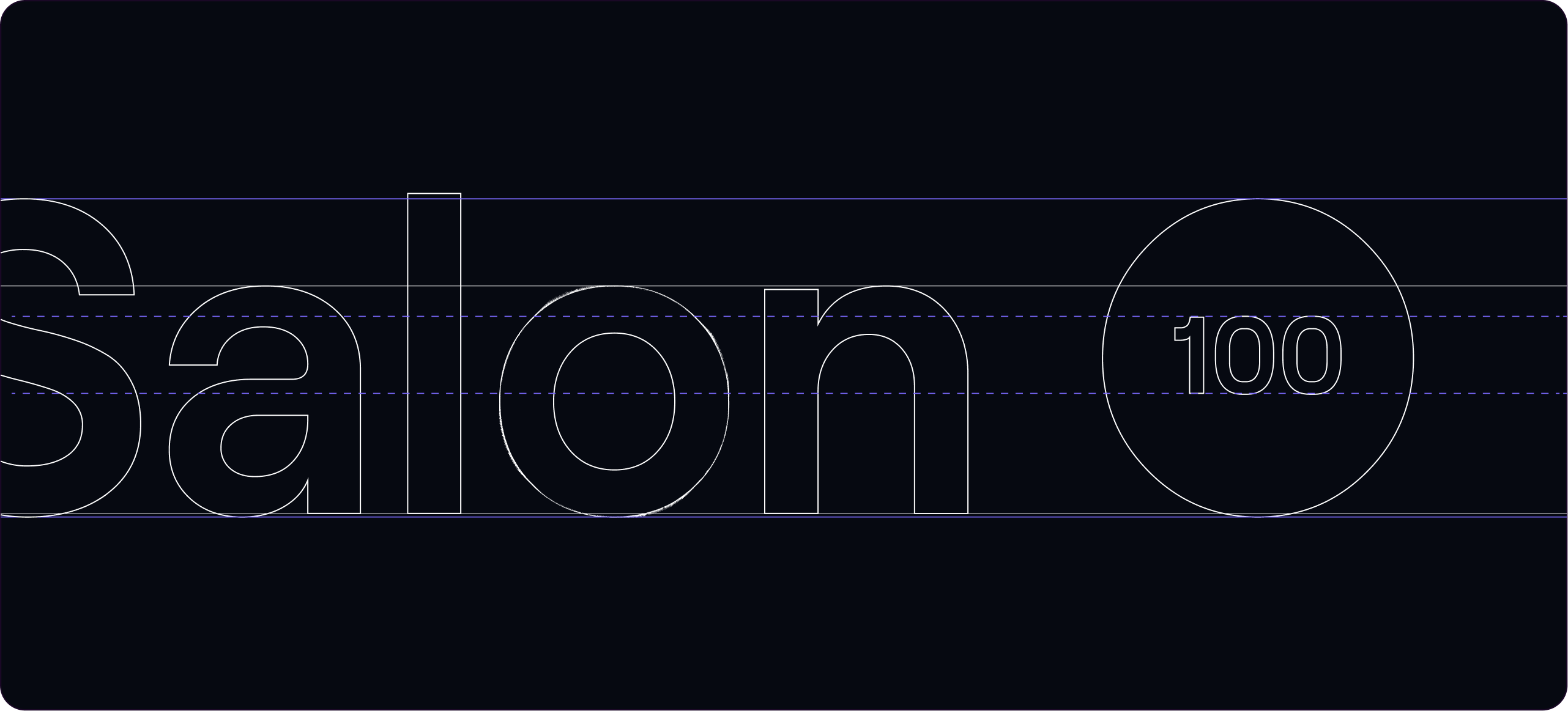
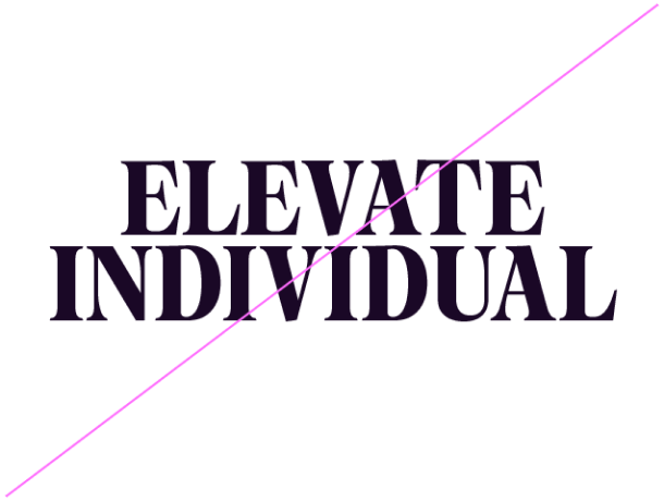
Our Emotive headline font, Tartuffo contains elegant and beautiful characteristics. It’s impactful and plays a key role in building a consistent identity for our brand.
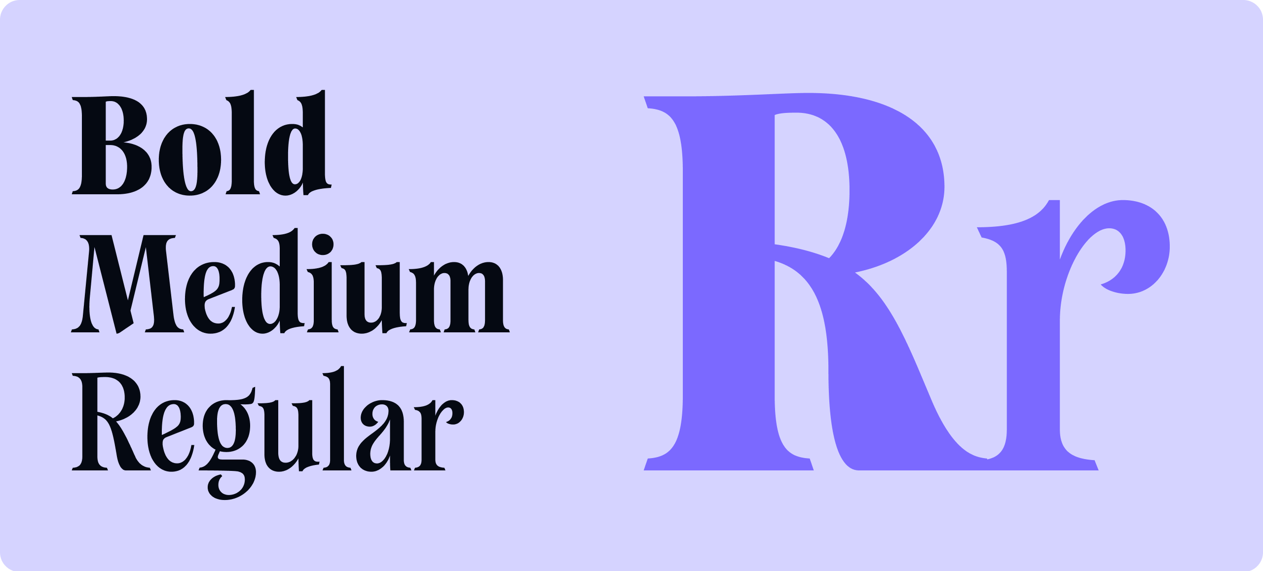
Weights
We use three weights across our communications - Regular, Medium and Bold. Bold should be used for all our headlines.
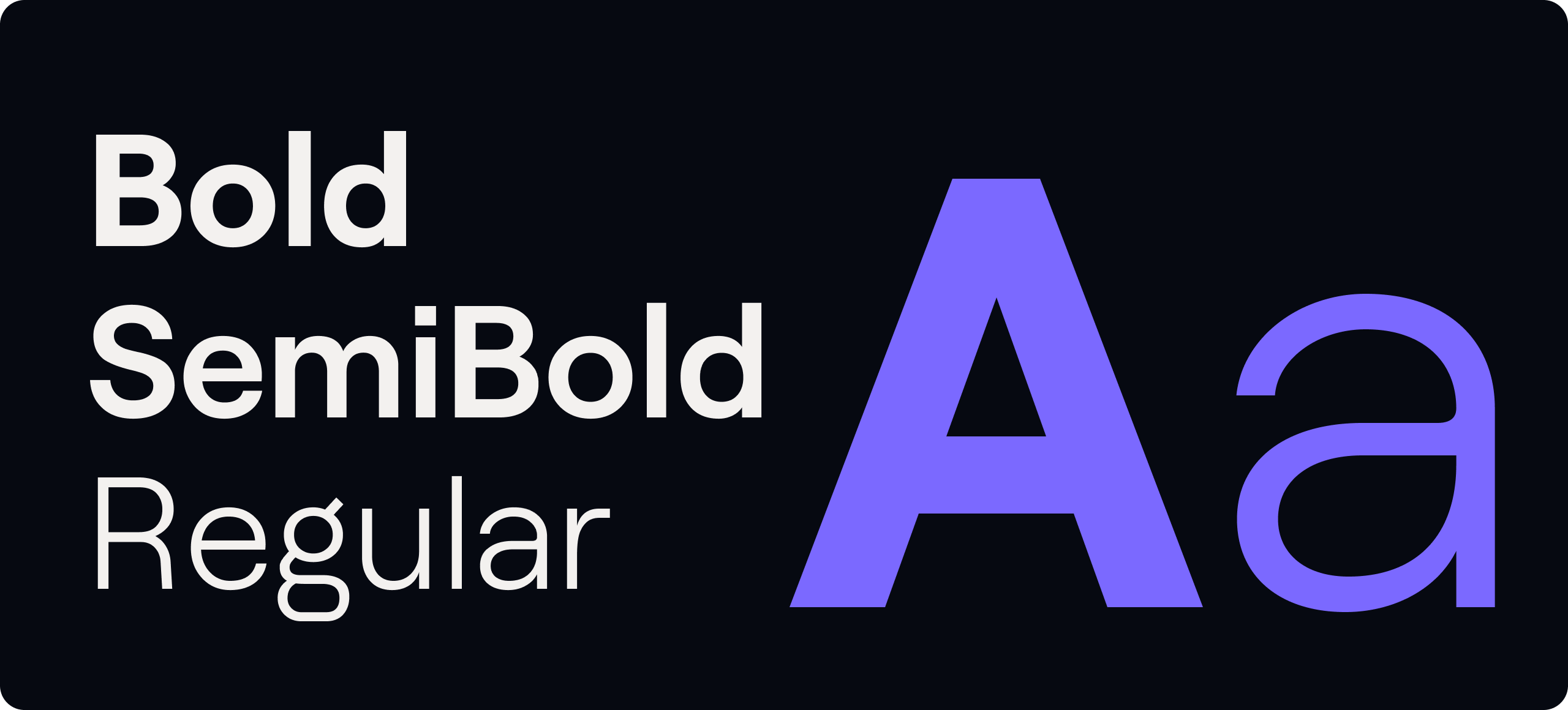
Rational type
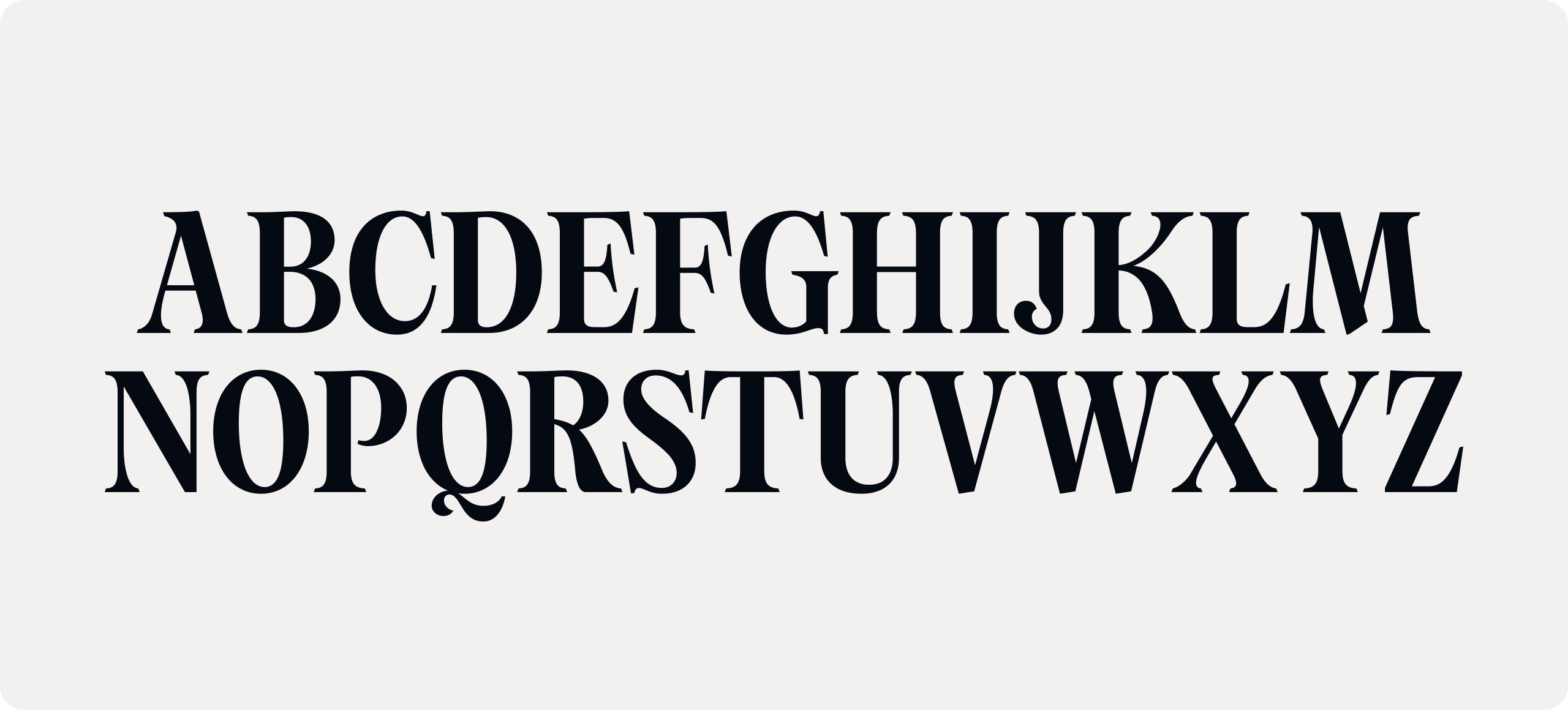
Our supporting typeface, Roobert is a functional display typeface with curved elements that compliment Tartuffo. We use Roobert for clear and functional messaging.
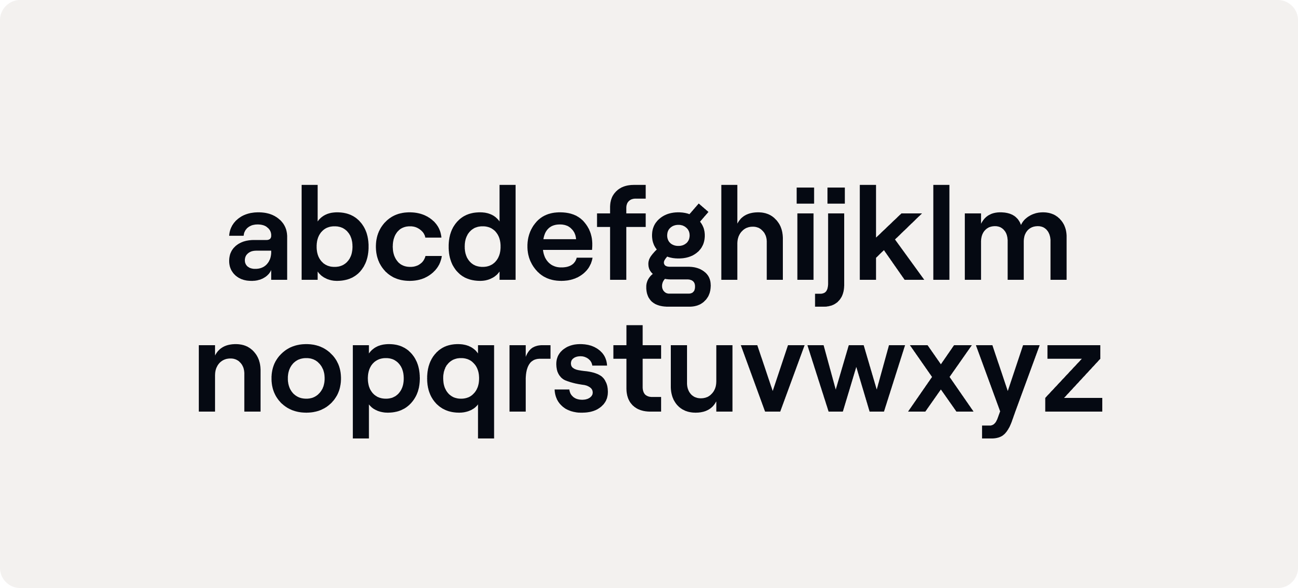
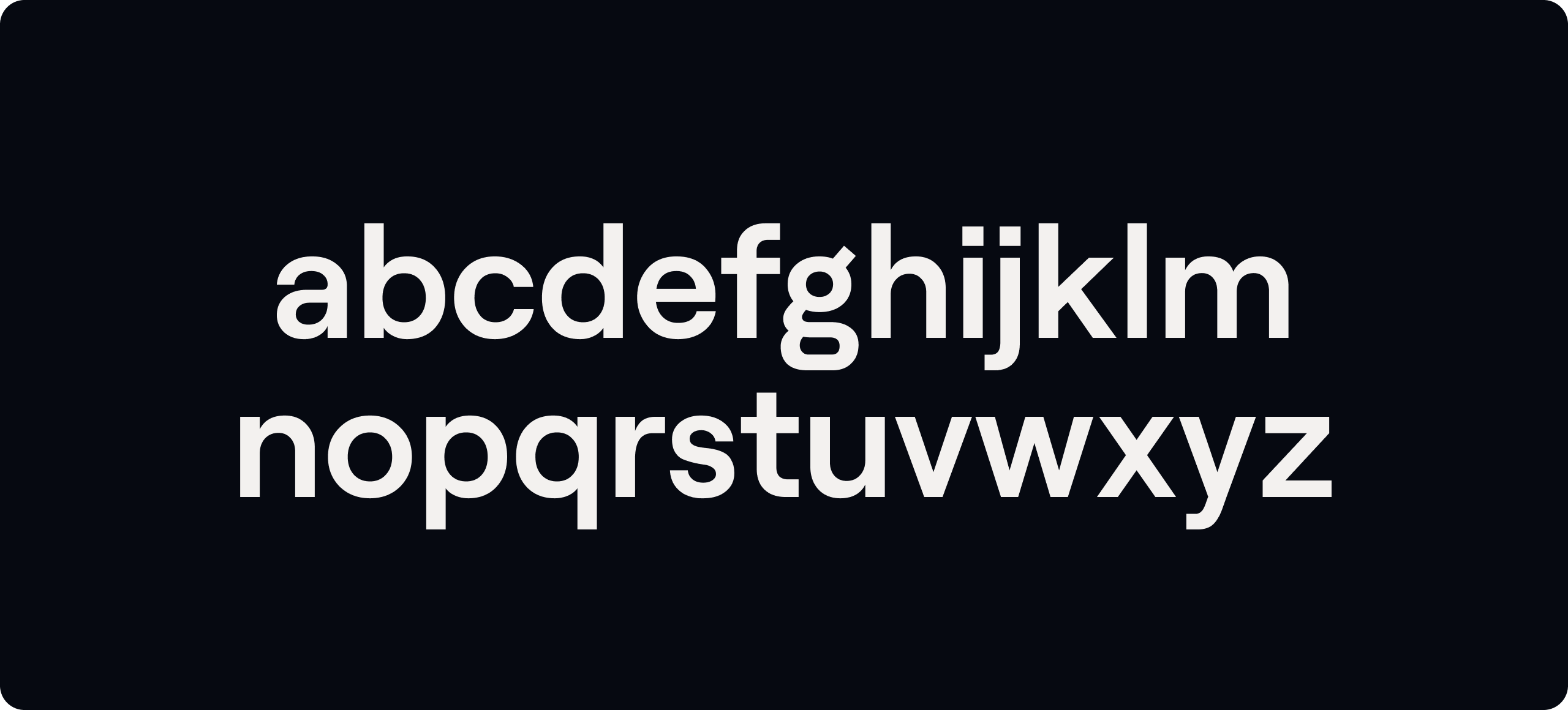
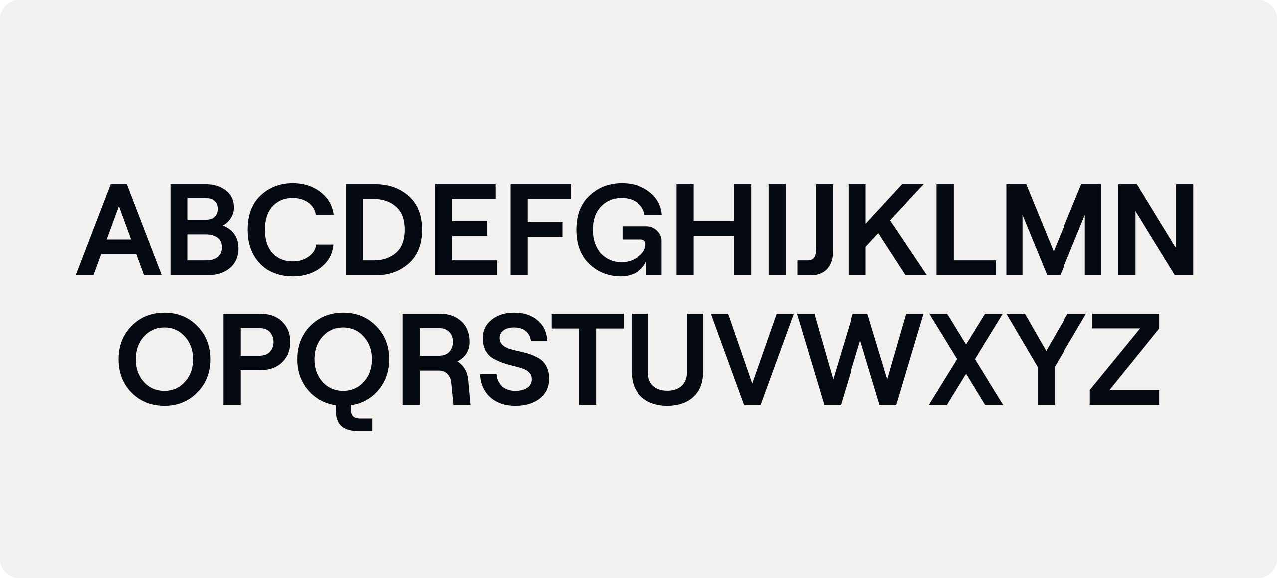
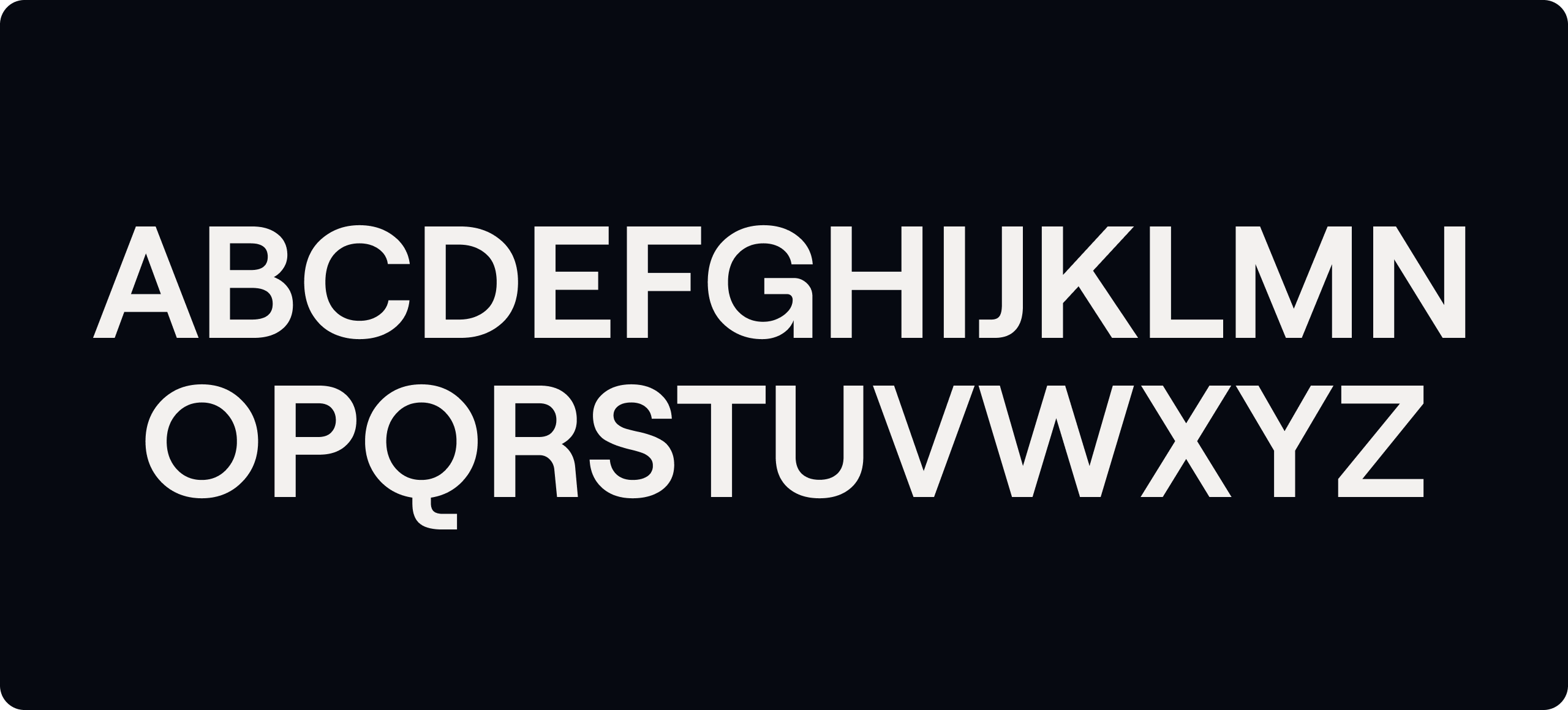
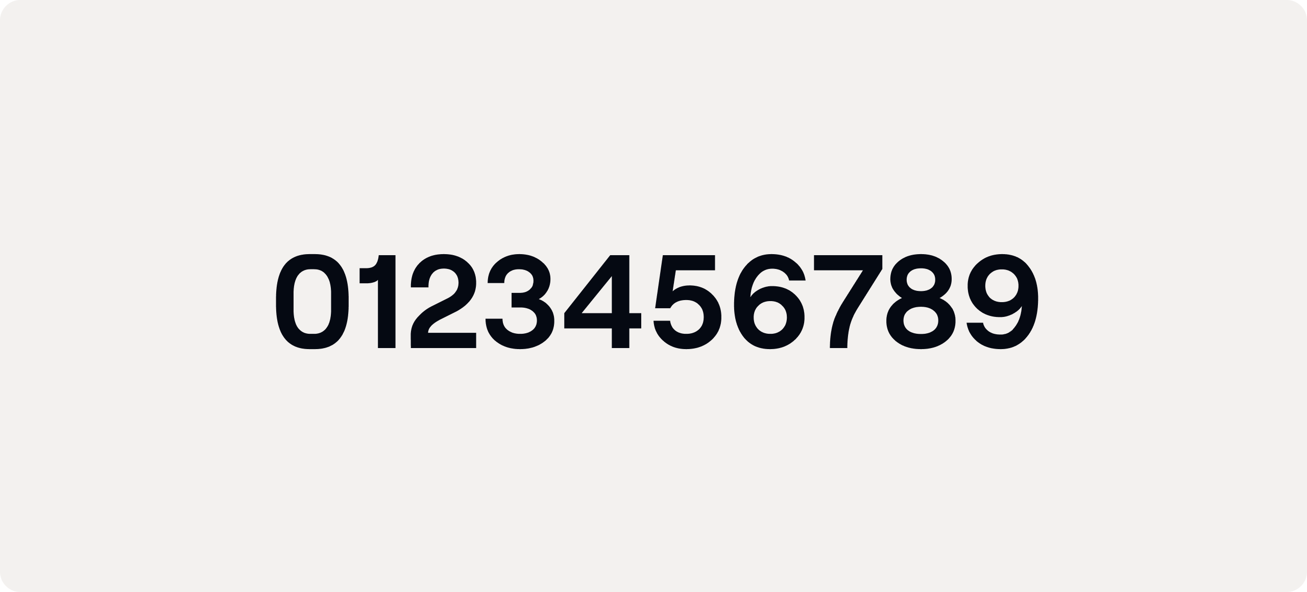
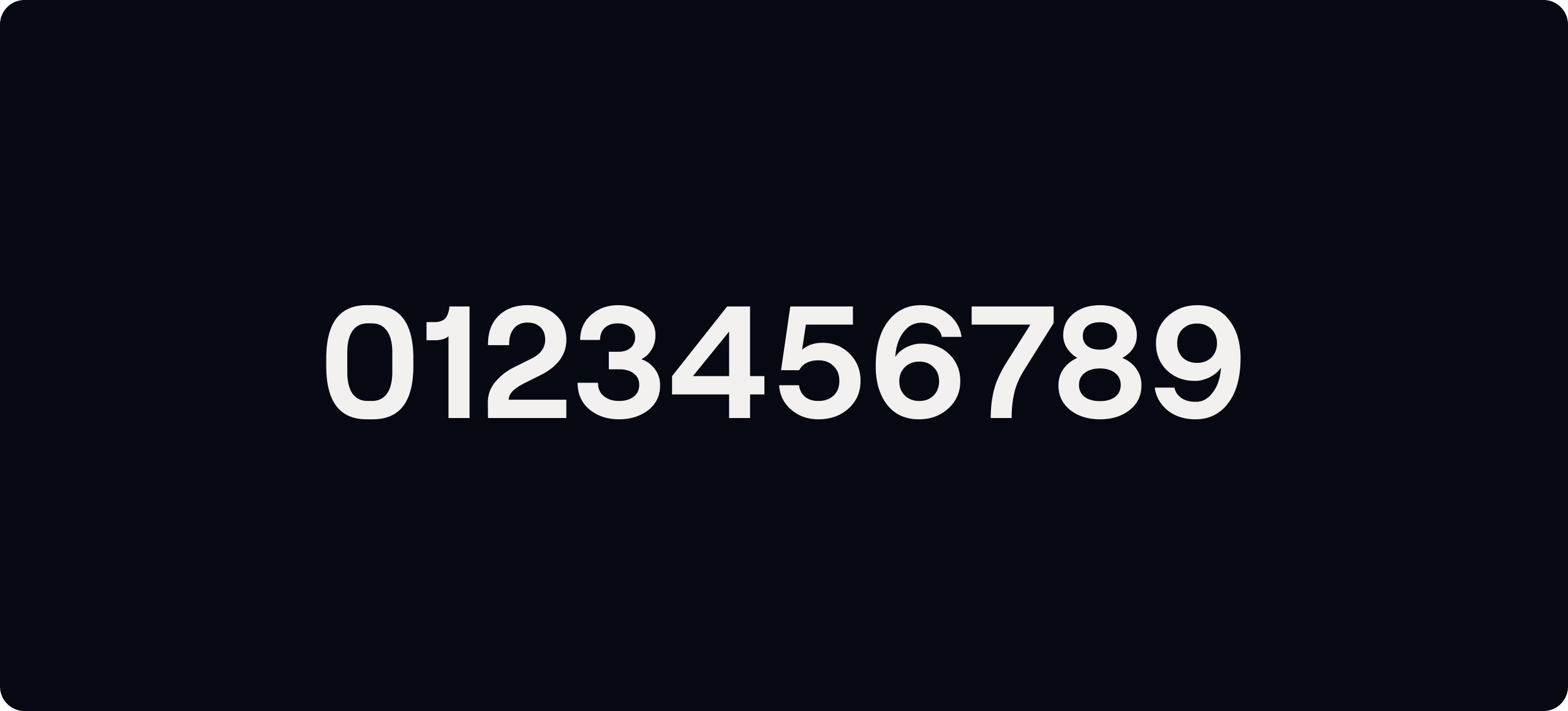
Weights
We use three weights of Roobert across our communications - Regular, SemiBold and Bold. Use our type hierarchy to make sure our use of Roobert is consistent.
Headline & Supporting Hierarchy
We have a very clear hierarchy on how we typeset our headlines, subheaders, body copy and CTA’s. Follow these rules to make sure our type system is consistent.
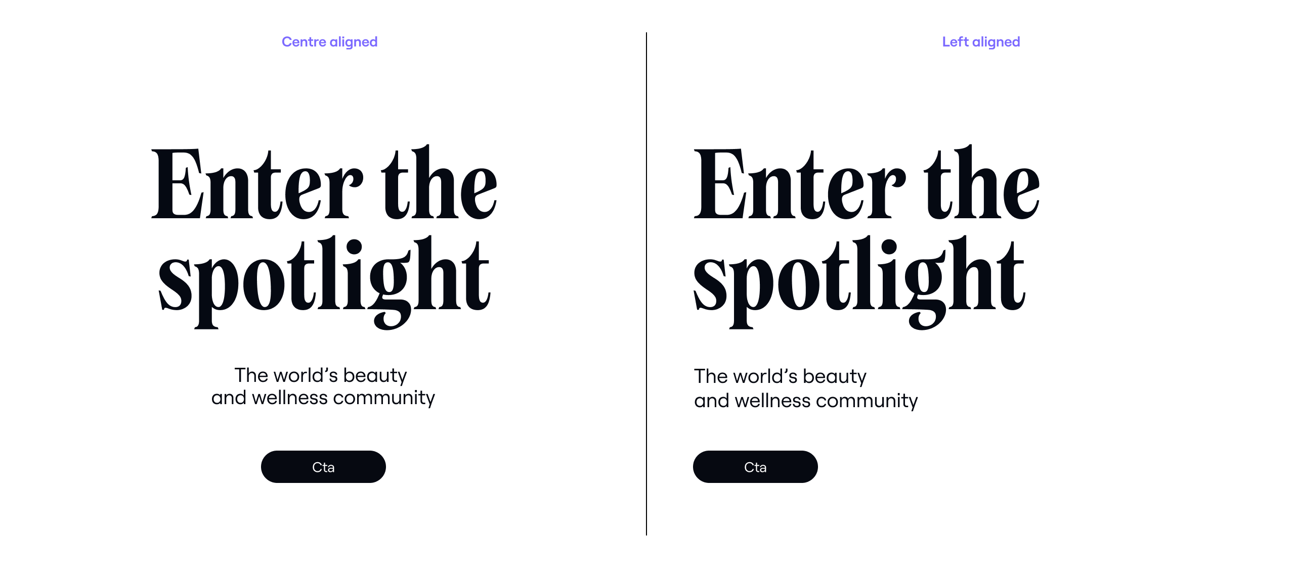
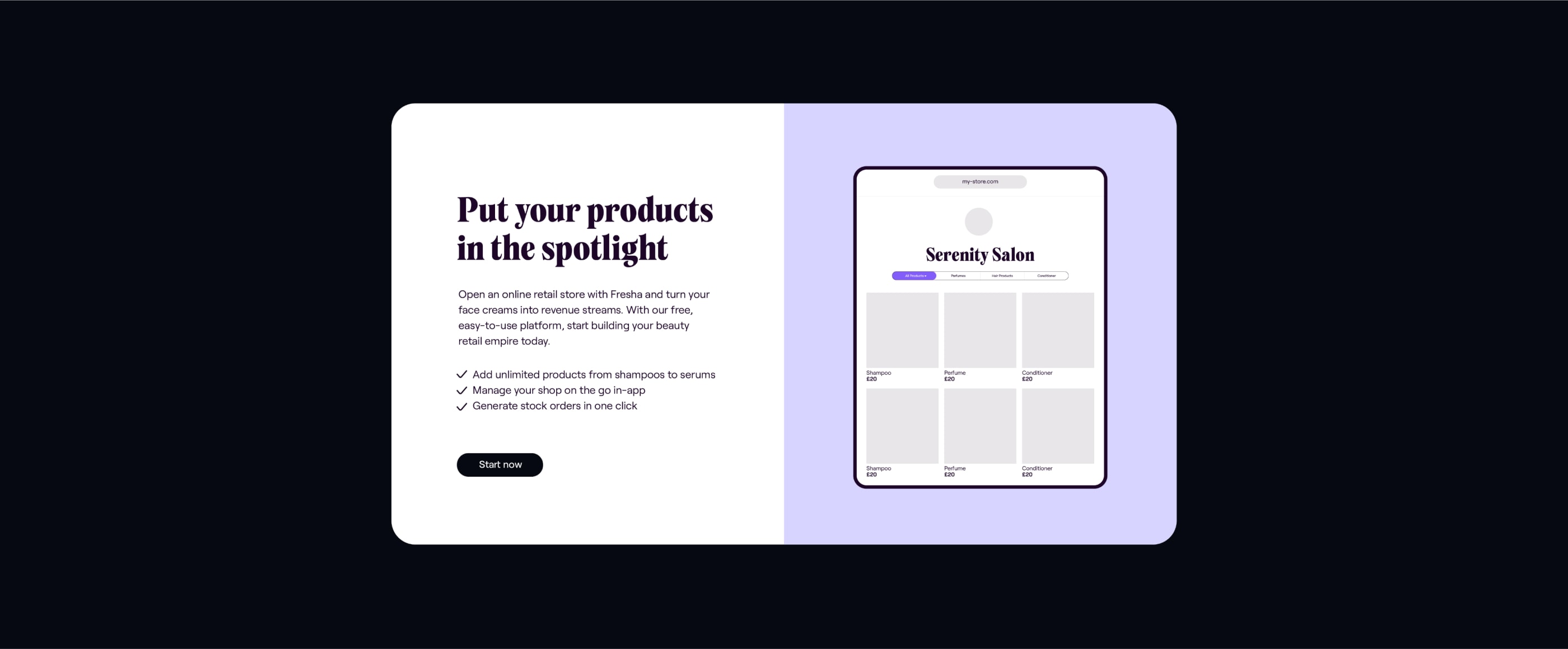
In-app typesetting
When we typeset our headlines, subheaders, body copy and CTA’s for digital/in-app applications, we can be centre or left aligned.
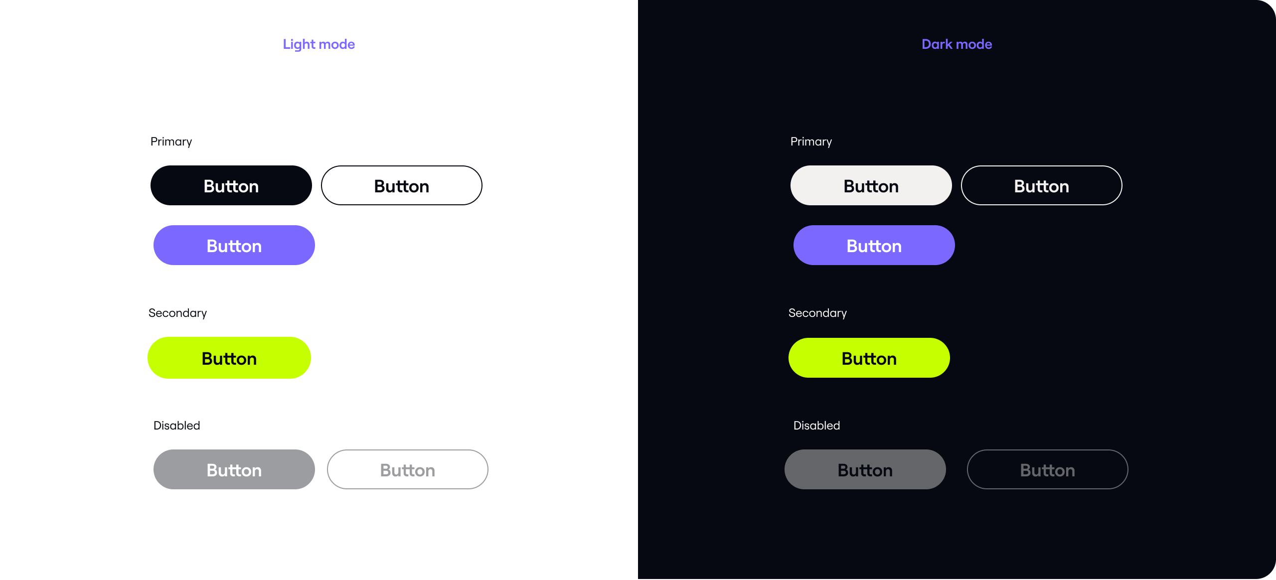
Type on colour
Primary
Our typography looks great when it sits over colour backdrops or spotlights. Always ensure we retain maximum legibility.


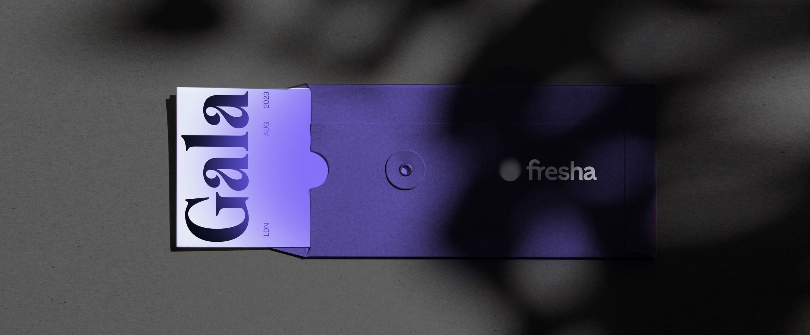
Expressive type
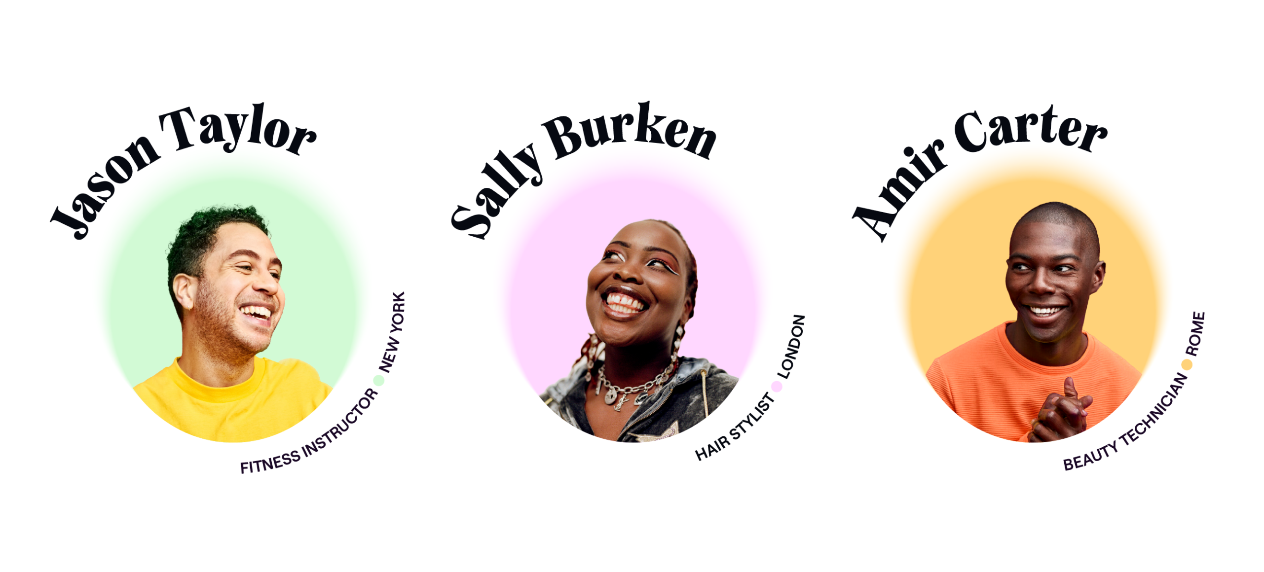
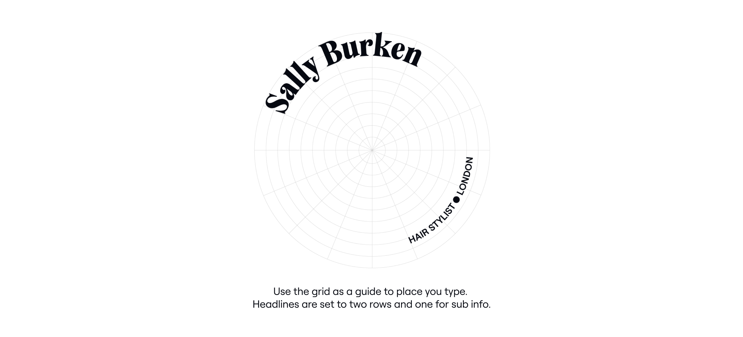
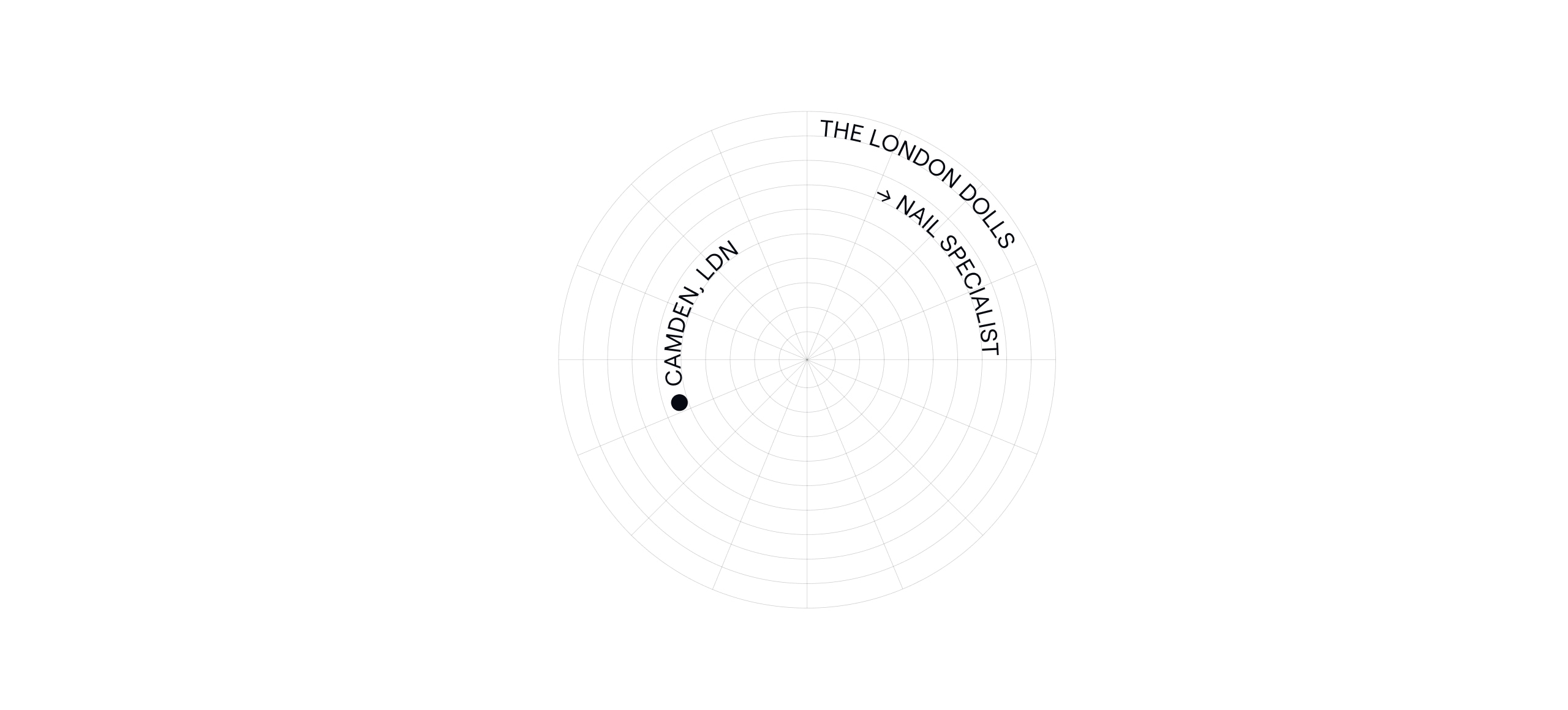
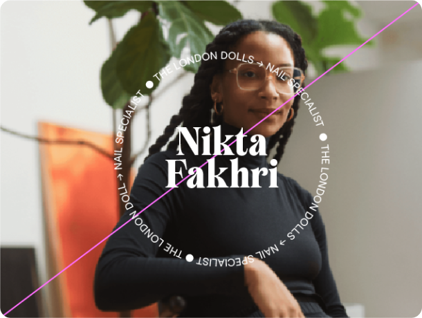
Spotlight typography
We continue our spotlight narrative through typographic layouts that circle our content. Follow these steps to accomplish this.
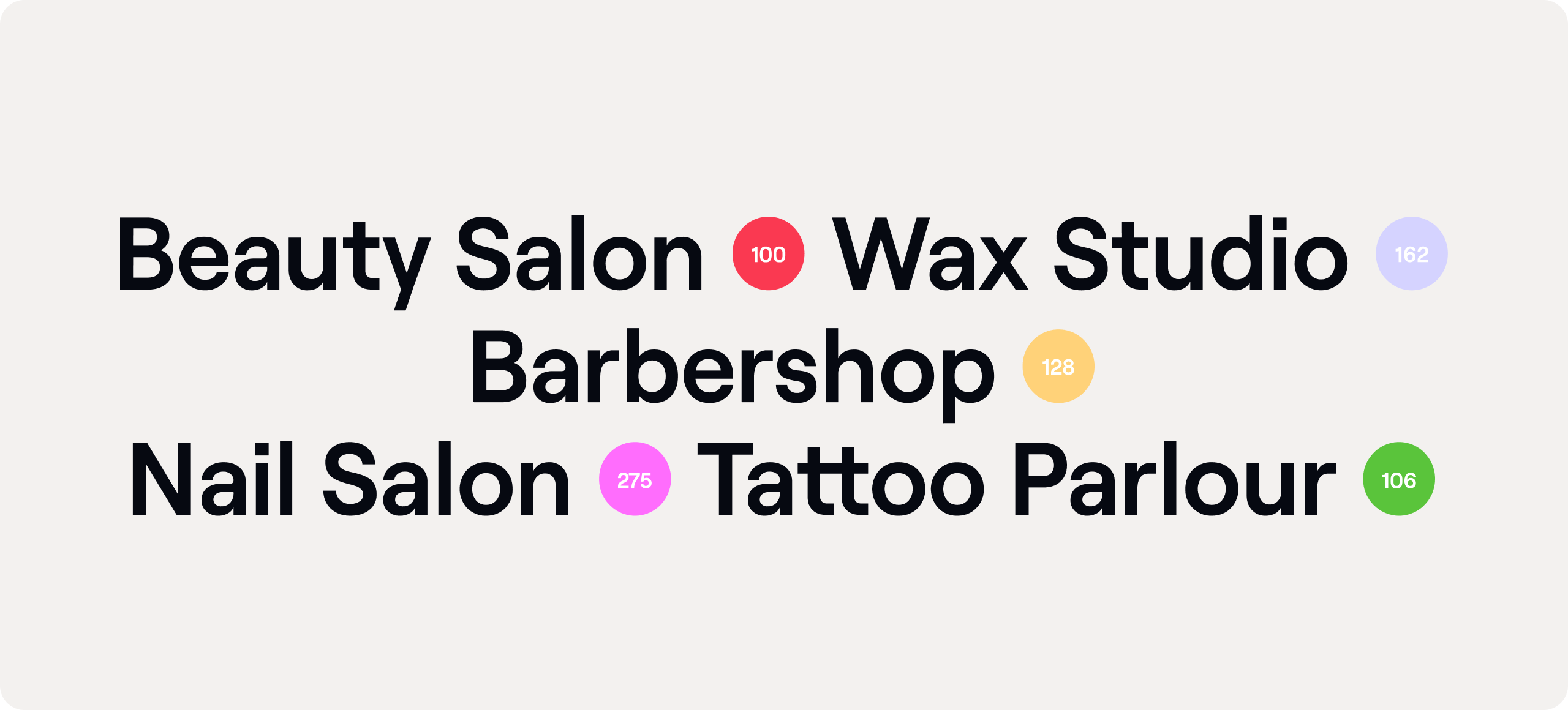
Dot spots
Our rational typeface features a variety of glyphs.
We use the oversize bullets to break type and hold functional details such as ratings and number of salon locations.
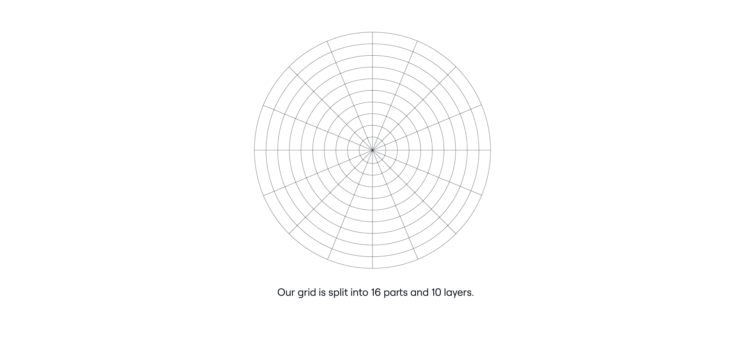
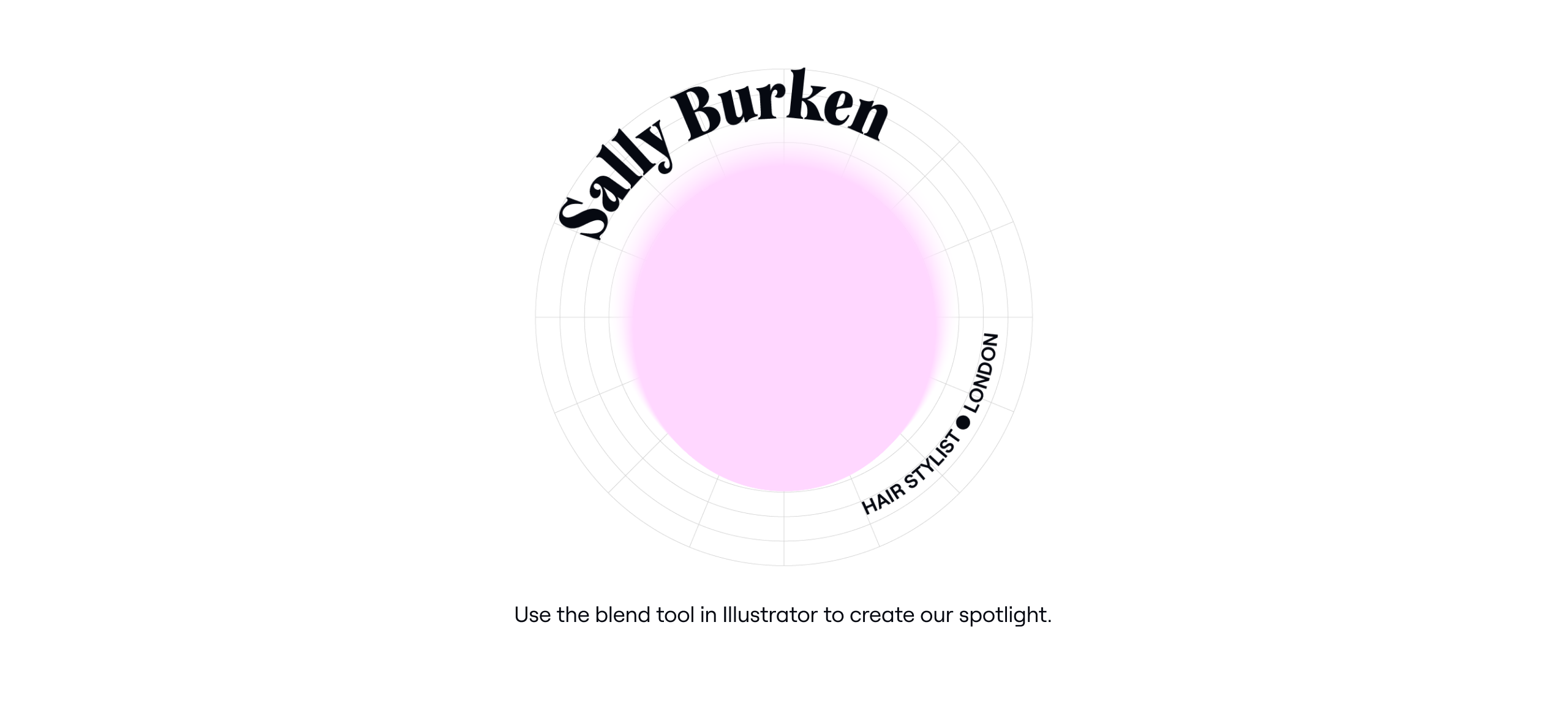
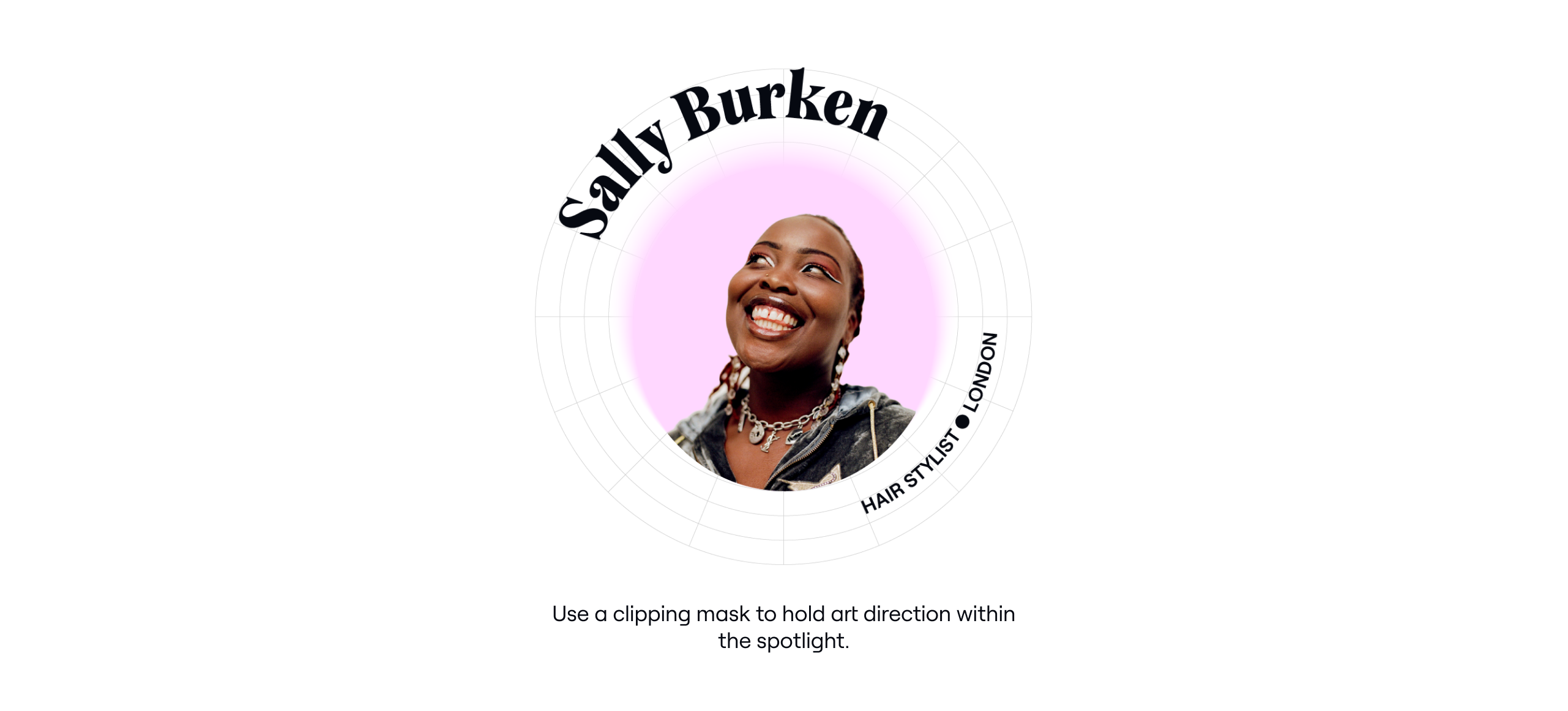
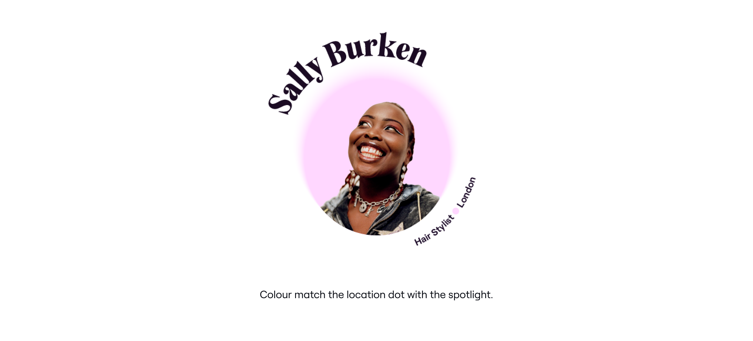
Spotlight apertures
We can also use our typography to create spotlight apertures. Below is how we can create them. They can be used across applications using art direction. we use the same grid sytem as
our Spotlight type forms.
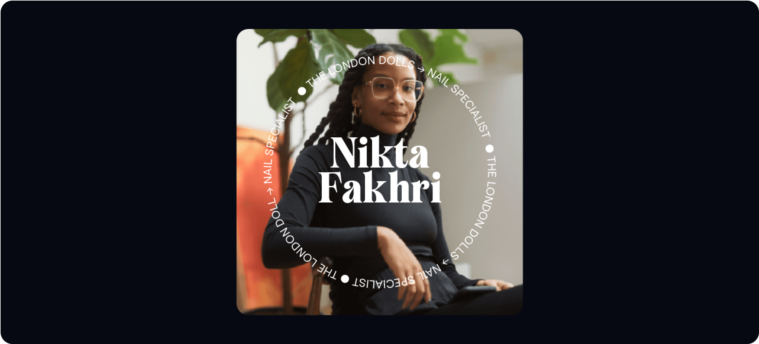
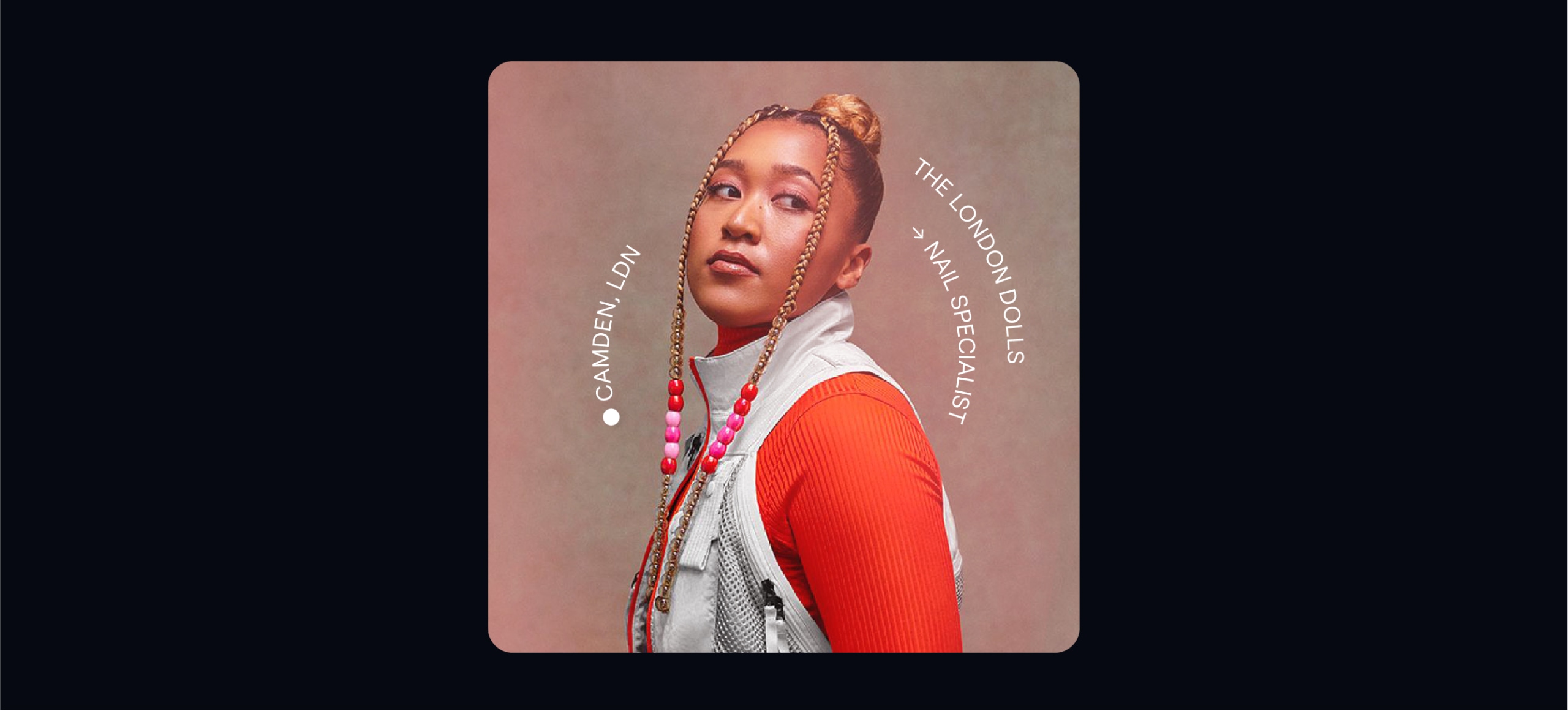
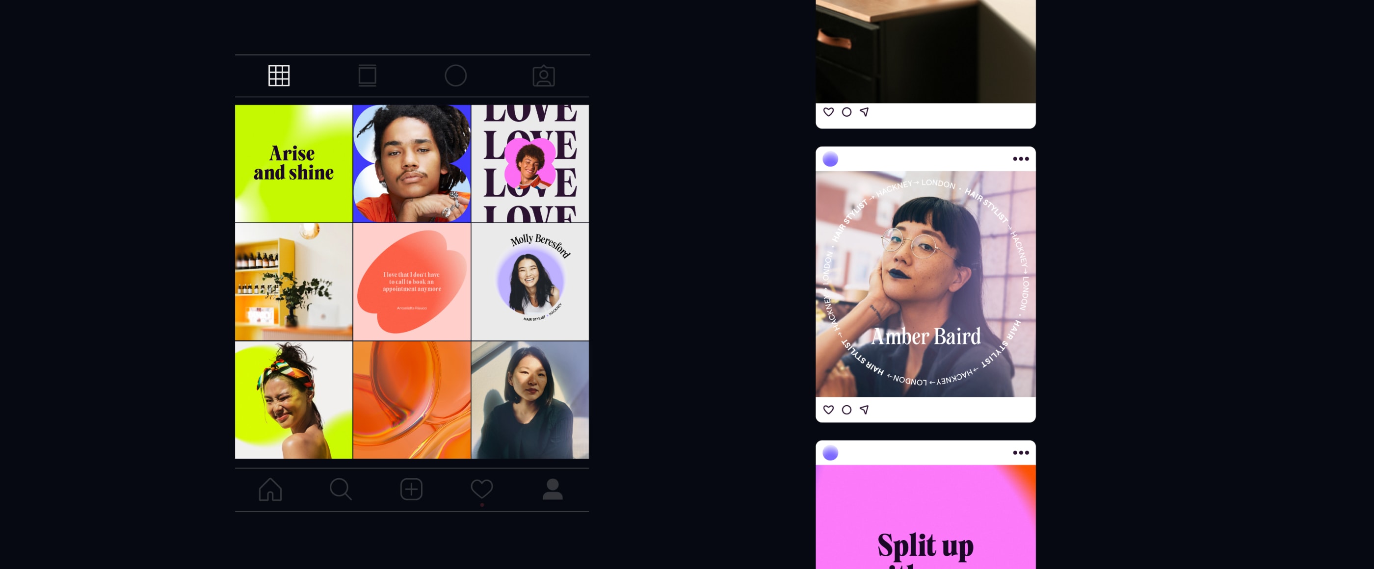
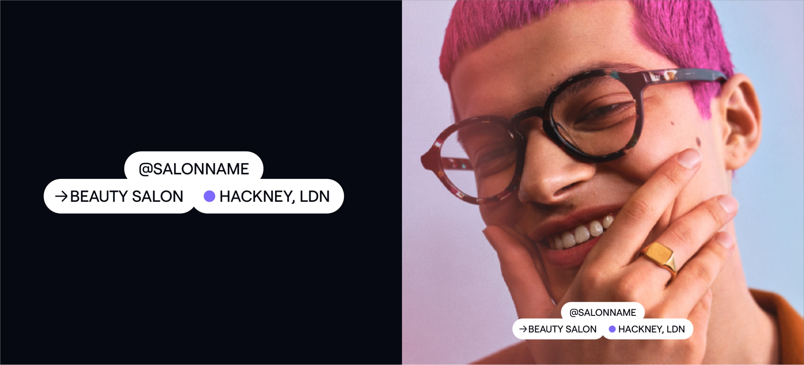
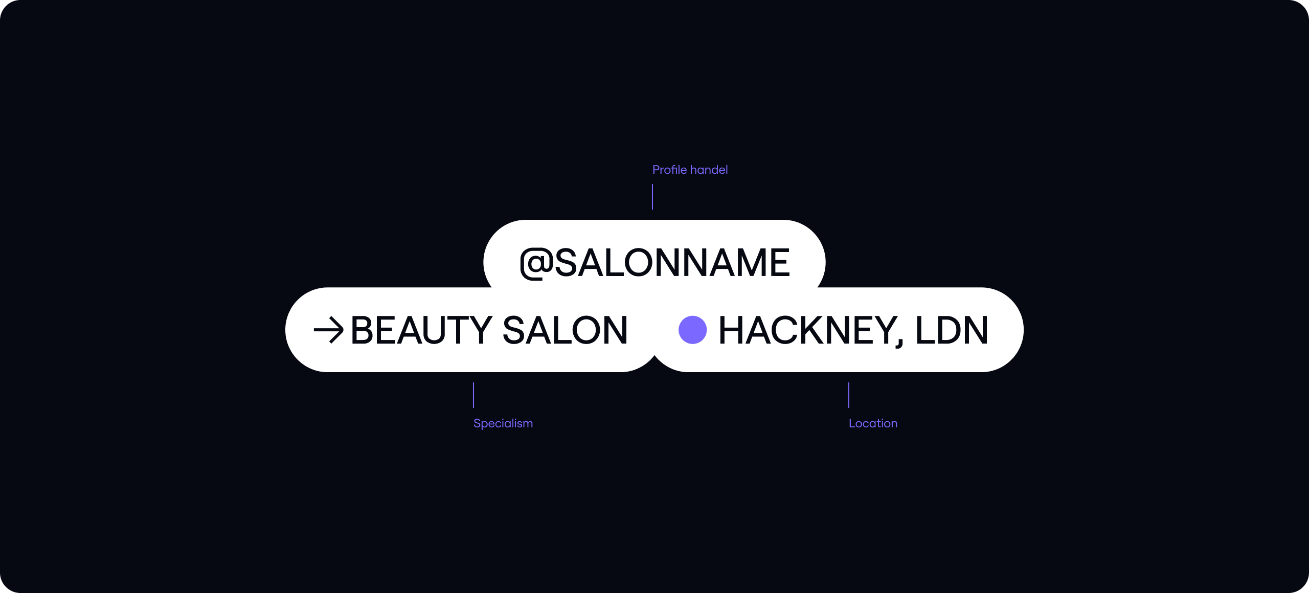
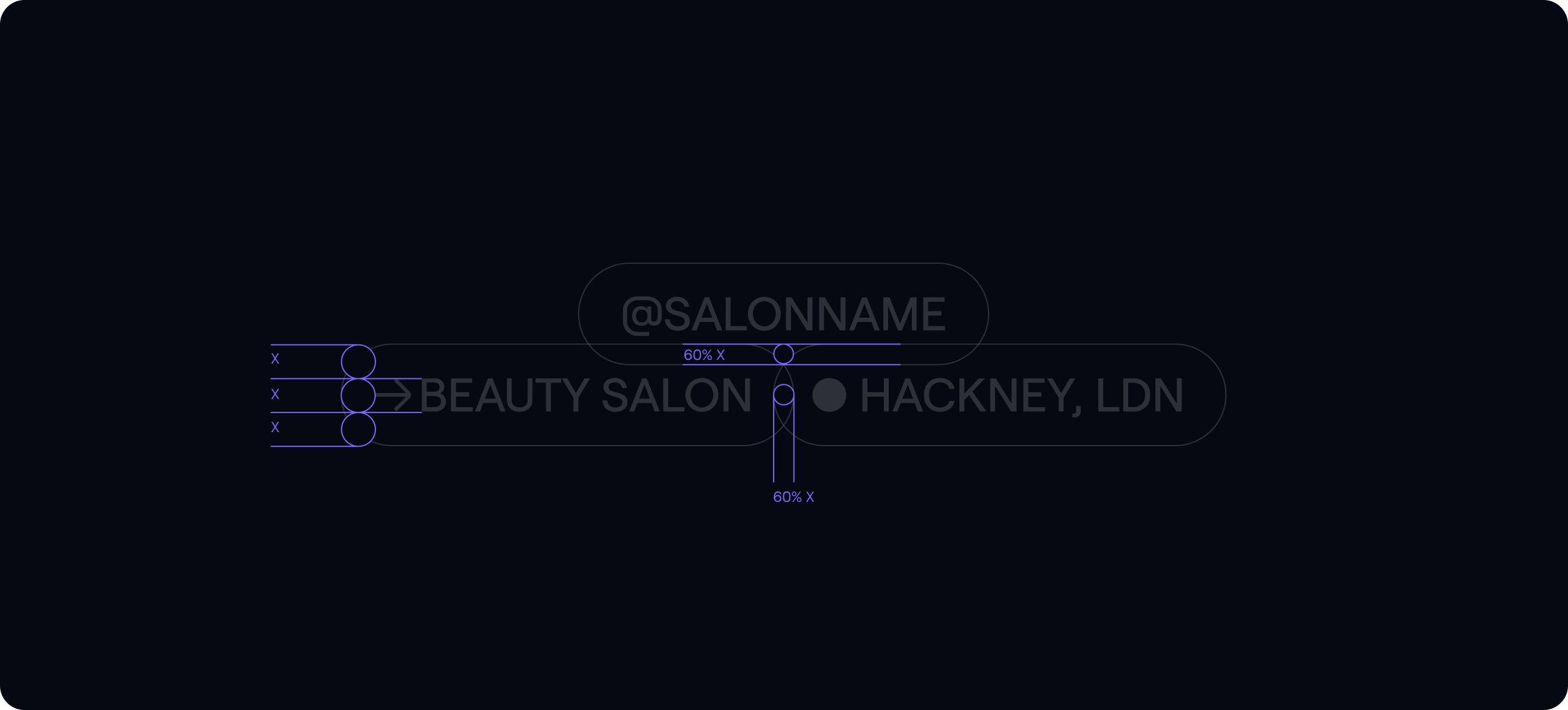
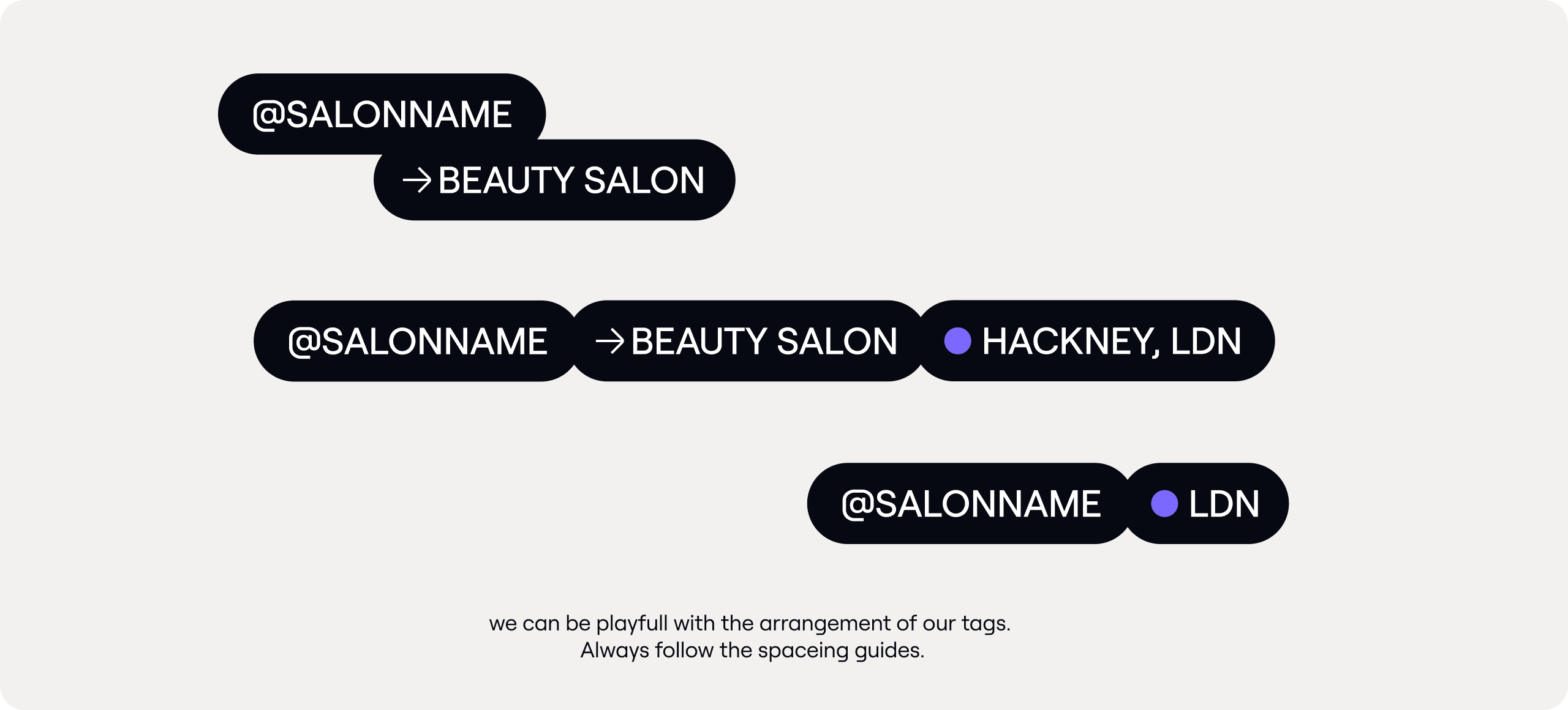
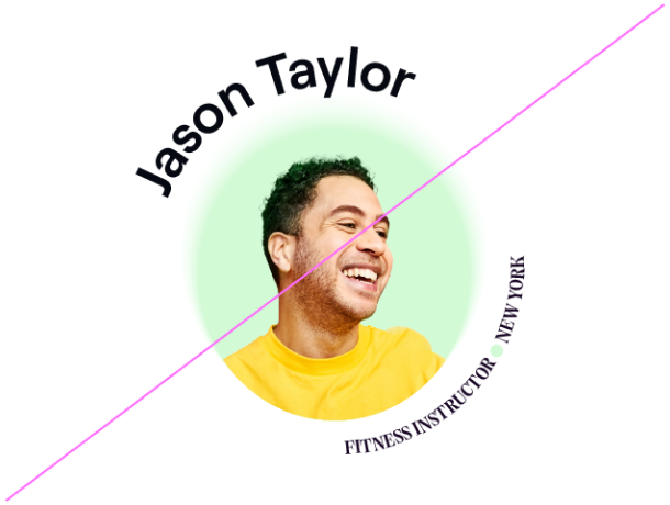
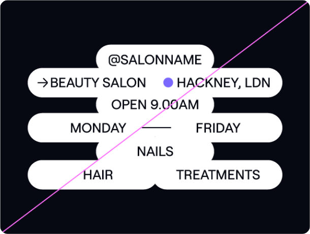
Spotlight tags
Inspired by our spotlights, we have a playful tagging system that can hold information about our clients and business owners.
System typefaces
Emotive type
Google font
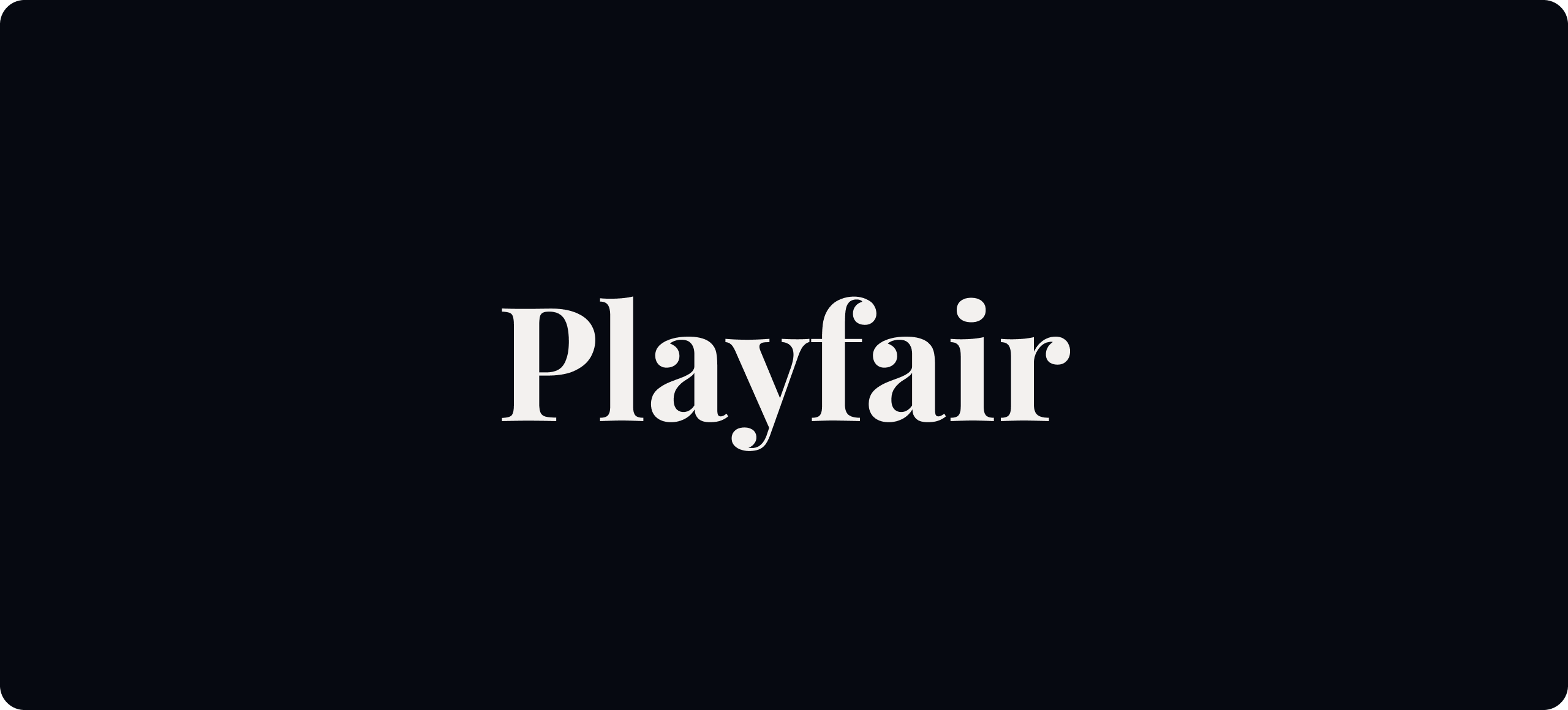
Wherever possible use our brand typeface, Tartuffo for headlines. Where this is not possible, we use the Google font Playfair.
https://fonts.google.com/specimen/Playfair+Display
https://fonts.google.com/specimen/Playfair+Display
Rational type
Google font
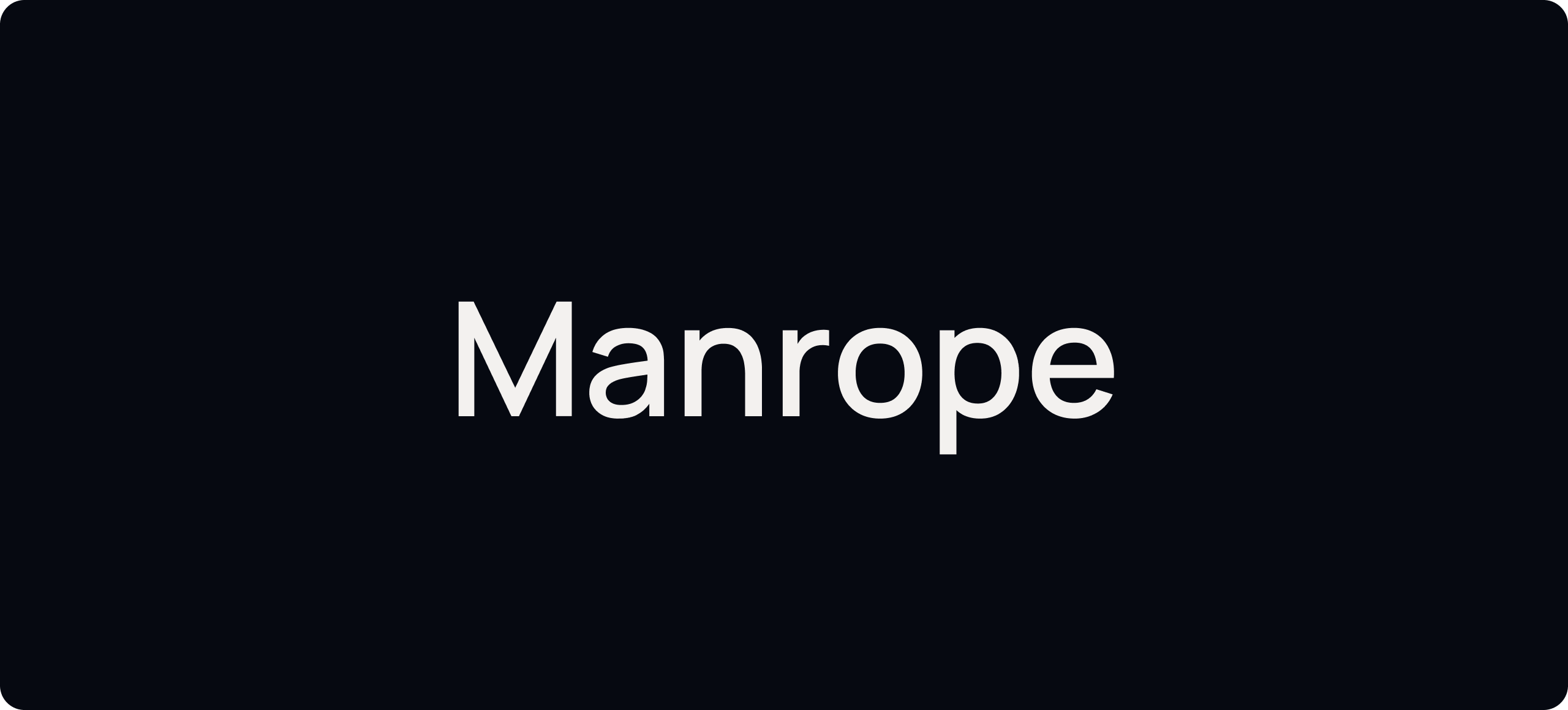
Wherever possible use our brand typeface, Roobert for our support font. Where this is not possible, we use the Google font Manrope.
https://fonts.google.com/specimen/Manrope
https://fonts.google.com/specimen/Manrope
Emotive type
System
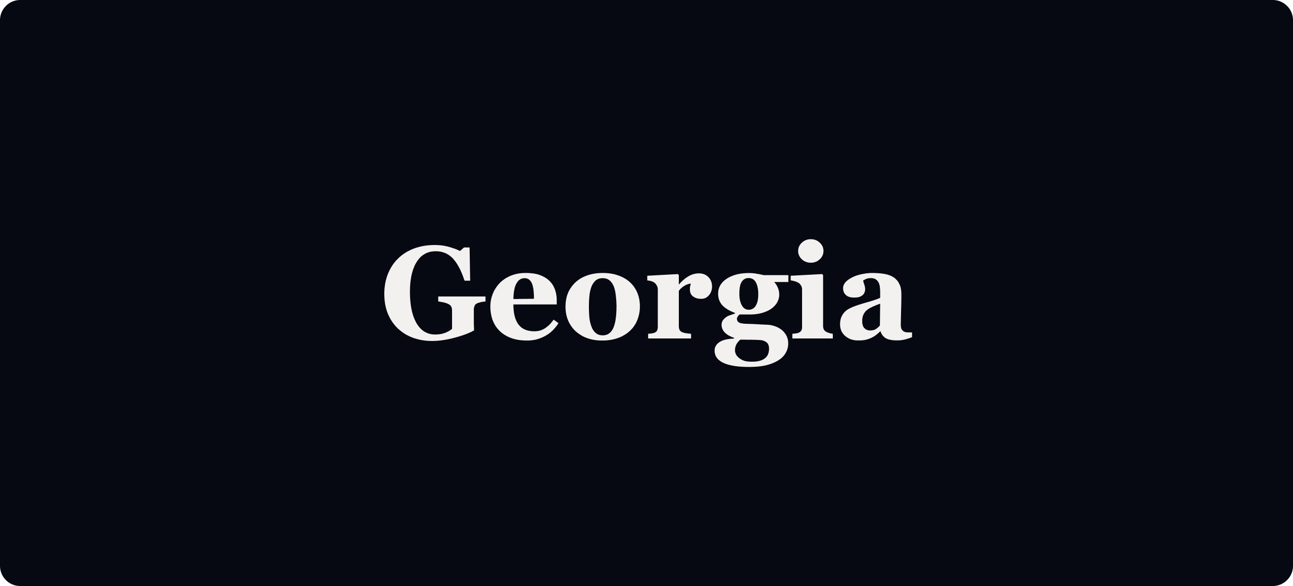
Within digital, wherever possible use Tartuffo. When this is not possible (for example in functional content-heavy applications) we use the system font Georgia.
Rational type
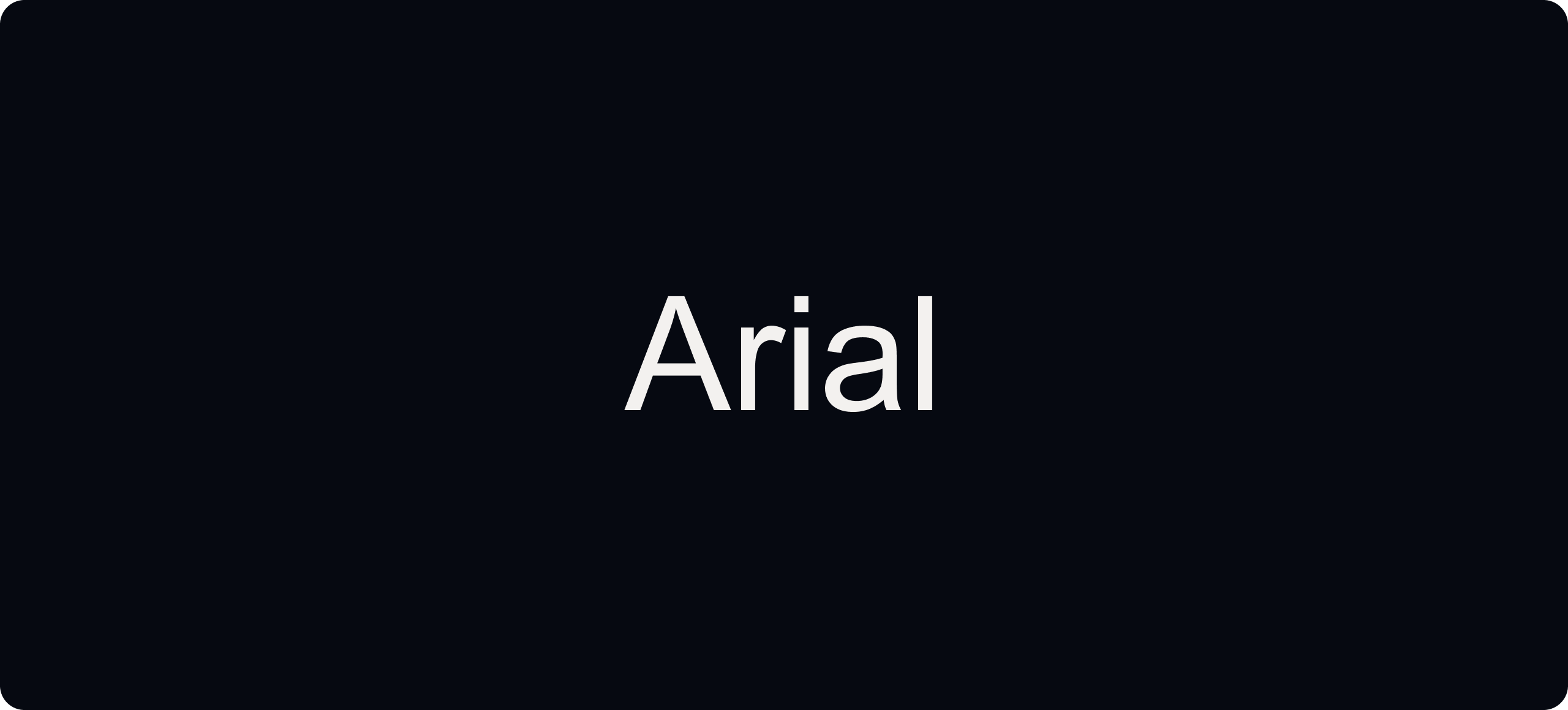
System font
Within digital, wherever possible use Tartuffo. When this is not possible (for example in functional content-heavy applications) we use the system font Arial.
Things to avoid
01
Don’t use uppercase for our headlines.
02
Don’t change the type principles for our radial spotlight type.
03
Don’t place our type apertures over awkward parts of imagery.
04
Don’t over use our spotlight tags or use them to hold other information.
Inspiration