Spotlights

Introduction
Spotlights are one of our most frequently used assets. It is inspired by the world of light, making it unique and ownable for us. It has full flexibility and can be both flat and immersive.
Expressive spotlights
Expressive spotlights
Our Expressive Spotlights make our brand energetic and distinctive.
Expressive Spotlights are made up of Single, Interactive and Immersive lights. They should be used throughout most applications.


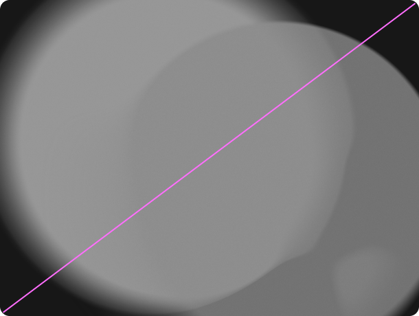
Single spotlights
Overview
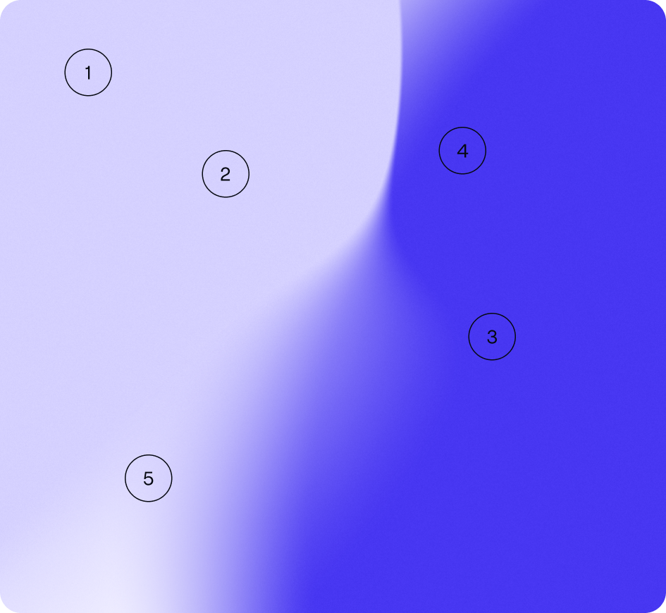
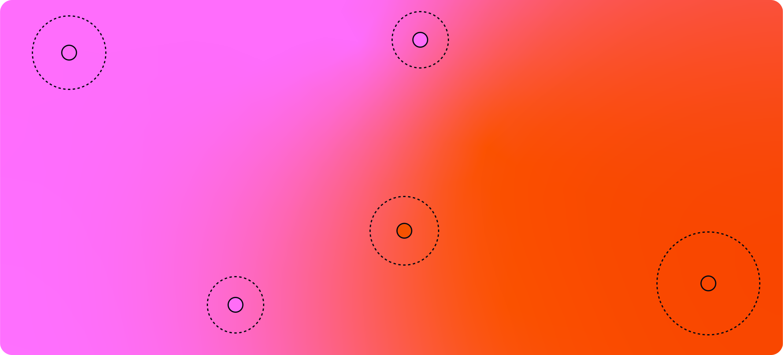
Our Single spotlights add sophistication and ownability to our comms. There is no hierarchy to the usage of our spotlights.
Our system should feel flexible and organic.


Details
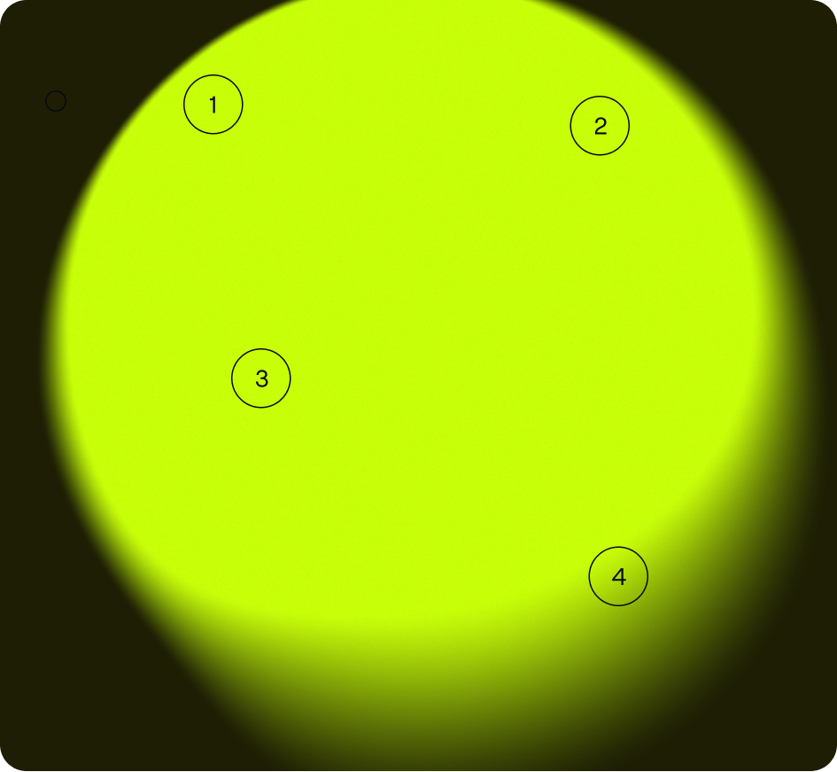
Below is an example of one of our Single spotlights and the details to follow when creating your own. The most important rule is to make sure they feel aesthetically natural, like the qualities of light.
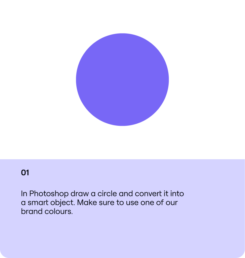
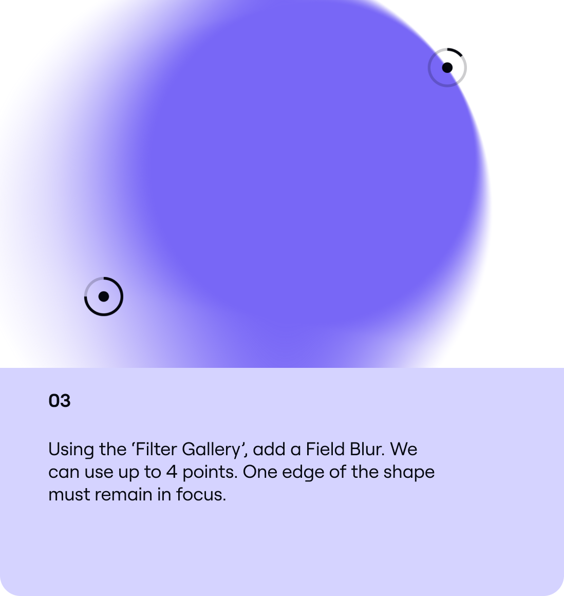
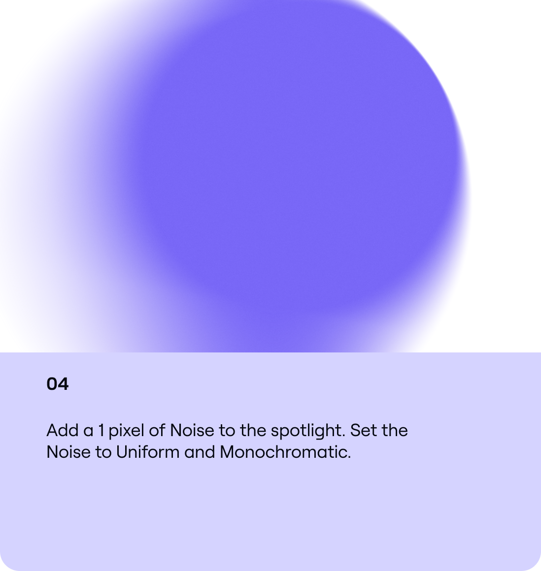
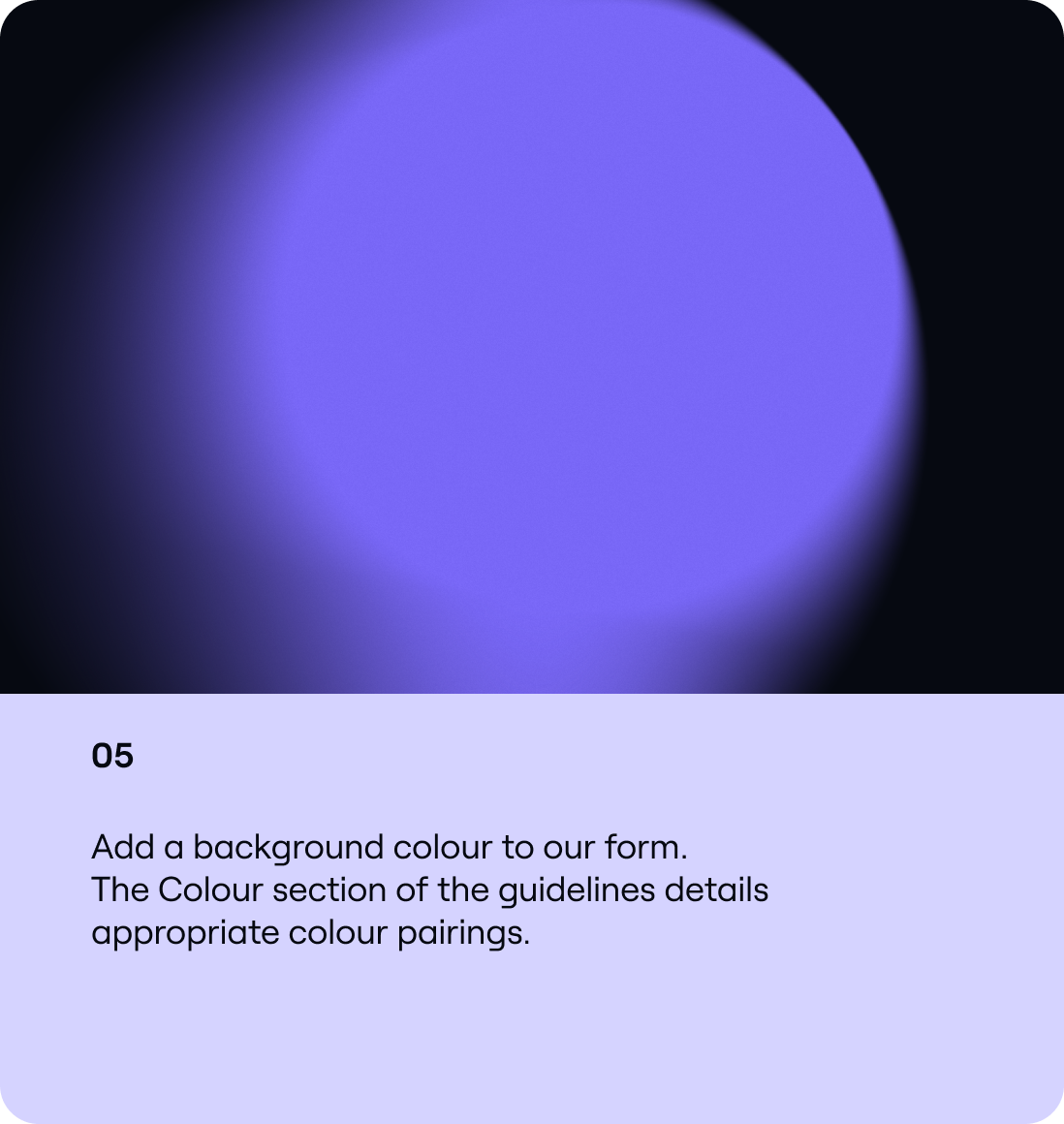
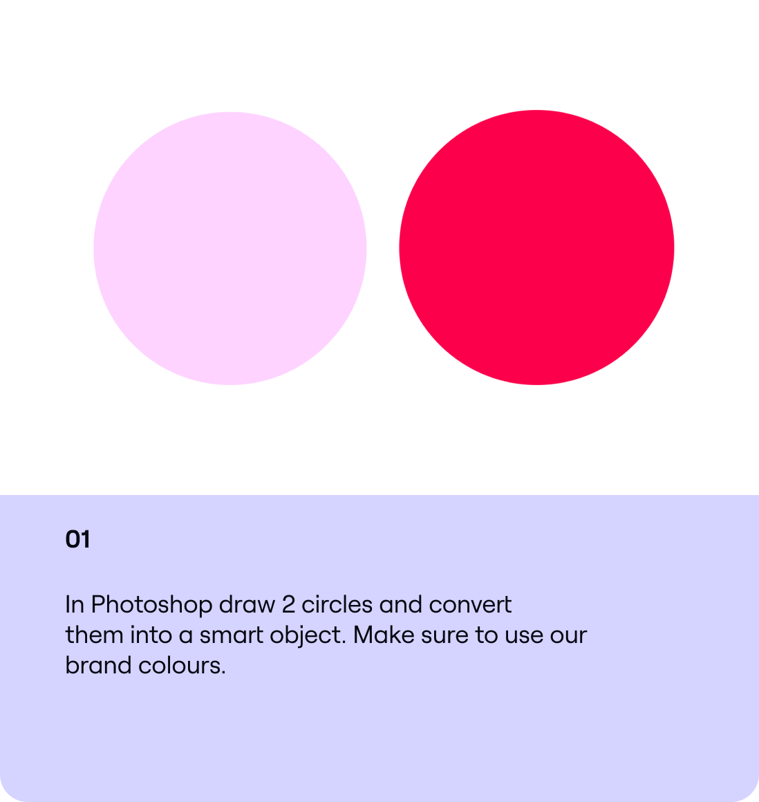
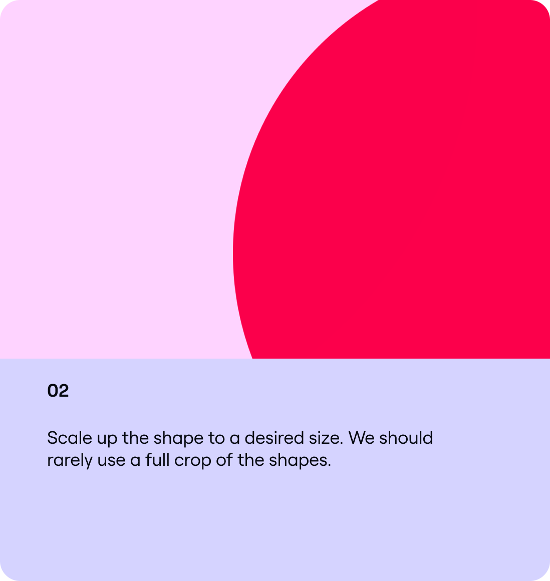
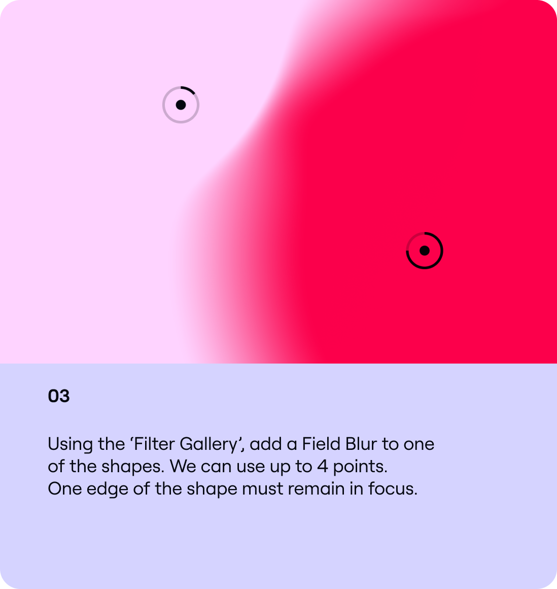
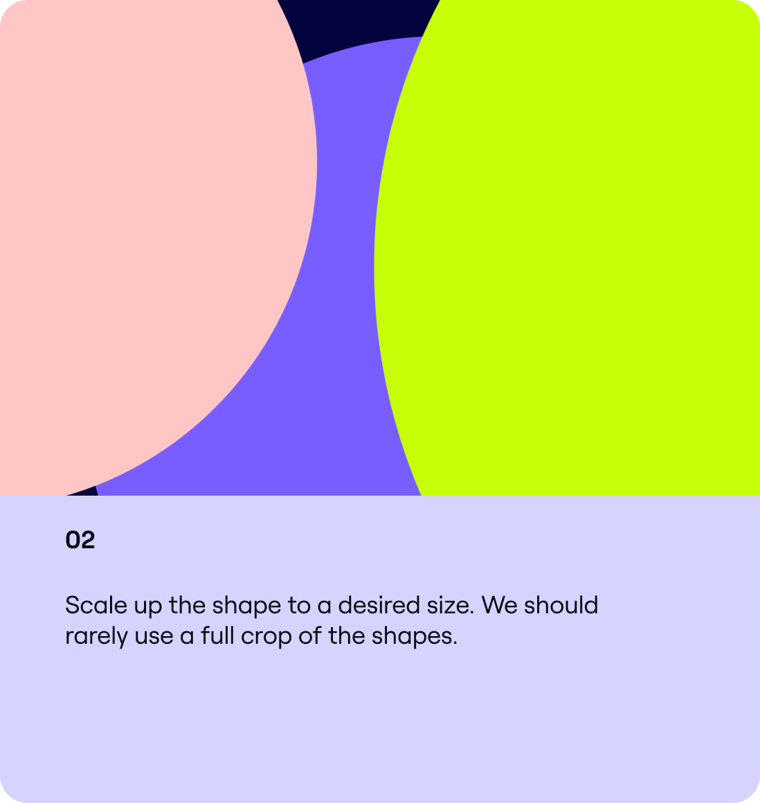
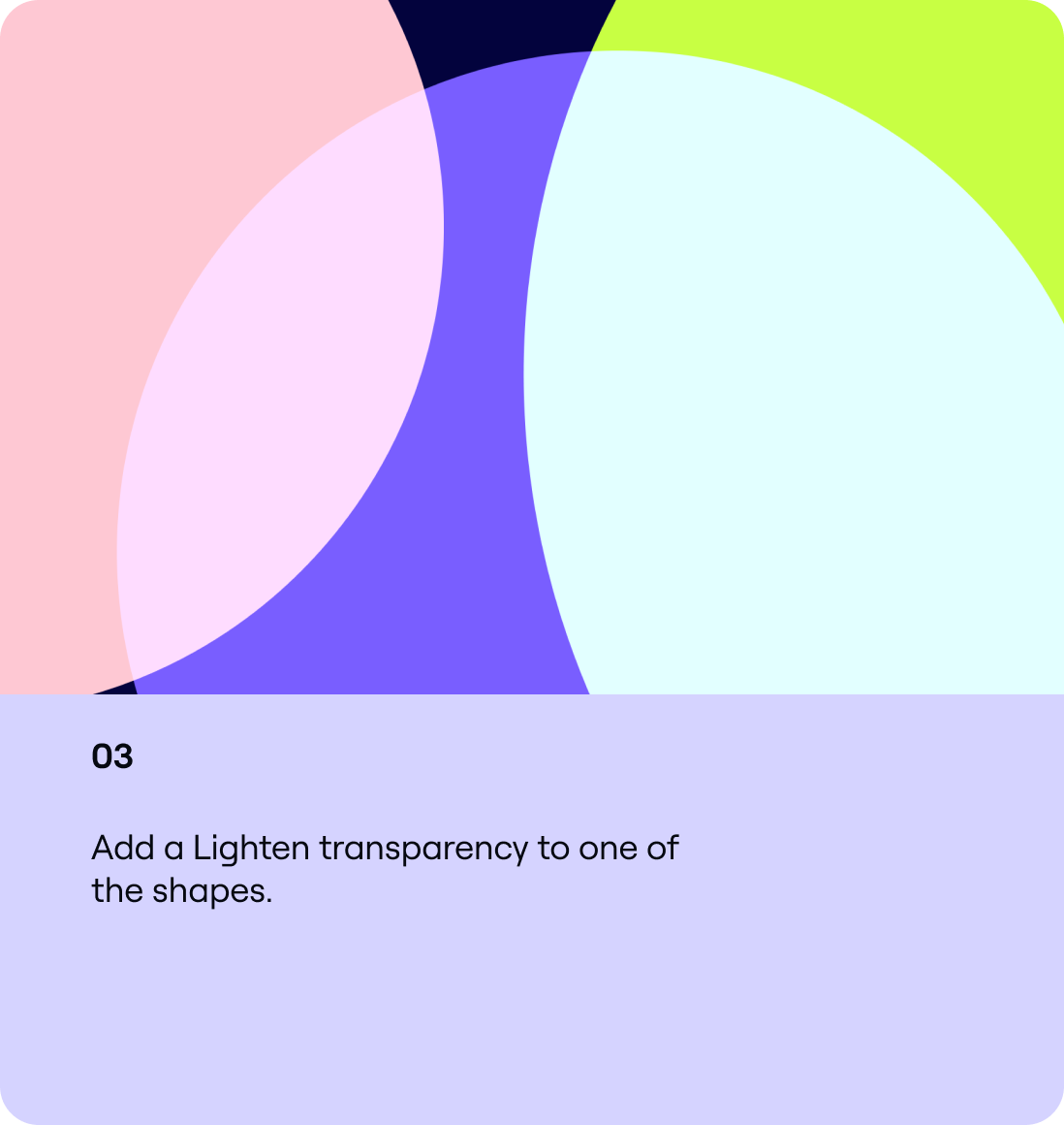
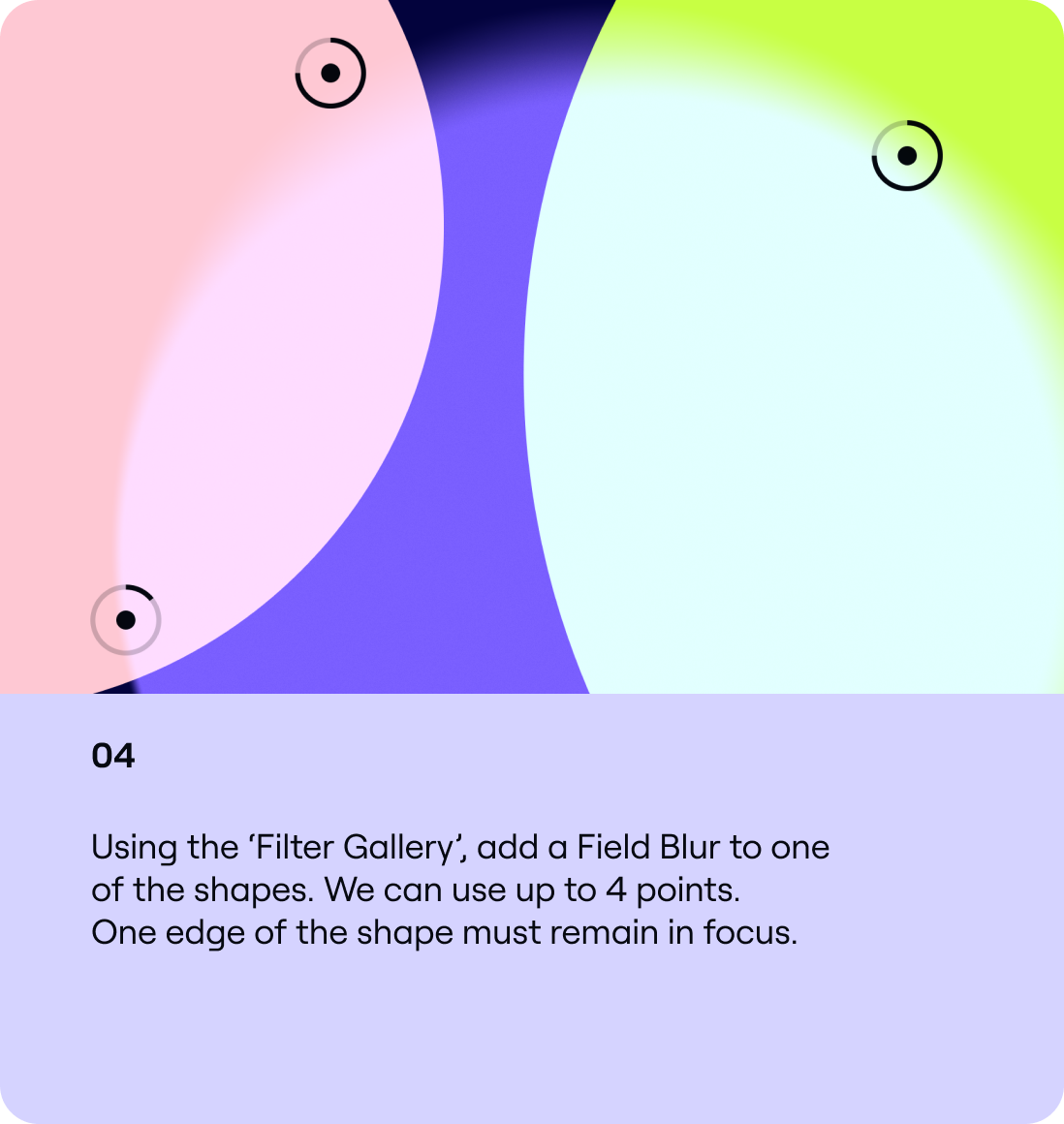
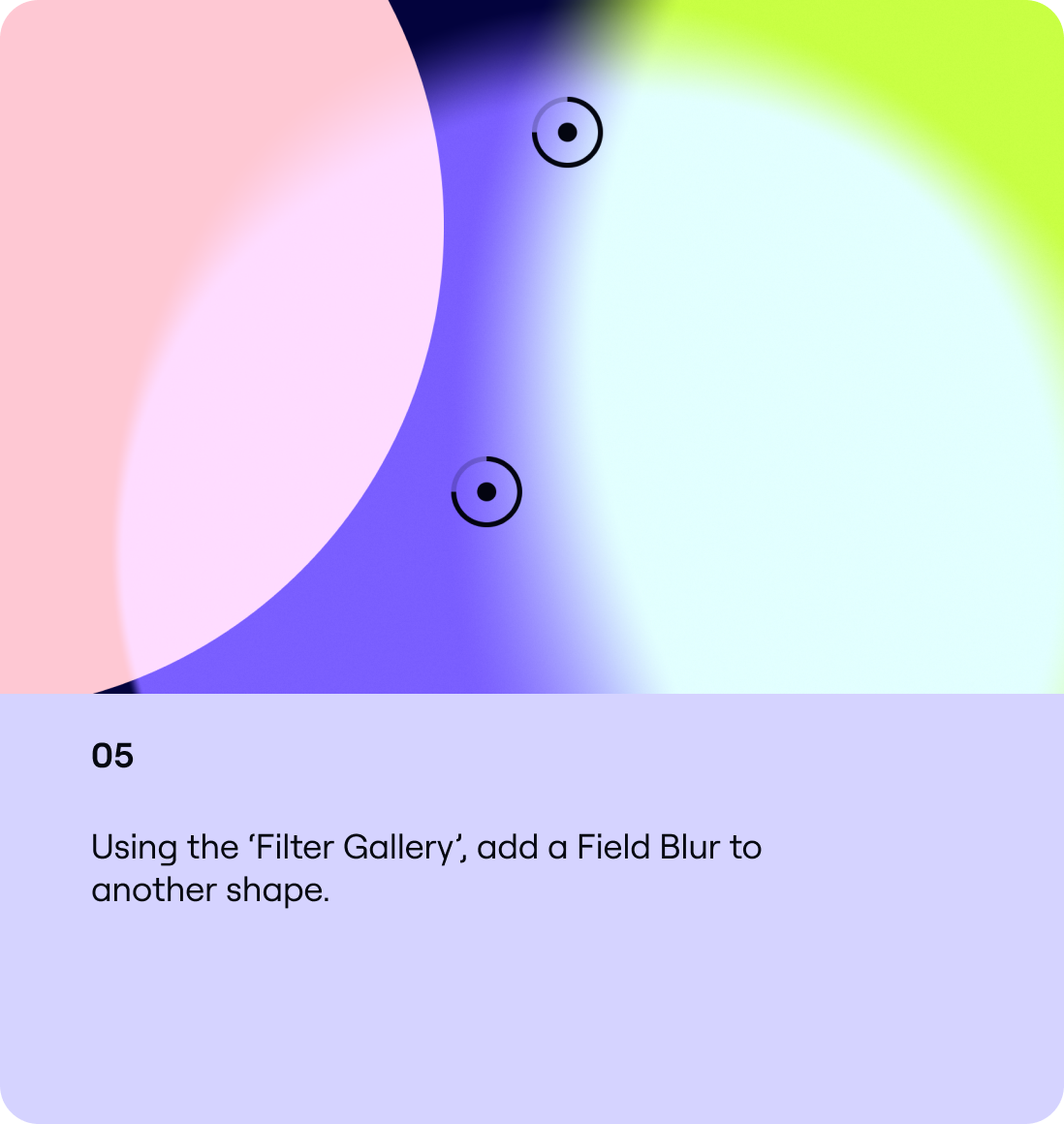
Build
Here are the steps to creating our Single spotlights. Follow this guidance to make sure all our Spotlights are consistent.
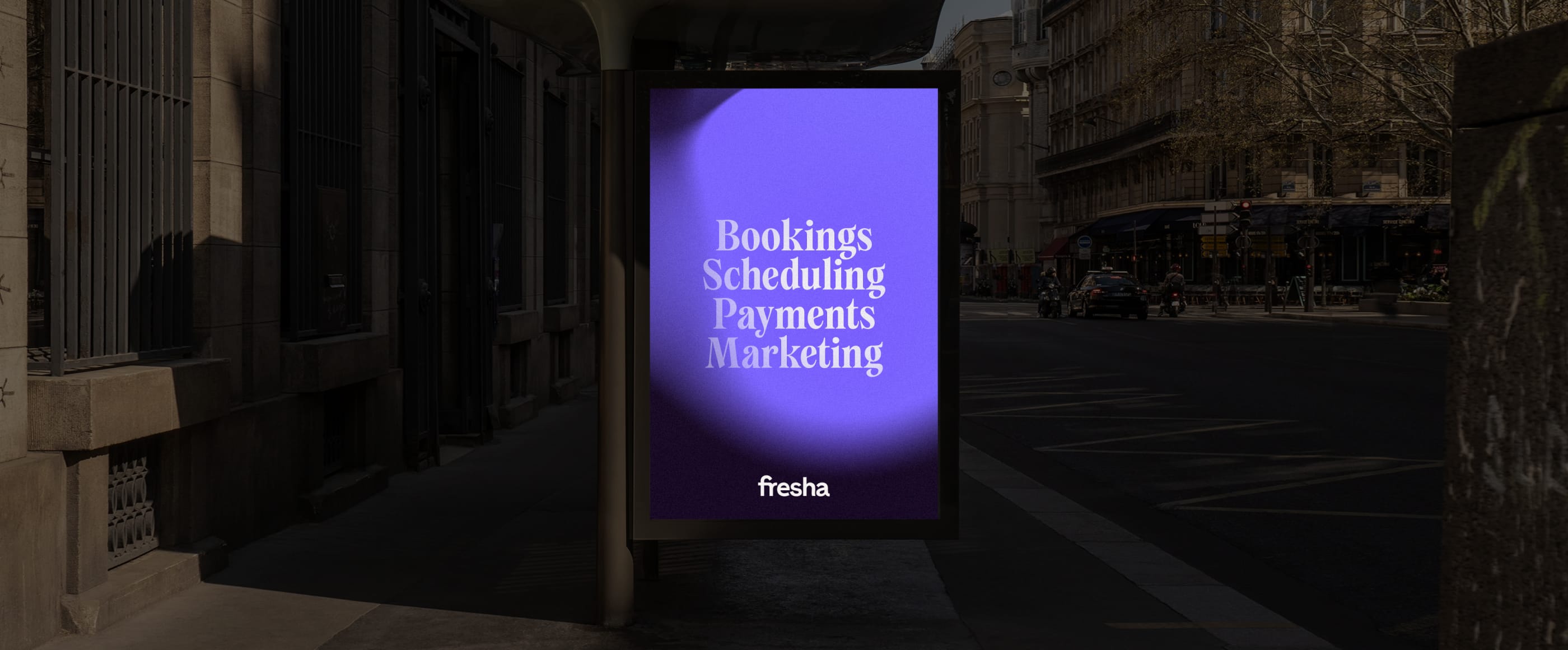
Example
Interactive spotlights
Overview
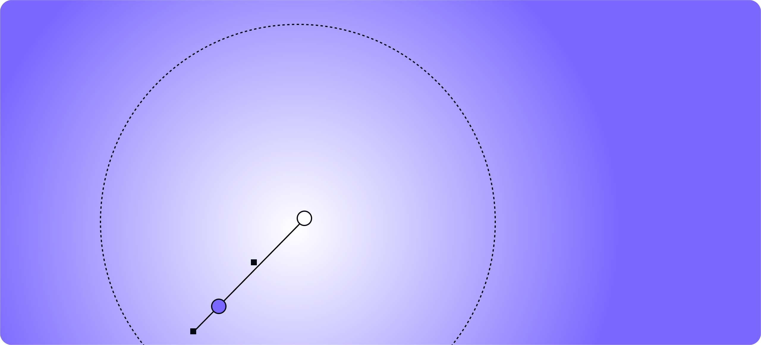
Our Interactive spotlights add vibrancy and energy to our applications. They should only use two colours and must interact
in a natural way.


Details
Below is an example of one of our Interactive spotlights and the details to follow when creating your own. The most important rule is to make sure they feel aesthetically natural, like the qualities of light.
Build
Here are the steps to creating our Interactive spotlights. Follow this guidance to make sure all our spotlights are consistent.
Example
Immersive spotlights
Overview
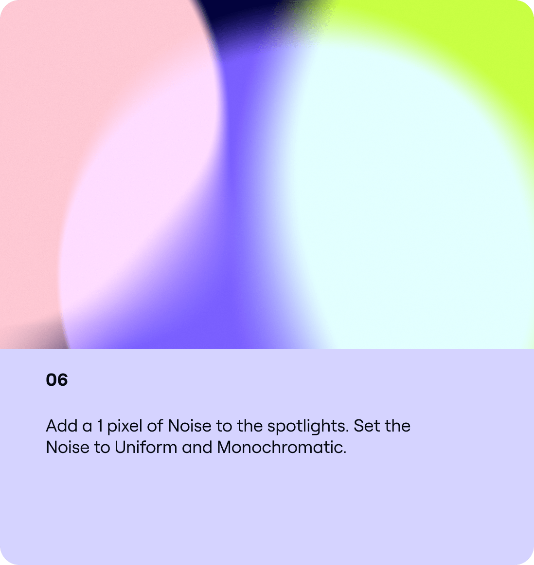
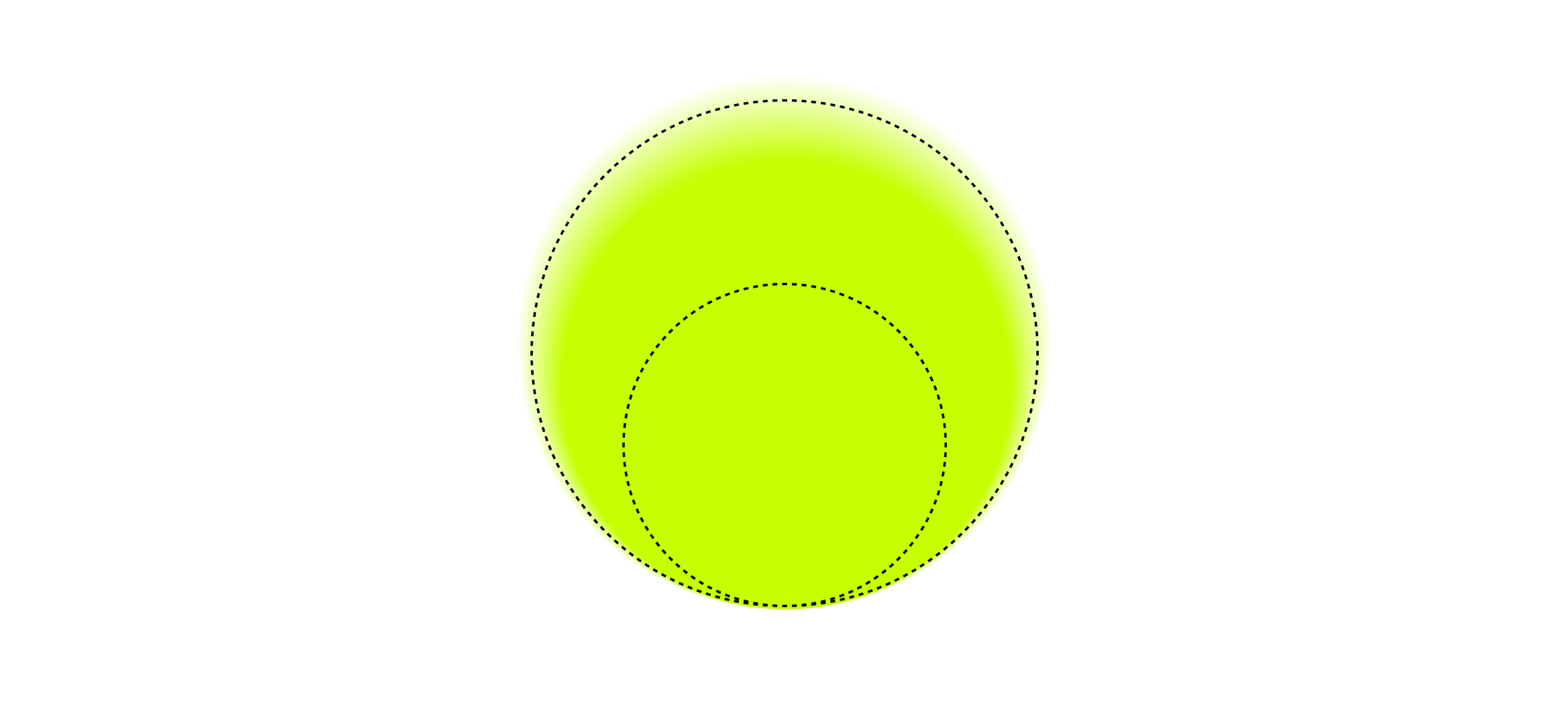
Our Immersive spotlights are the most expressive form of our spotlight system. They should be used for our most emotive
applications and communications.


Details
Below is an example of one of our Immersive spotlights and the details to follow when creating your own. The most important rule is to make sure they feel aesthetically natural like the qualities of light.
Build
Here are the steps to creating our Immersive spotlights. Follow this guidance to make sure all our spotlights are consistent.
Example
Functional spotlights
Overview
Our Functional spotlights are a practical solution for digital
and functional applications. These spotlights are built in Adobe Illustrator and can be replicated in code.


Details
Below is an example of one of our Functional spotlights. Follow these rules to make sure that our system is used consistently.
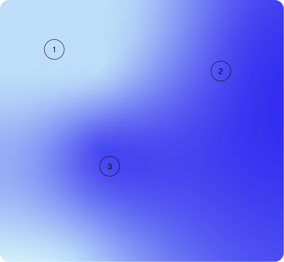
Build
Below are three examples of how we can create our spotlights in Illustrator. When using Freeform Gradients make sure the colour blends appropriately. On the far sides of the composition adds points of the chosen colours. Radial gradients should only be used within iconography.
Example

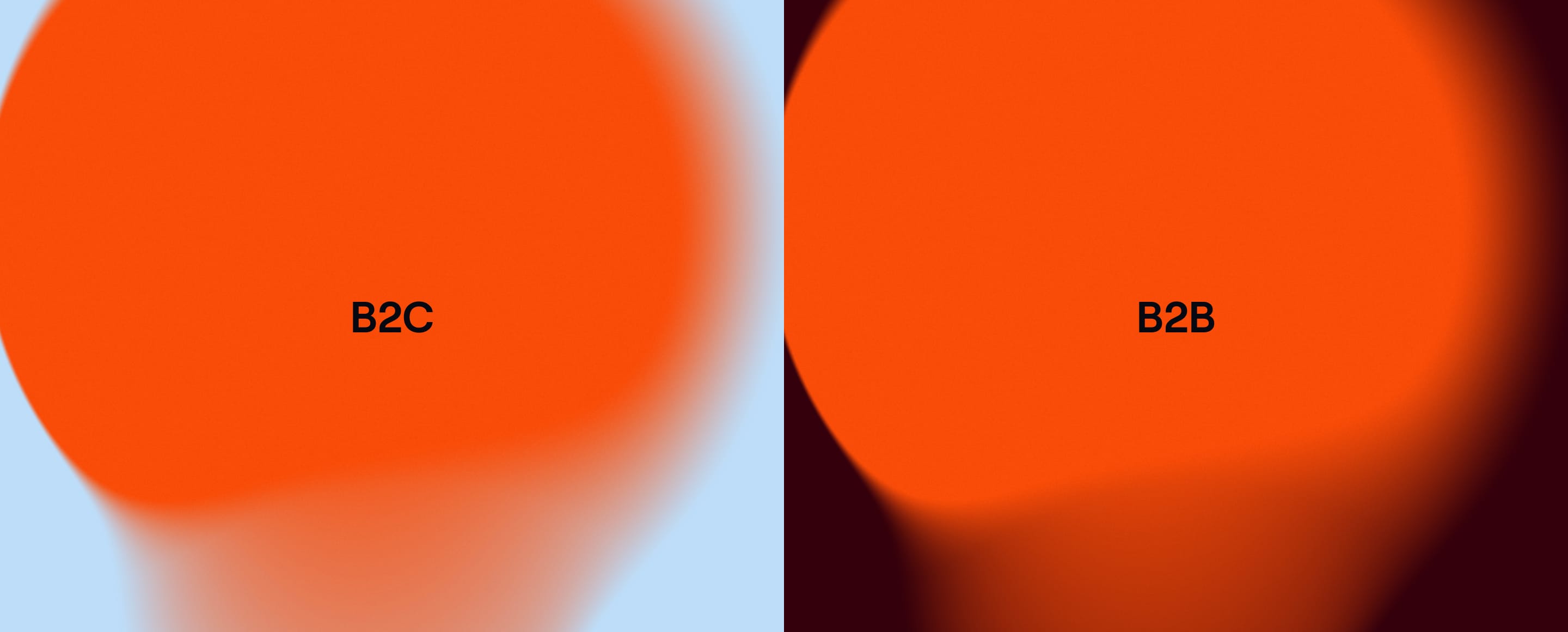
B2C & B2B
Colour usage
For B2C applications we should use our Pastel and Punch colour combinations. For B2B uses we should lead with our Earth pairings.
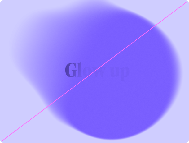
Type & spotlights
Type & spotlights
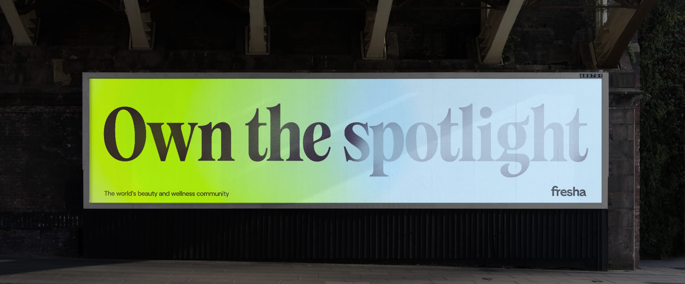
When using typography with our spotlights we can immerse the type within the lights. This treatment does not need to be used all the time. Always ensure the copy is legible.


Motion
Principles
Both our Expressive and Functional spotlights can be used in motion. The animation must feel natural and elegant. The interaction of light should use the same blending principles as our
Expressive Spotlights.
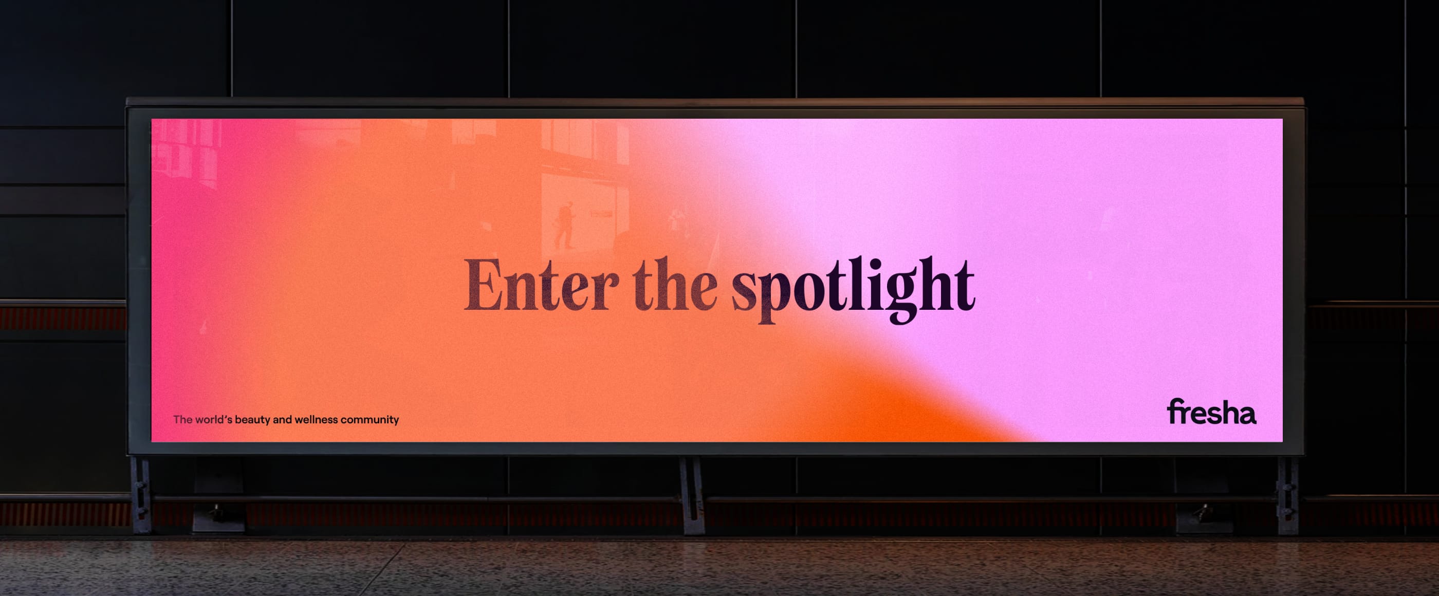
Image & Spotlights
Image & spotlights
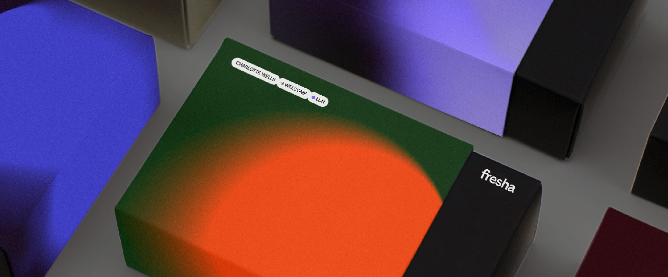
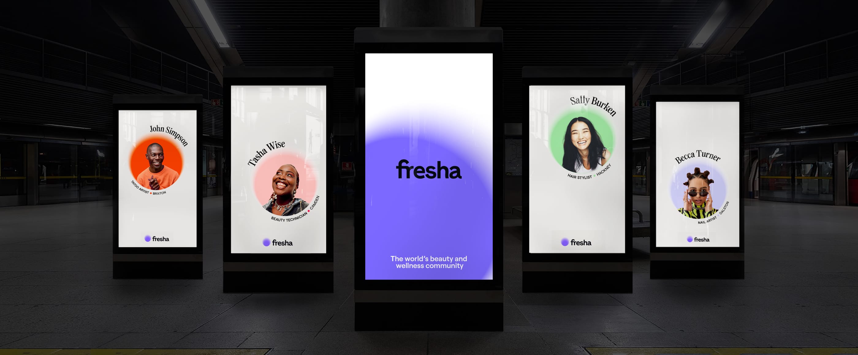
We can also use our Single spotlights as a frame to hold our art direction. These can be created using our Expressive and Functional methodology.

Things to avoid
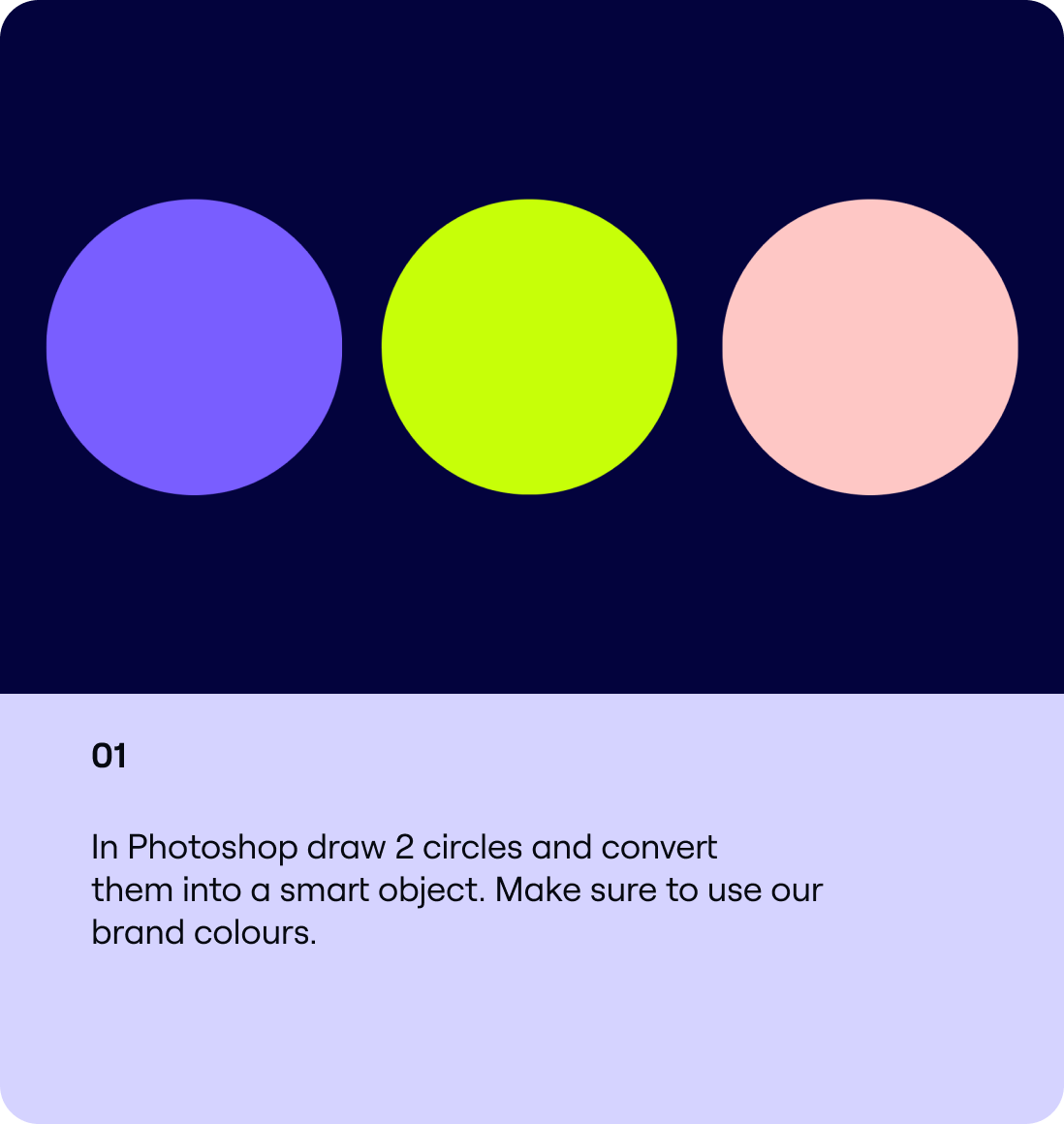
01
Spotlights should never be shown in greyscale.
02

Only use combinations detailed in the colour section.
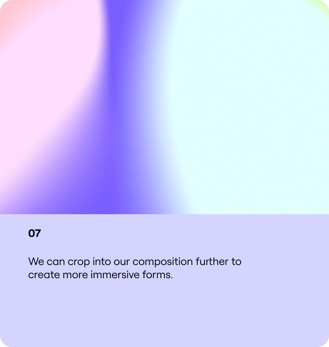
03

Make sure that our Spotlights aren’t cropped into too much.
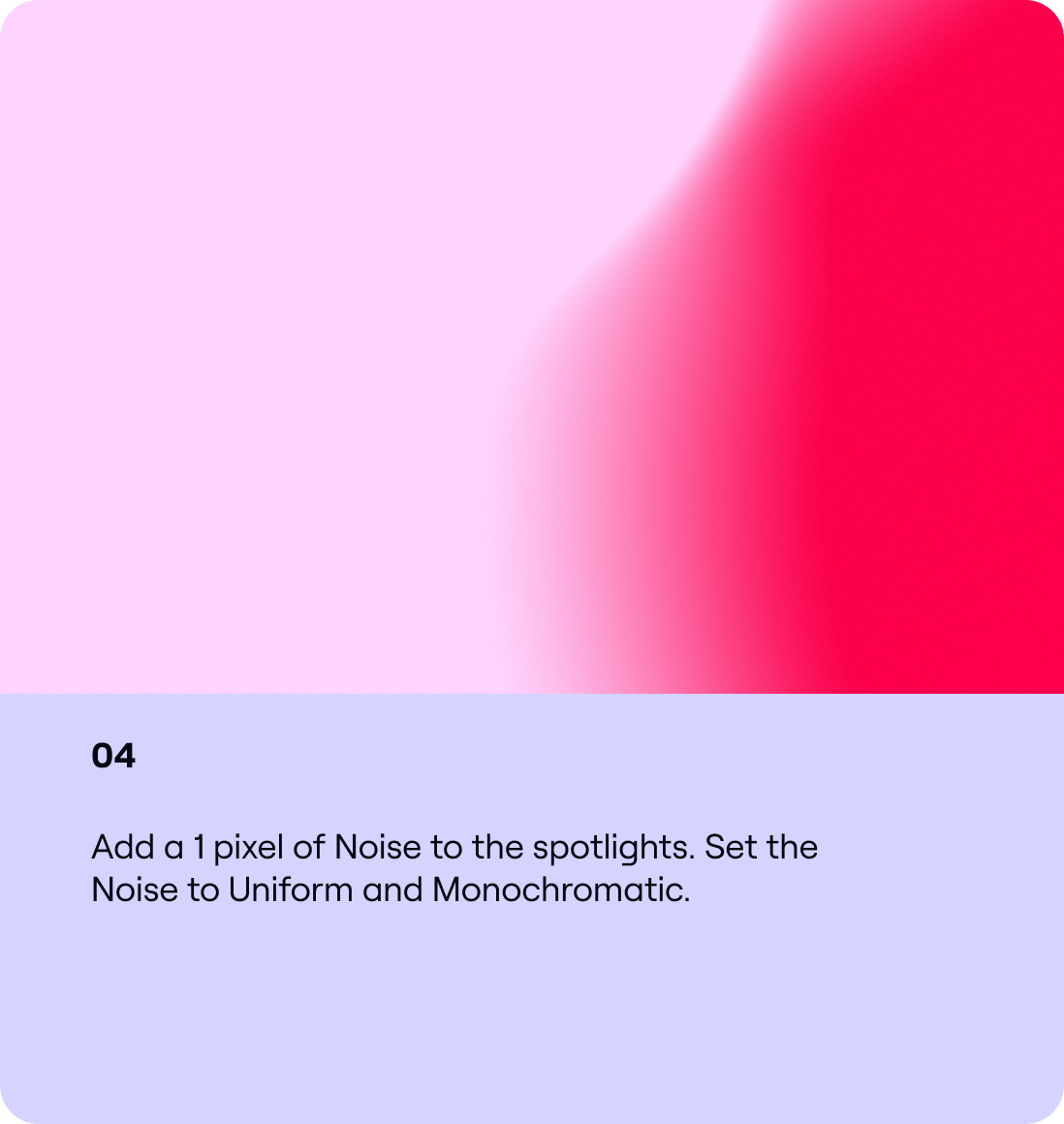
04
Make sure copy is legible when using typography and our Spotlights.
Inspiration