Logo
Introduction
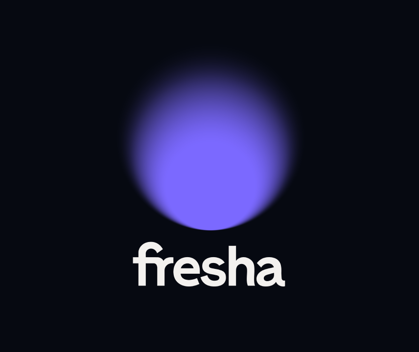
Our logo is the beacon of our brand. Inspired by the very nature of a shining spotlight, it is emotional, tactile, and unique as a symbol.
Logo suite
Logo suite
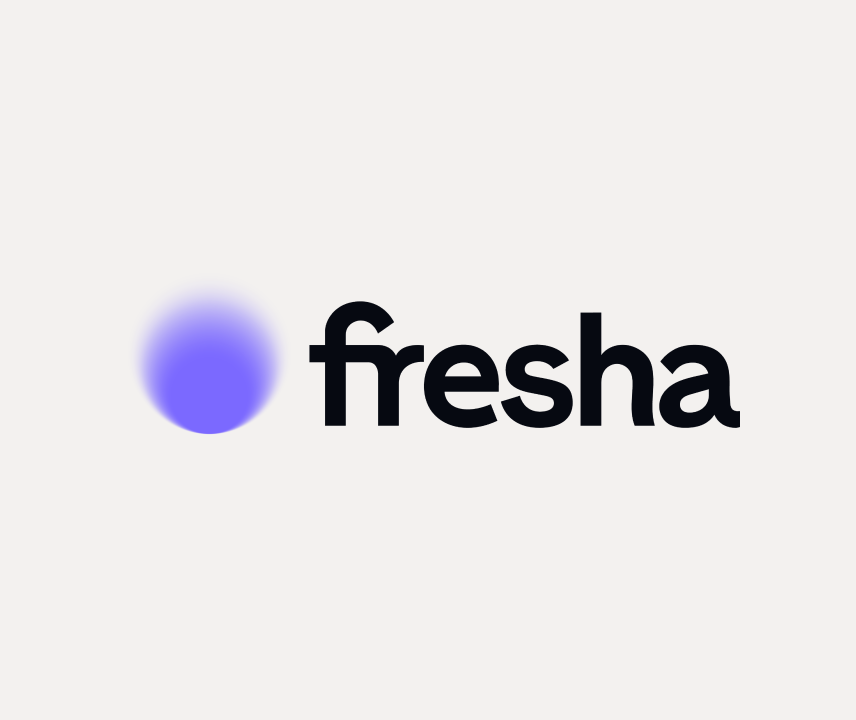
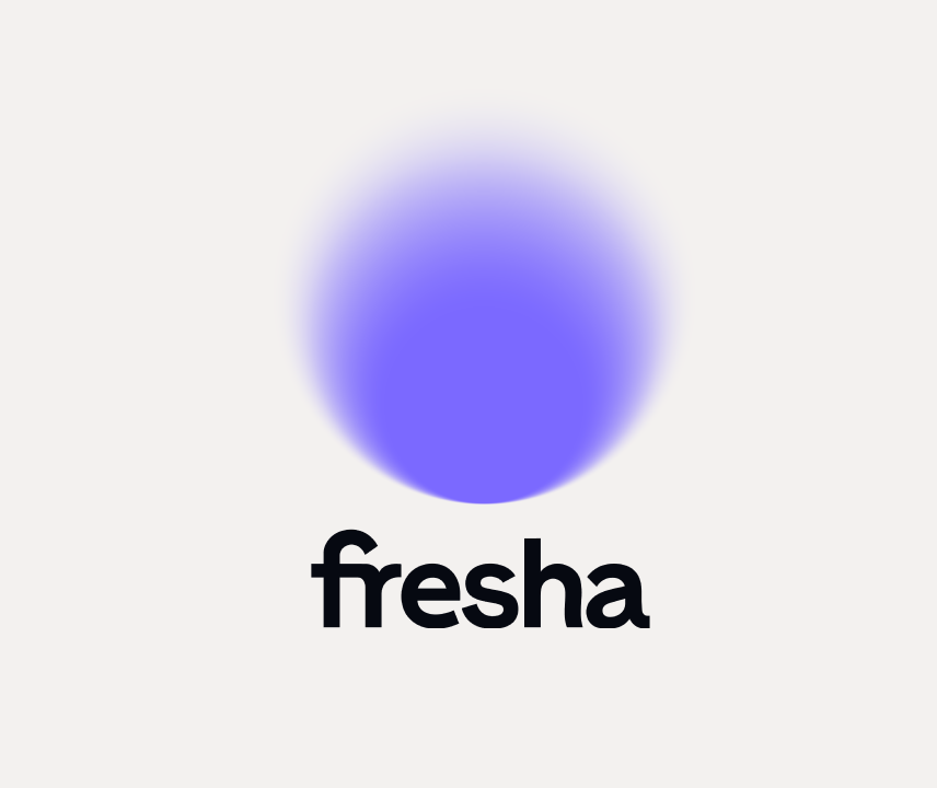
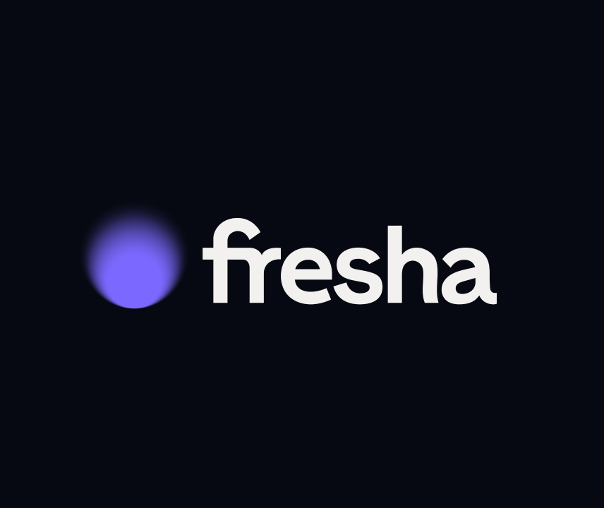
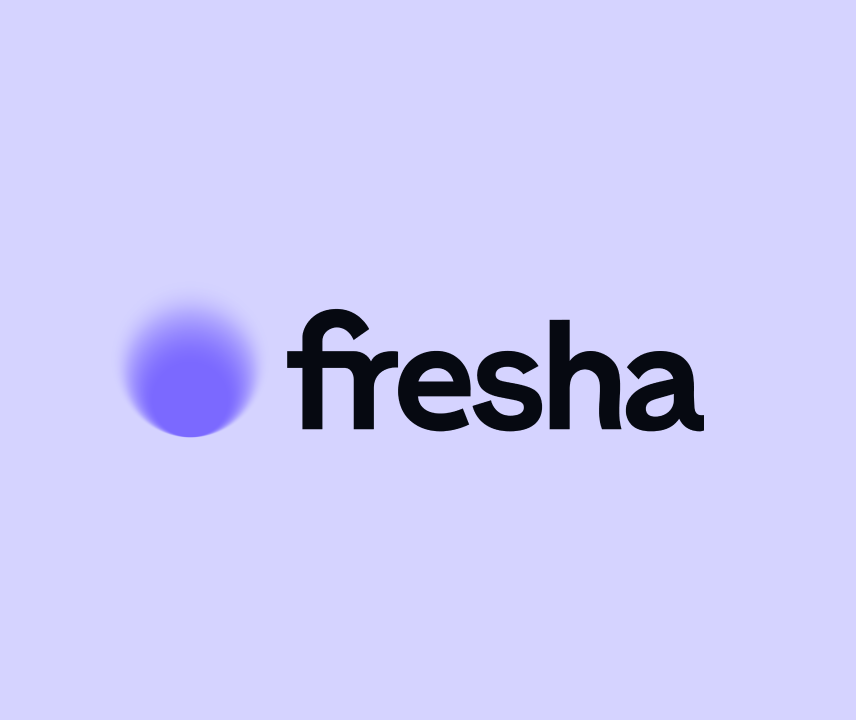
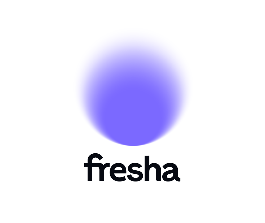
Our logo suite consists of our emotional symbol, a powerful wordmark, and then our two lockups, horizontal and vertical
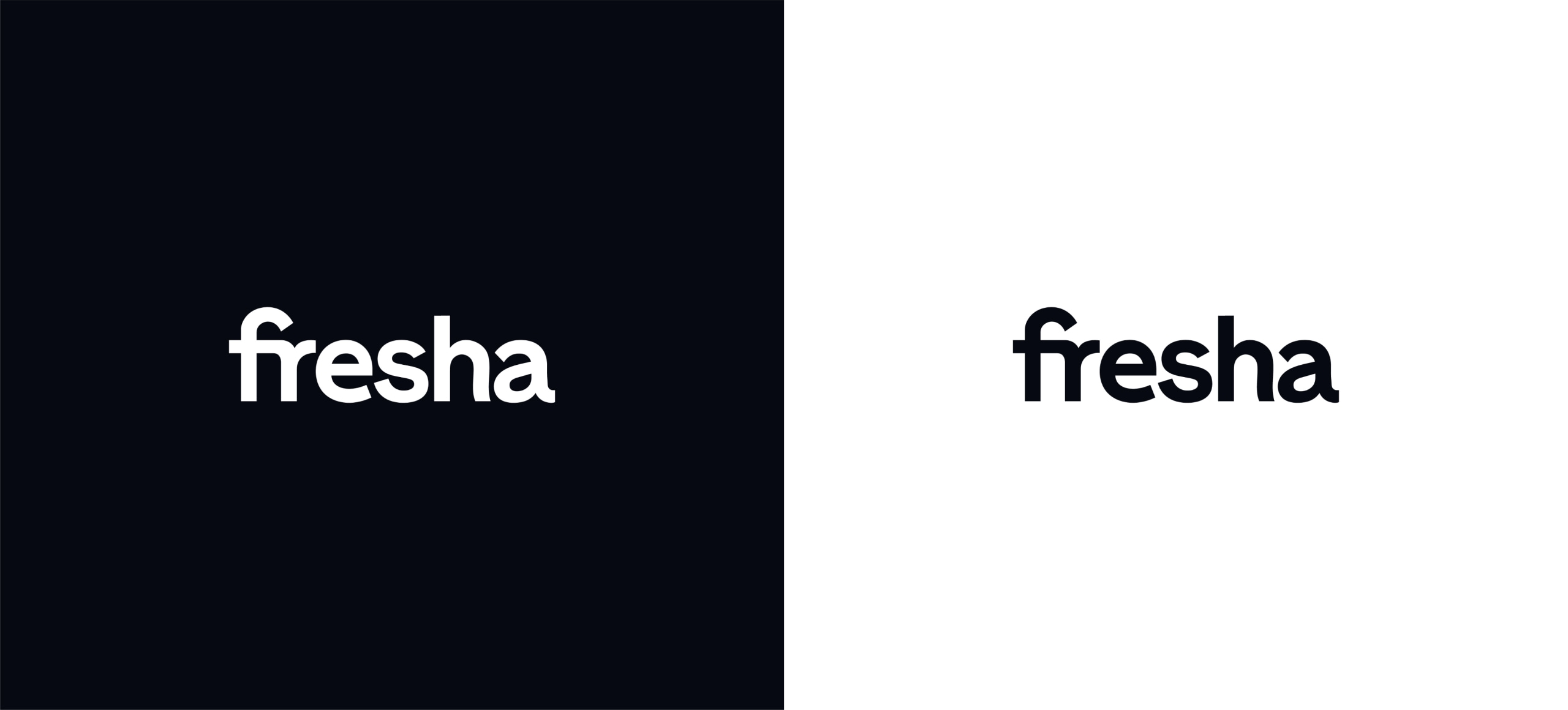
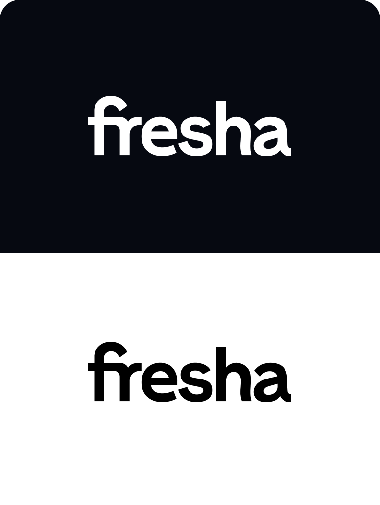
Colour usage
Colour usage
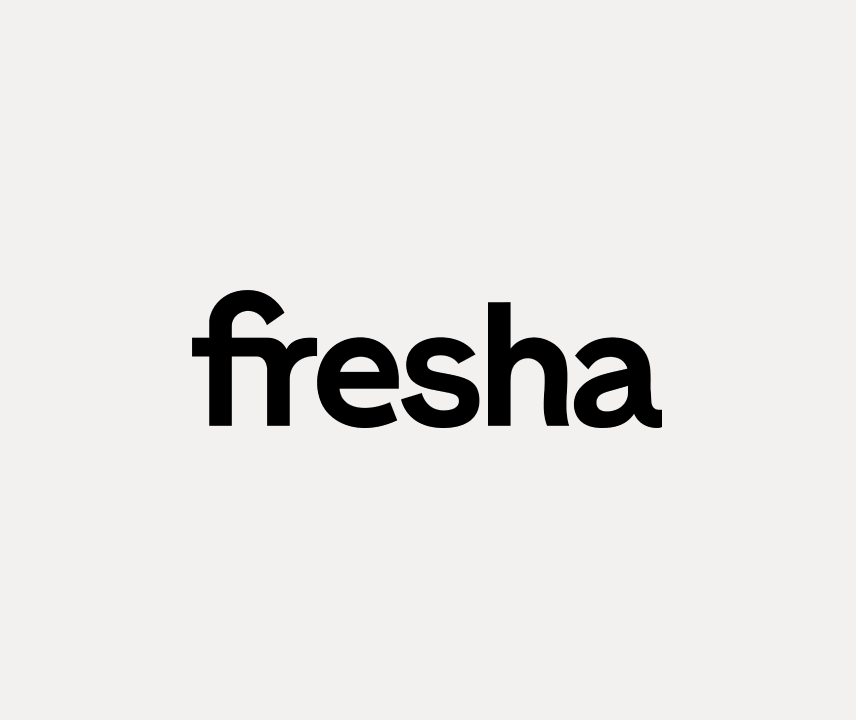
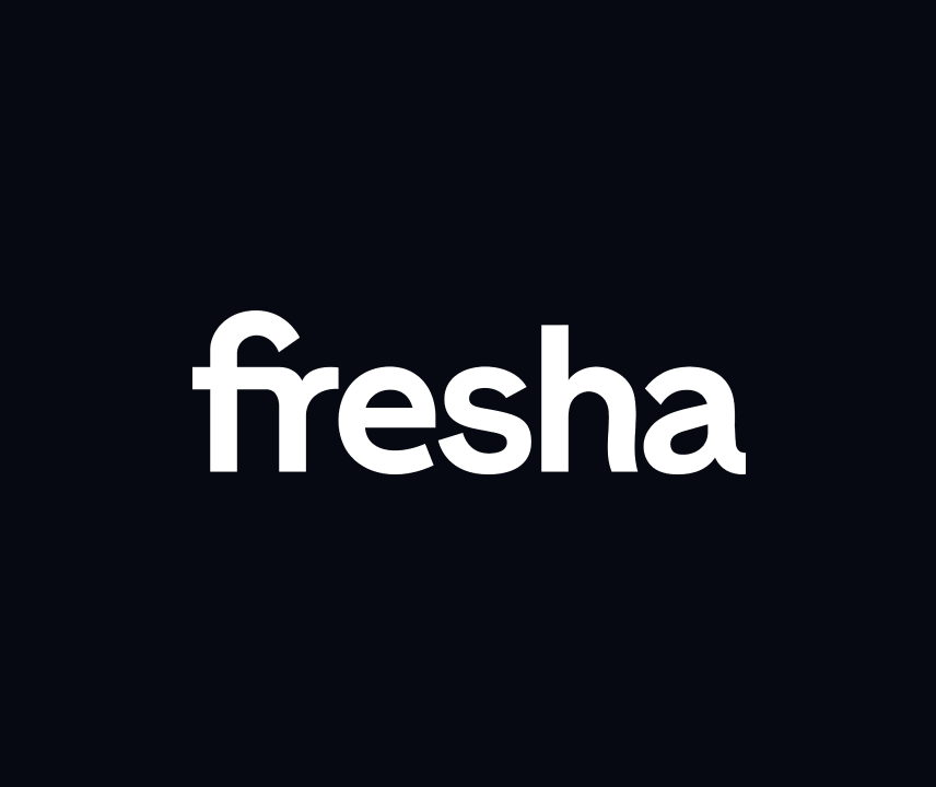
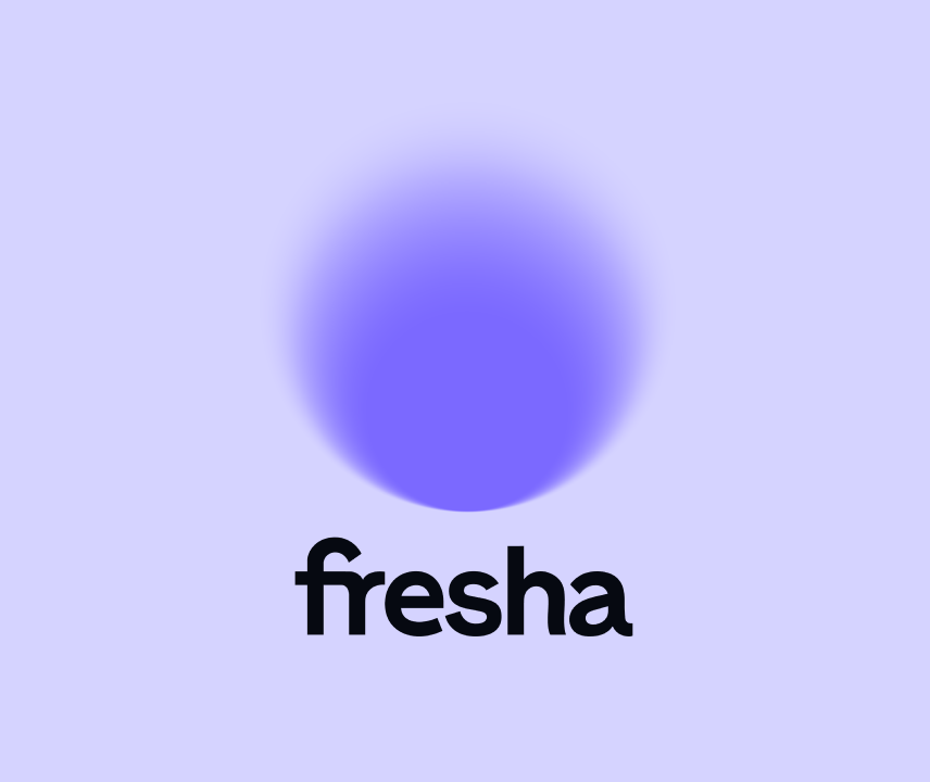
Our symbol is purple in almost all instances, with white being a backup. And our wordmark is only ever seen in our black or white.


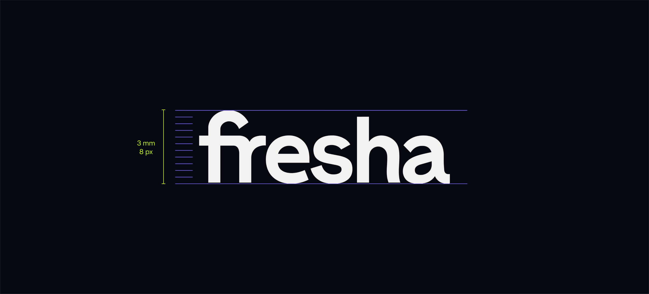
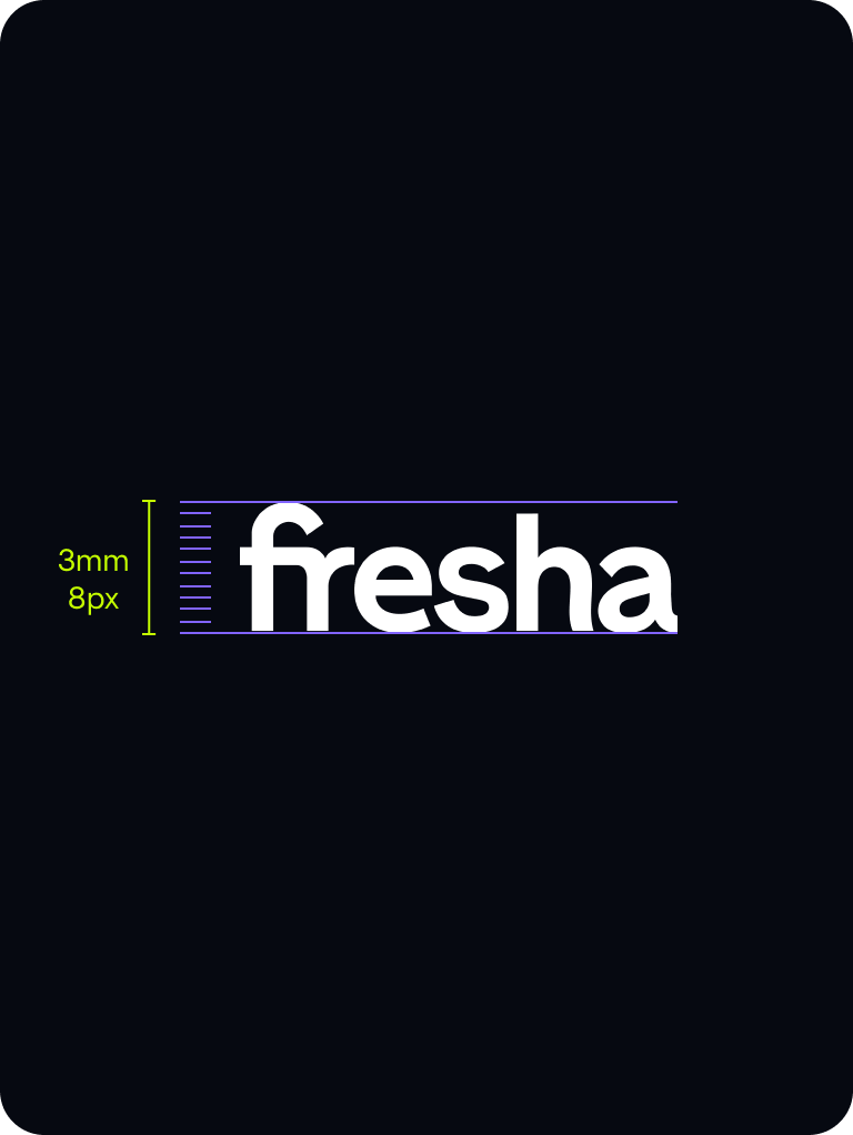
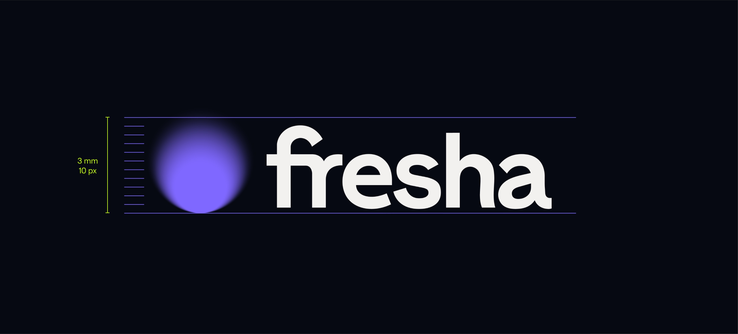
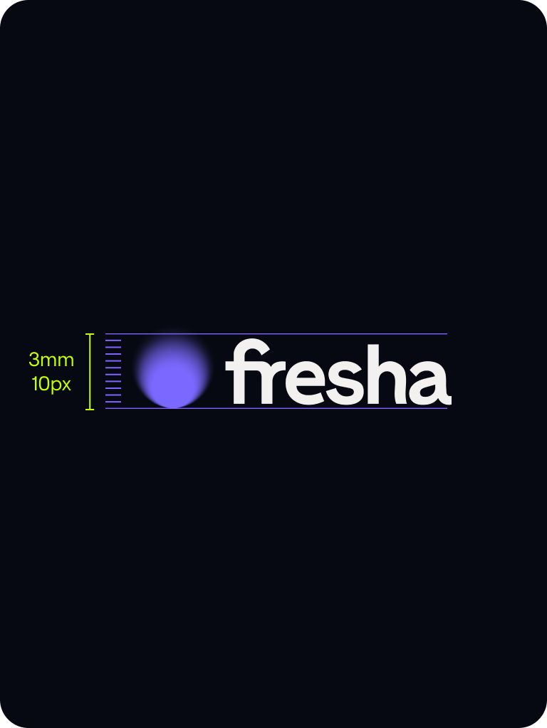
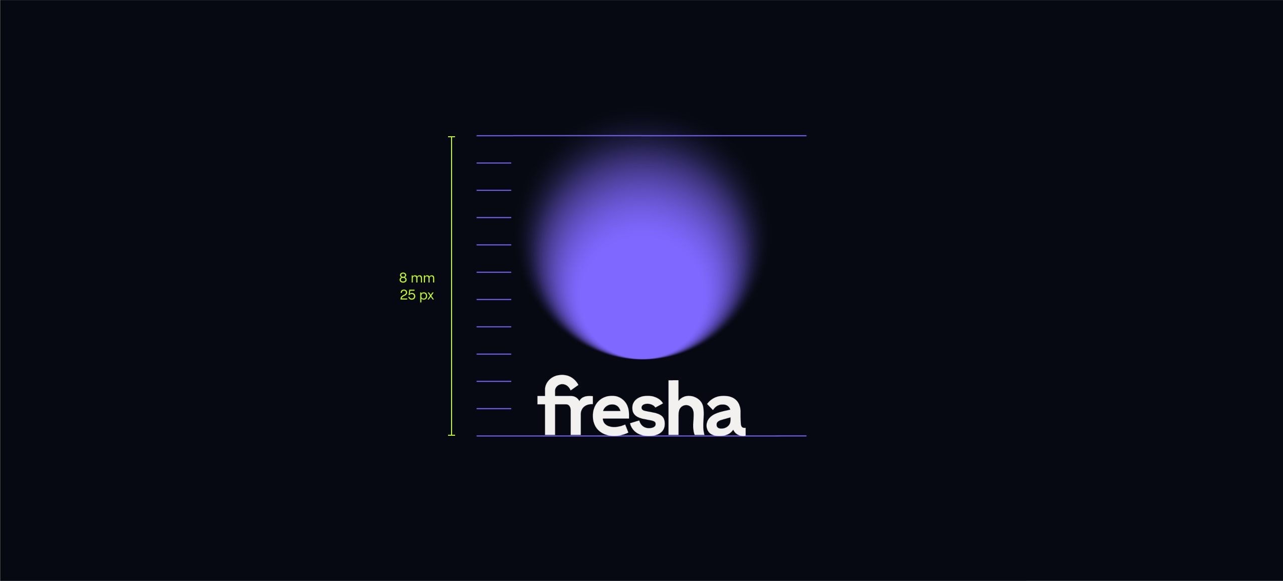
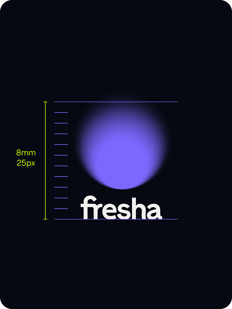
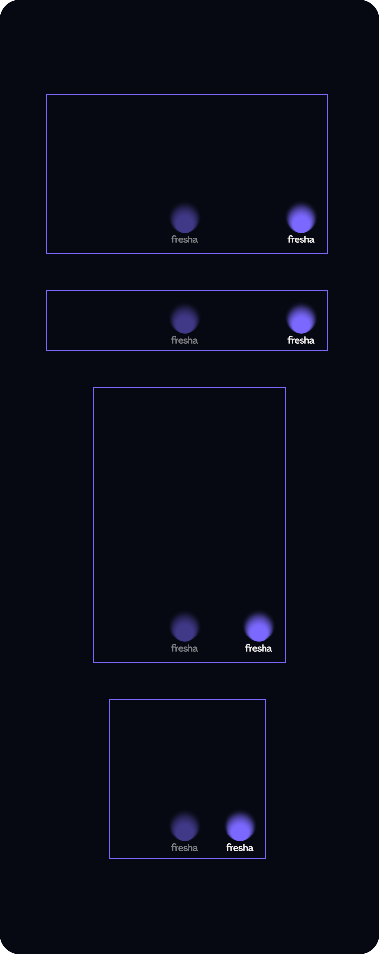
Sizing
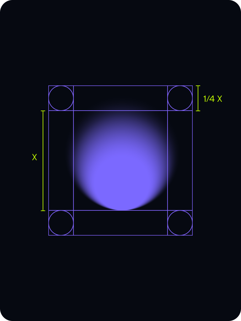
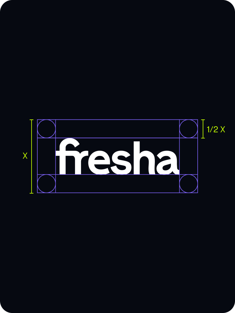
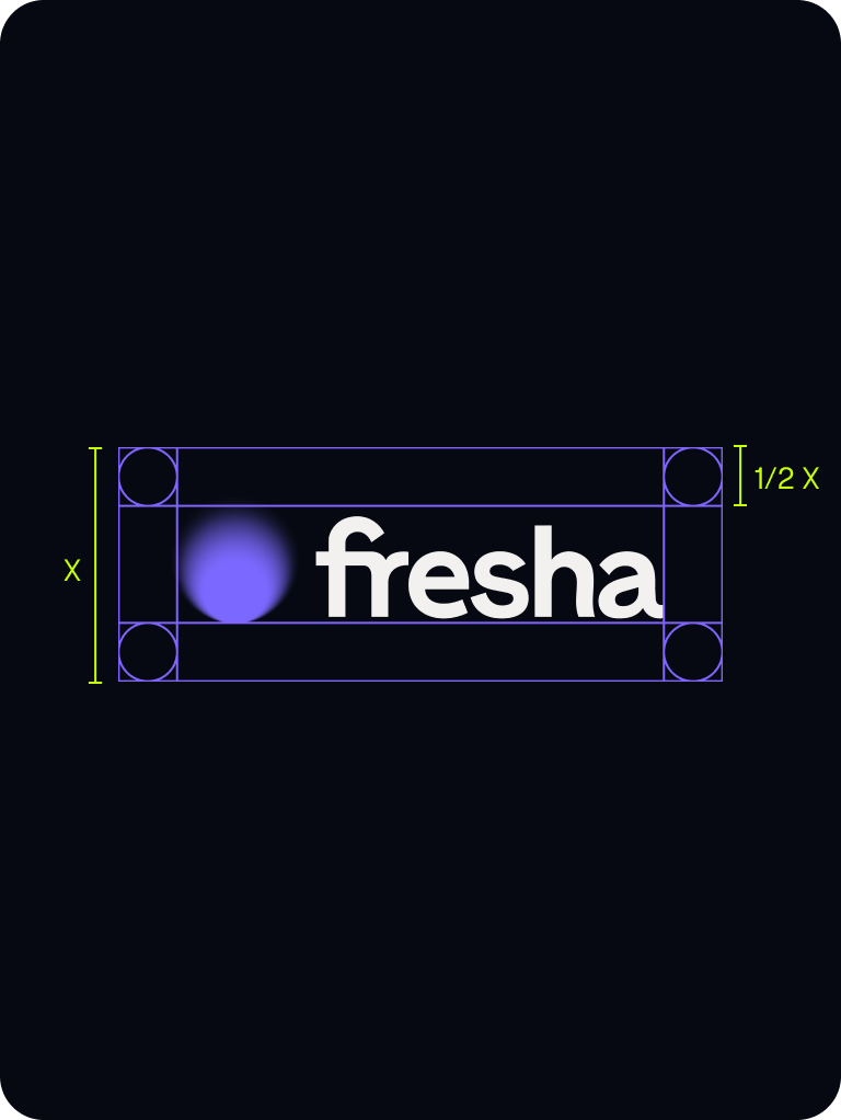
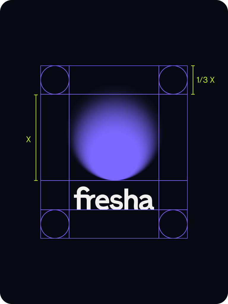
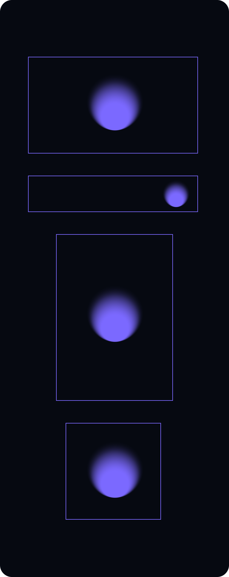
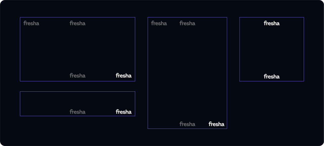
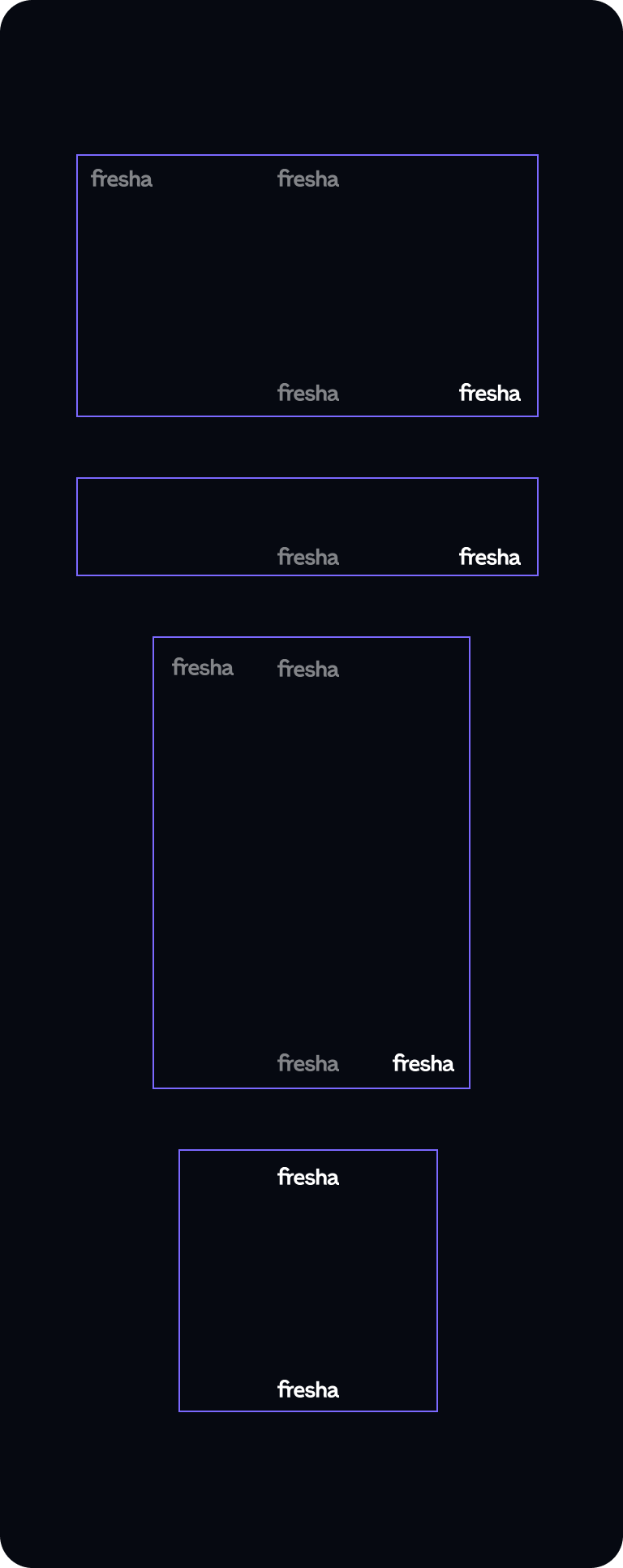
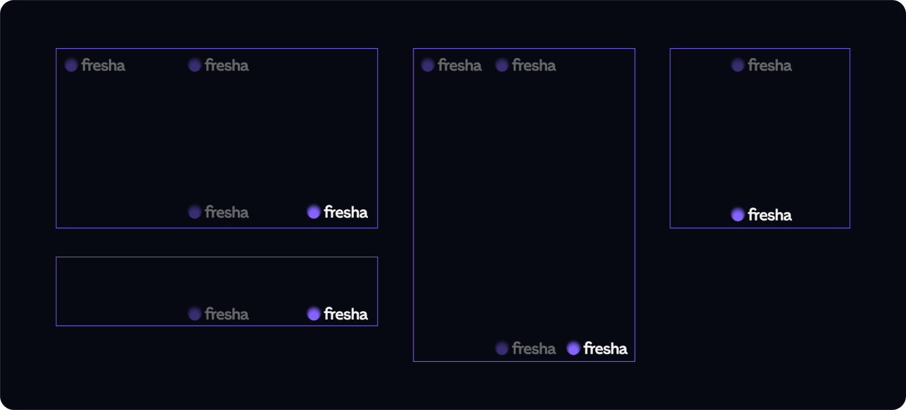
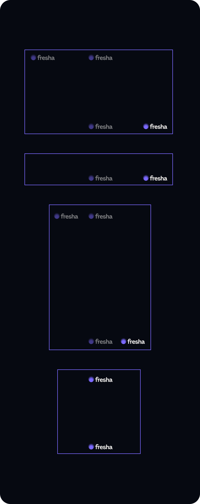
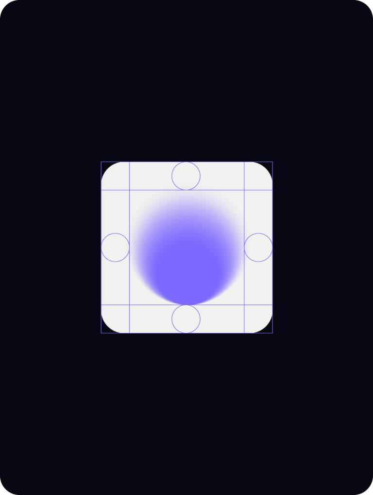
Logo margins
We always give room for our logo variants to breathe, below is guidance for clear space for all our lock-ups.
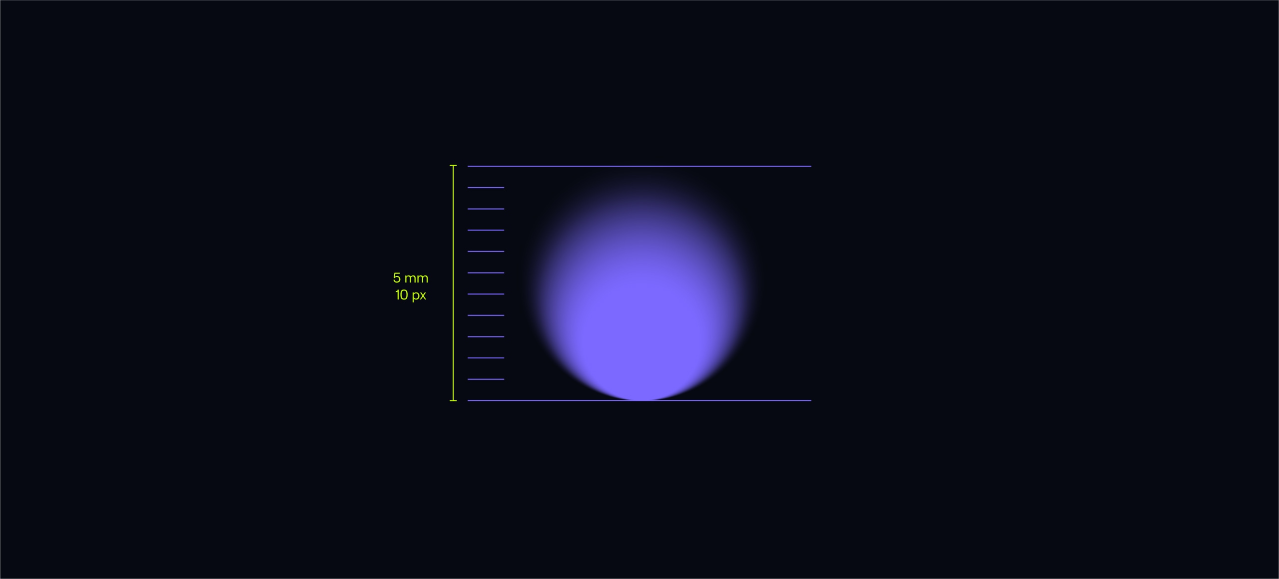
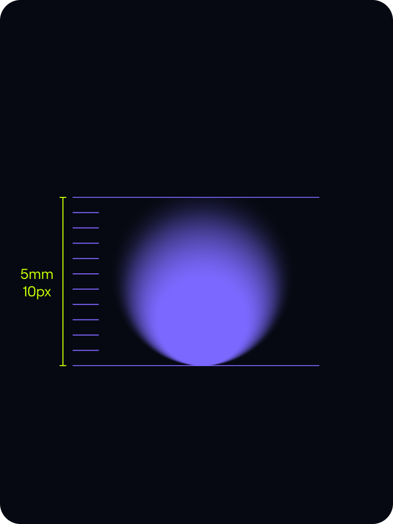
Minimum size
Both our symbol and wordmark maintain their legibility and distinctiveness at very small sizes.
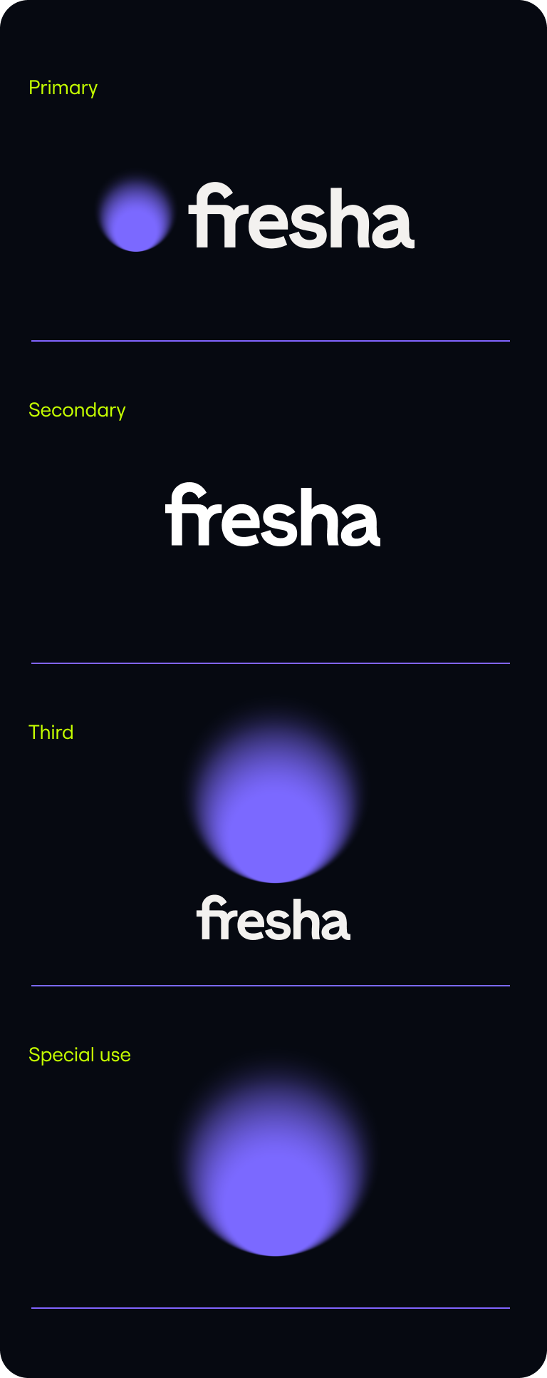
Hierarchy
Logo hierarchy
We use our horizontal lockup in most instances, with the wordmark and vertical being backups, and the symbol on its own in special instances
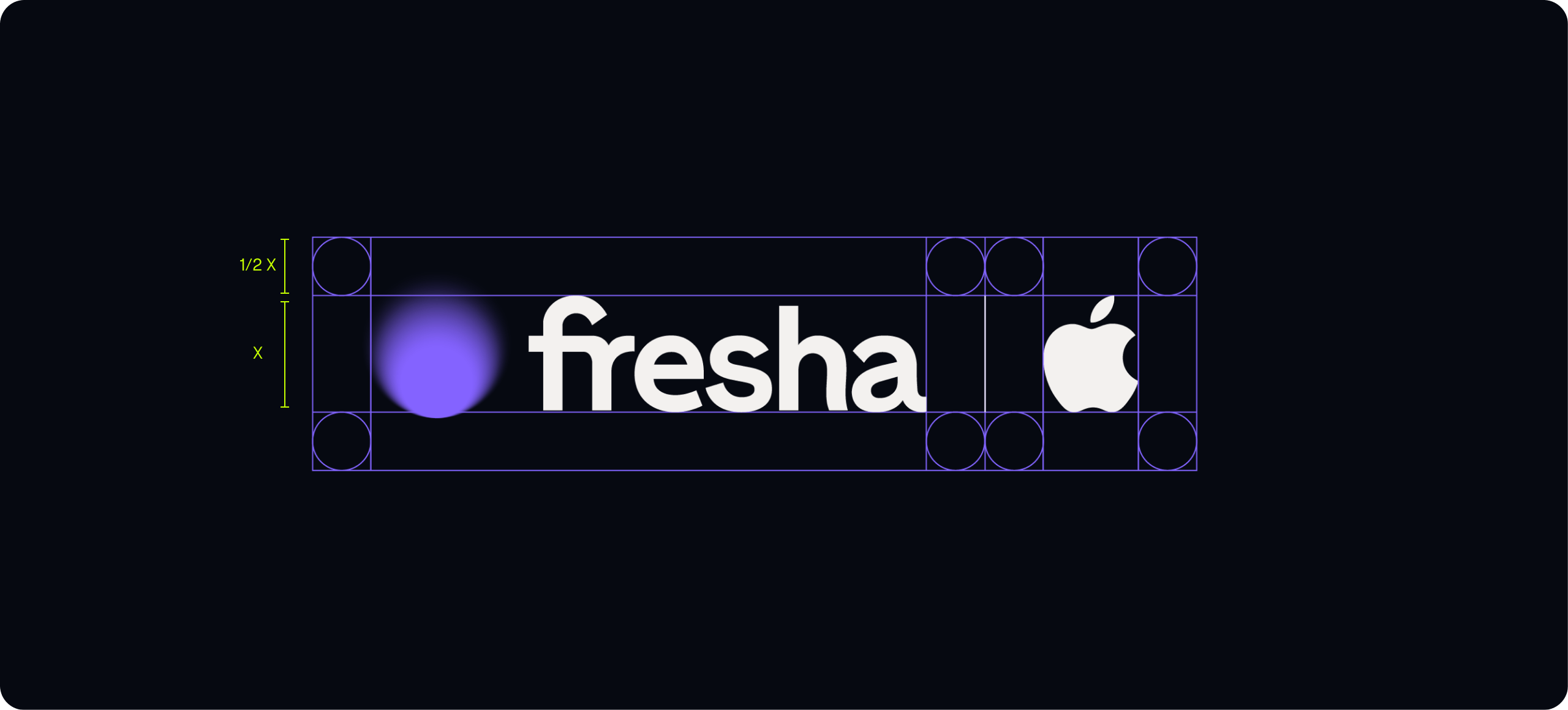
Placement & partnerships
Logo placement
All logo variants should either be placed centrally, as heroically as we can make them, or in the bottom right as a sign off.


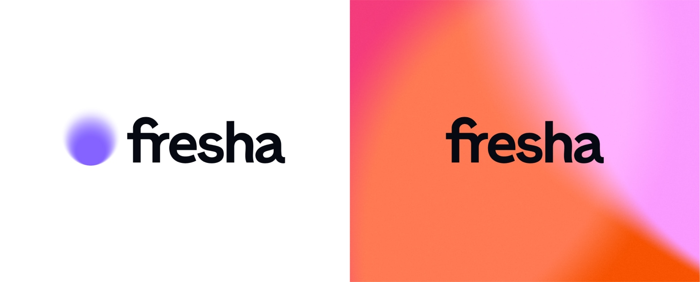
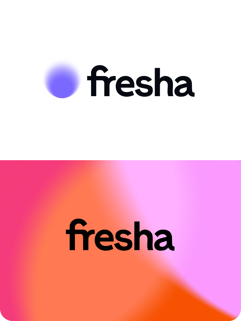
Legibility
Use on backgrounds
Use any of our lock-ups with the Symbol on solid colour. When the background is a Spotlight, make sure to use our Wordmark.
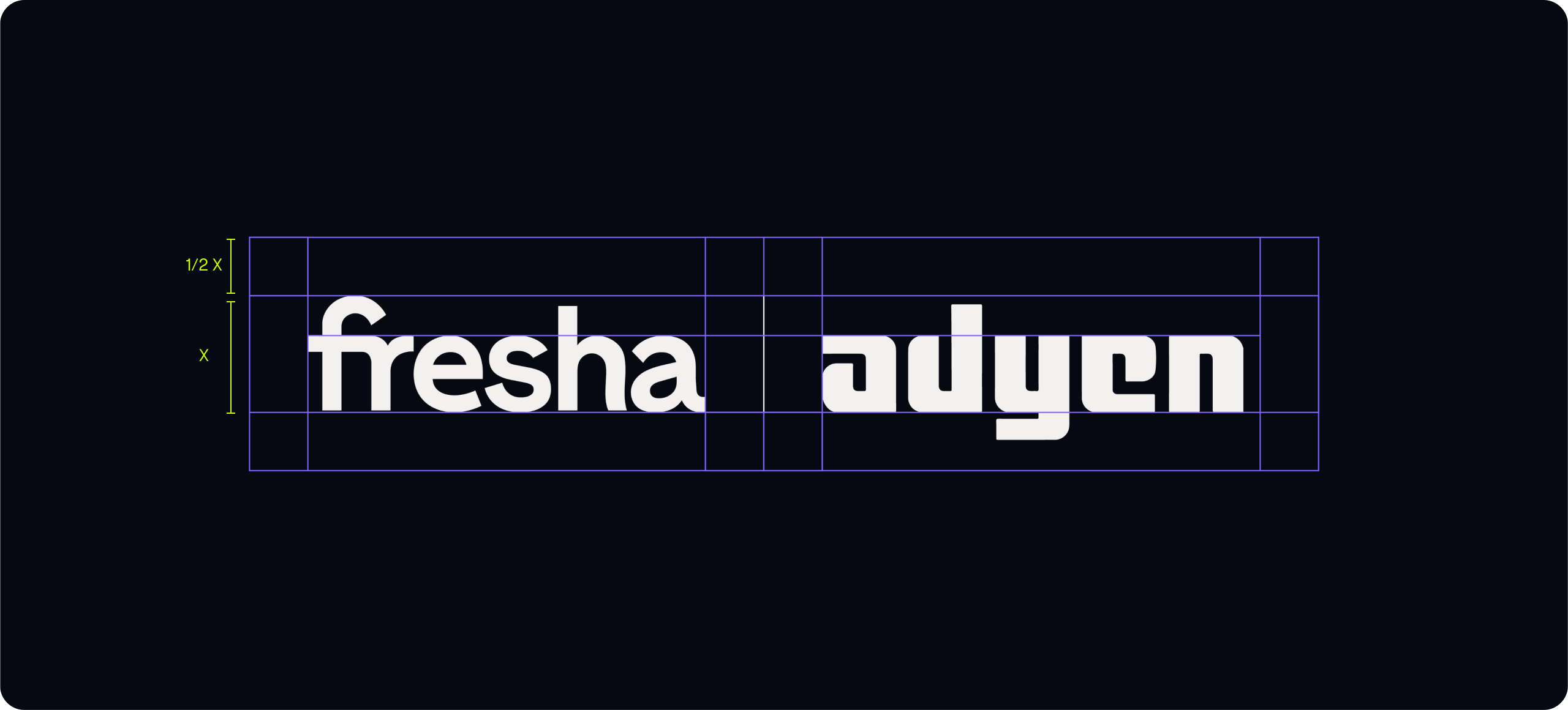
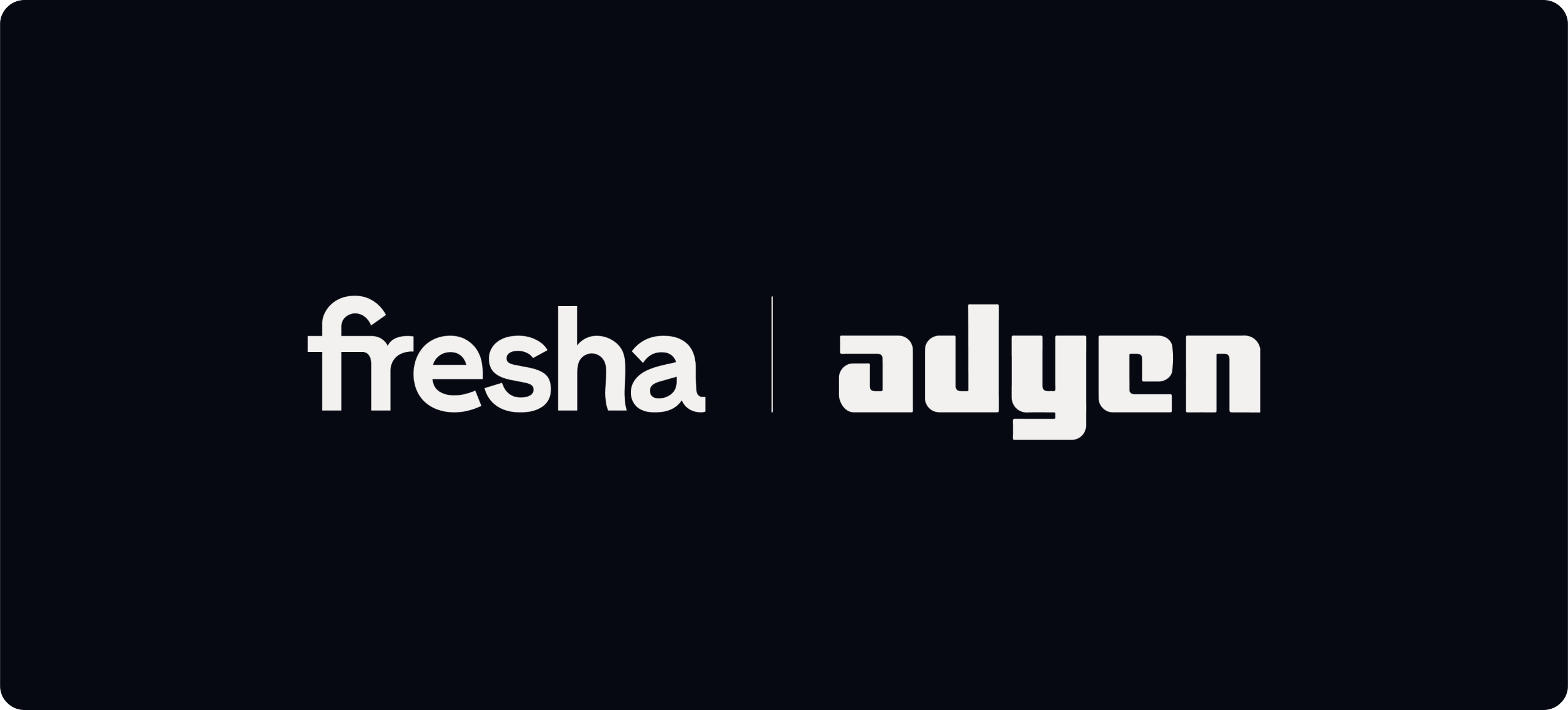
Partnerships
We use the same margin rule as our own logos for spacing of partnership logos, and make sure the sizing of their logo is the same as the Fresha logo.

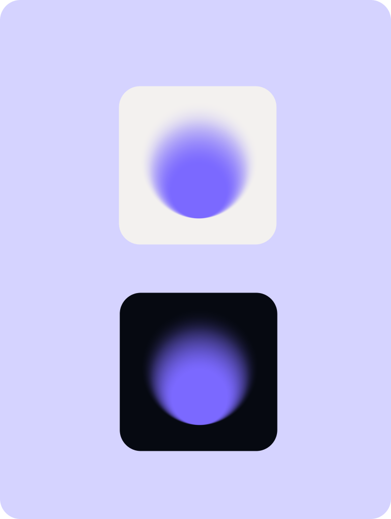
App icons
App icon
We use the same margin rule for our app icons too. Changing the background for the app icon allows flexibility for B2C and B2B.
Favicon/social
For our social icons and website favicon we use a crop of our symbol to still give the same impact and clarity.

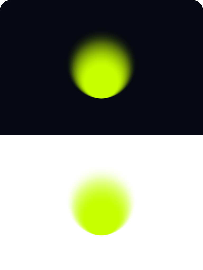
Limelight lockups
How to use
We can also use our symbol in Limelight. This is the secondary colour way, and wouldn’t be used as much as our primary colour, simply down to clarity. We can use it internal applications such as a Welcome Pack when people are aware of the brand, or when we want to be more expressive externally.

Monochrome usage
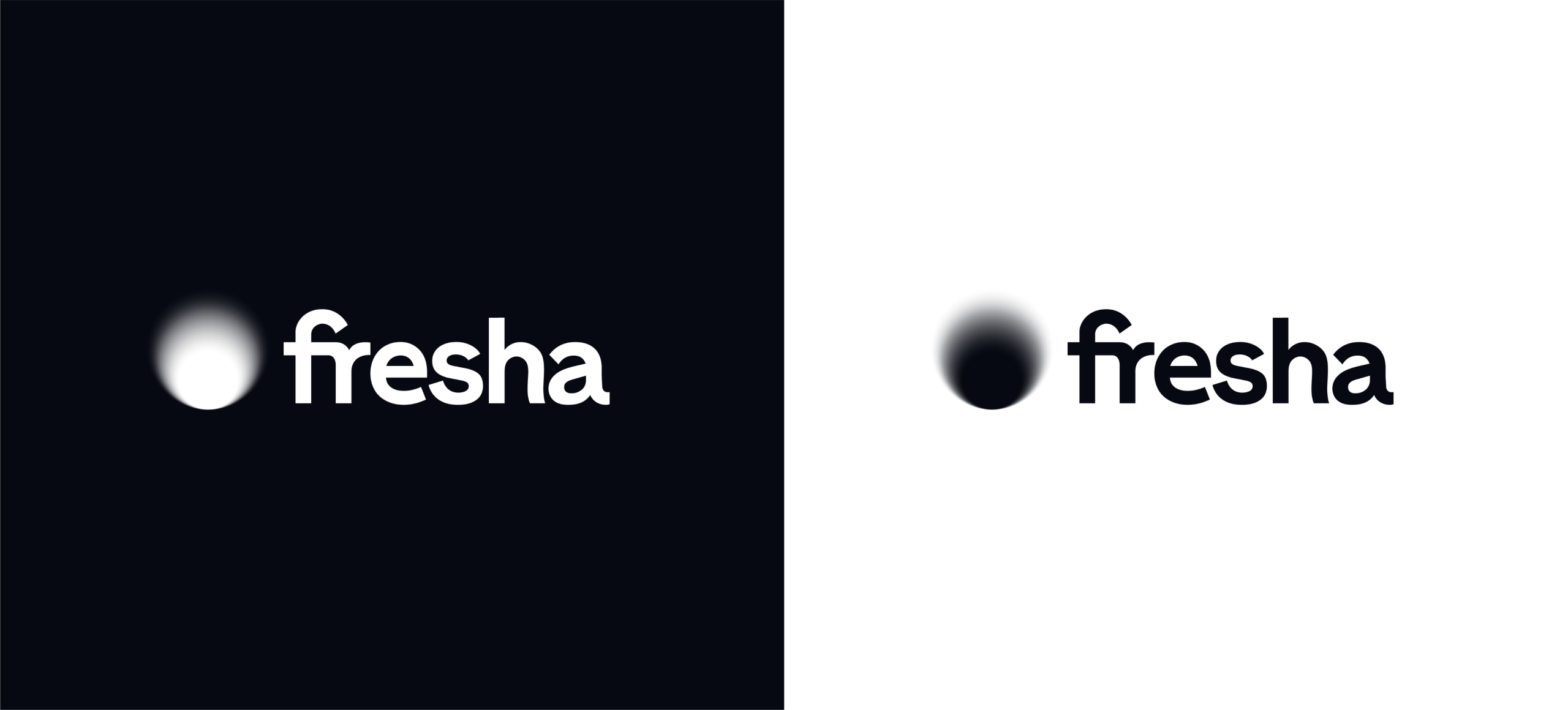
Monochrome usage
For extreme usages where colour isn’t an option, we have created monochrome versions of all the logos. These should be used as a last resort.

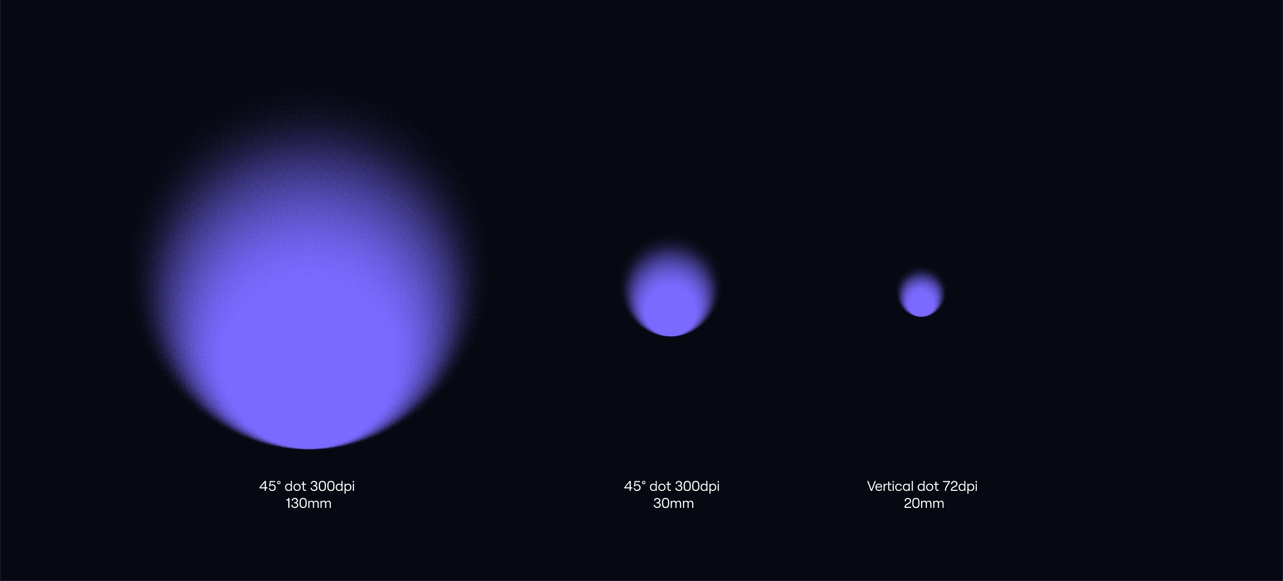
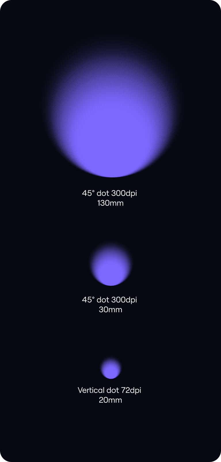
Production
Production usage
When producing printed merch, such as hoodies, we use a bitmap version of our symbol. This version enables us to screenprint with high fidelity.
Things to avoid
01
Do not distort our Symbol.
02
Do not rotate our Symbol.
03
Do not outline our Wordmark.
04
Do not use inappropriate colours.