Iconography

Introduction
Our icon styles are distinct and ownable, incorporating the visual language of our logo and typographic system. They ensure that the brand is represented even in the smallest and most functional parts of the experience.
Icon styles
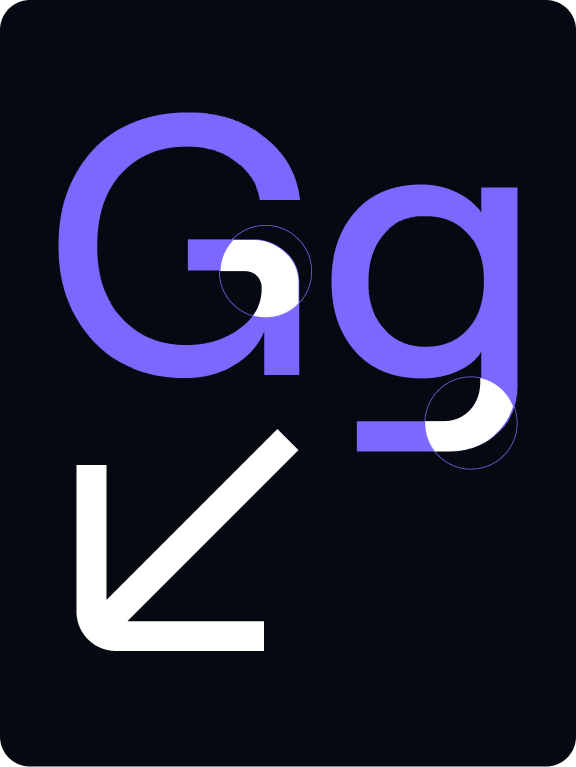
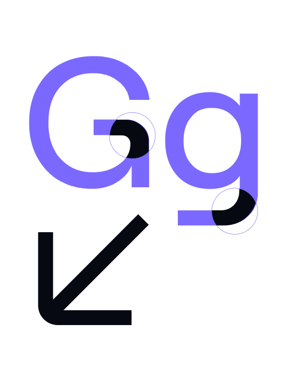
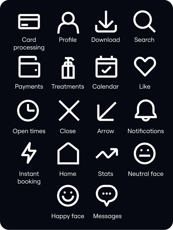
We use two different types of icons: Functional and Expressive. Each style is constructed using geometric forms inspired by our typography .
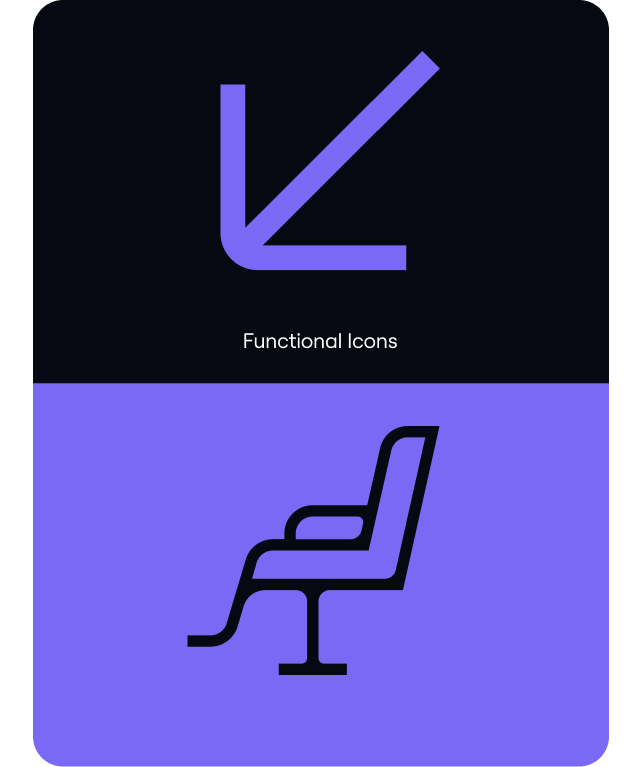
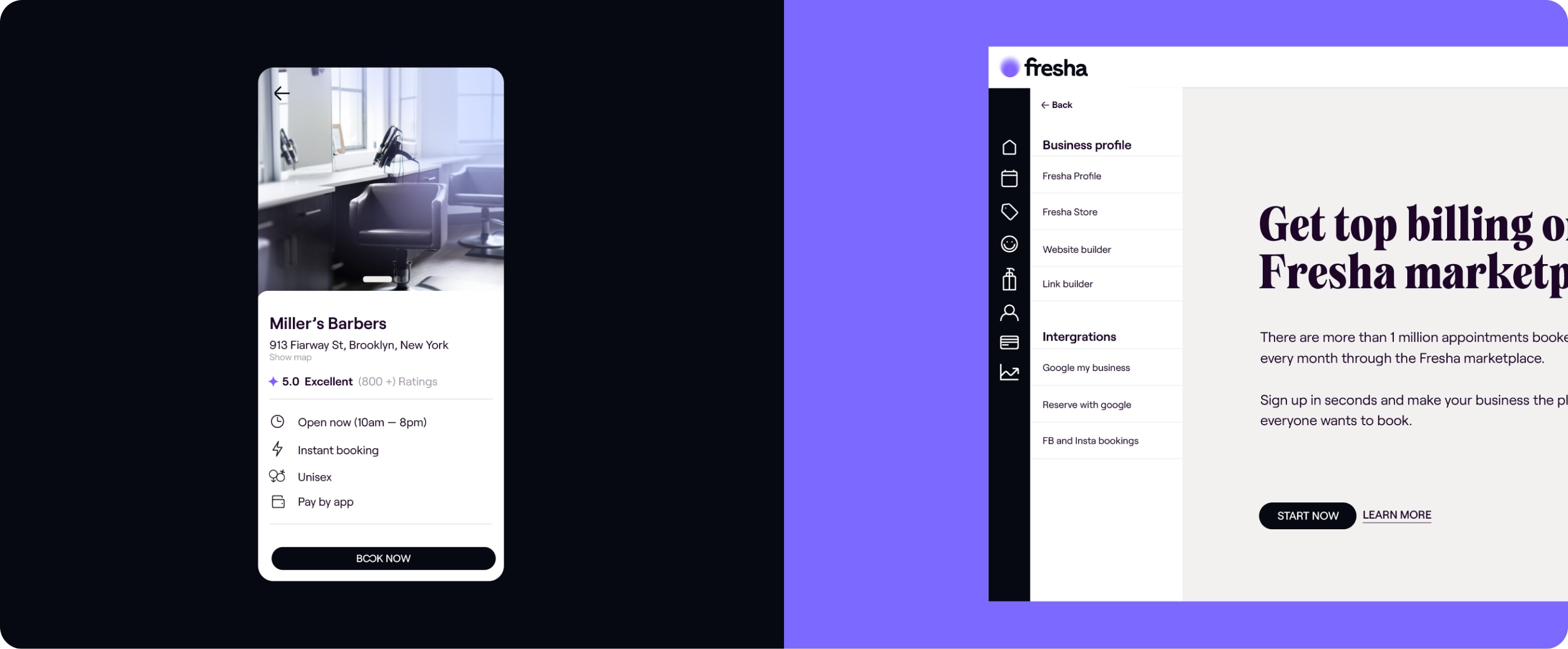
Functional icons
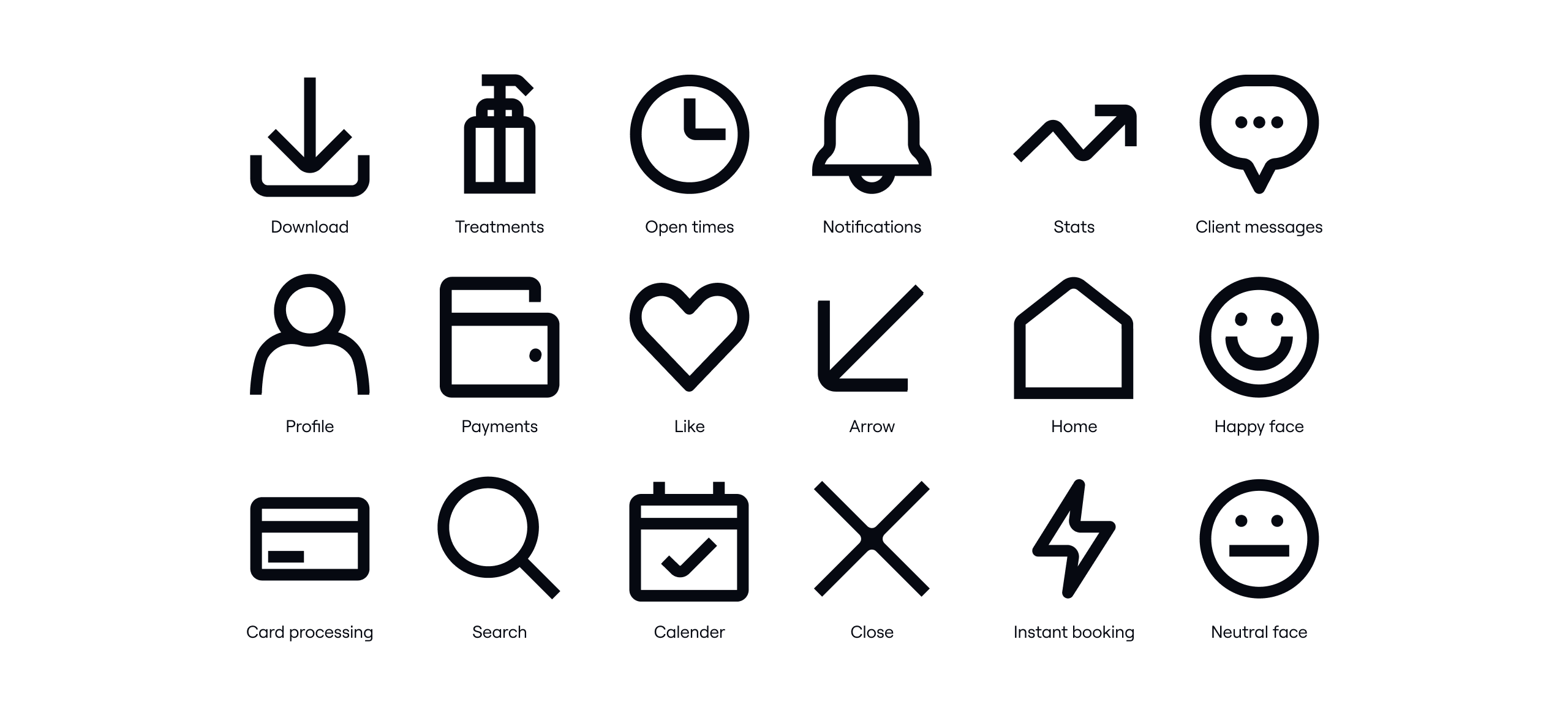
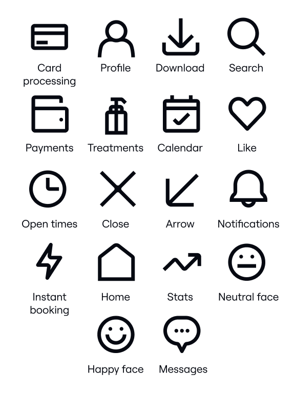
Overview
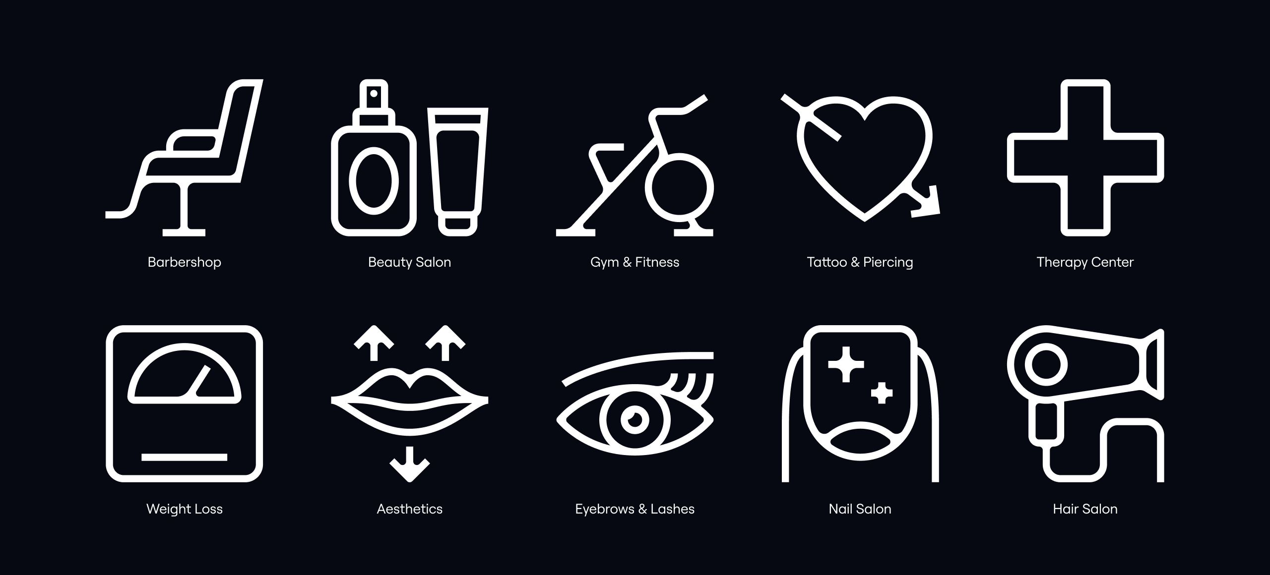
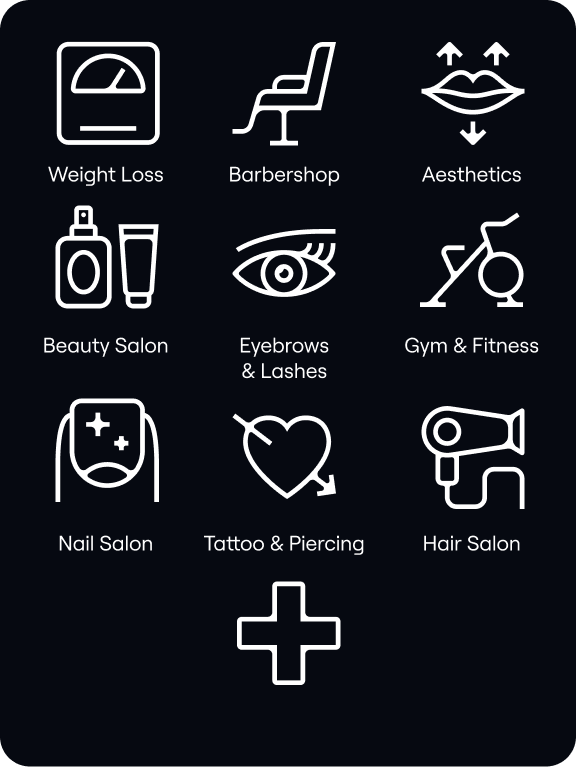
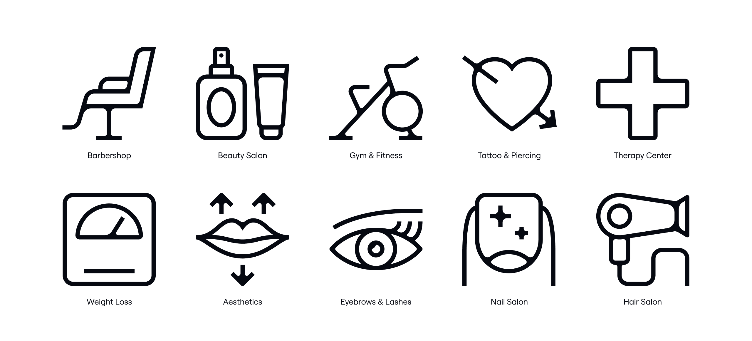
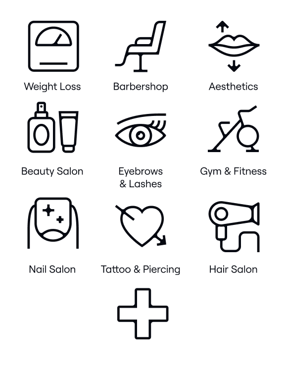
Our functional iconography is inspired by the simple yet ownable features of our secondary typeface Roobert.
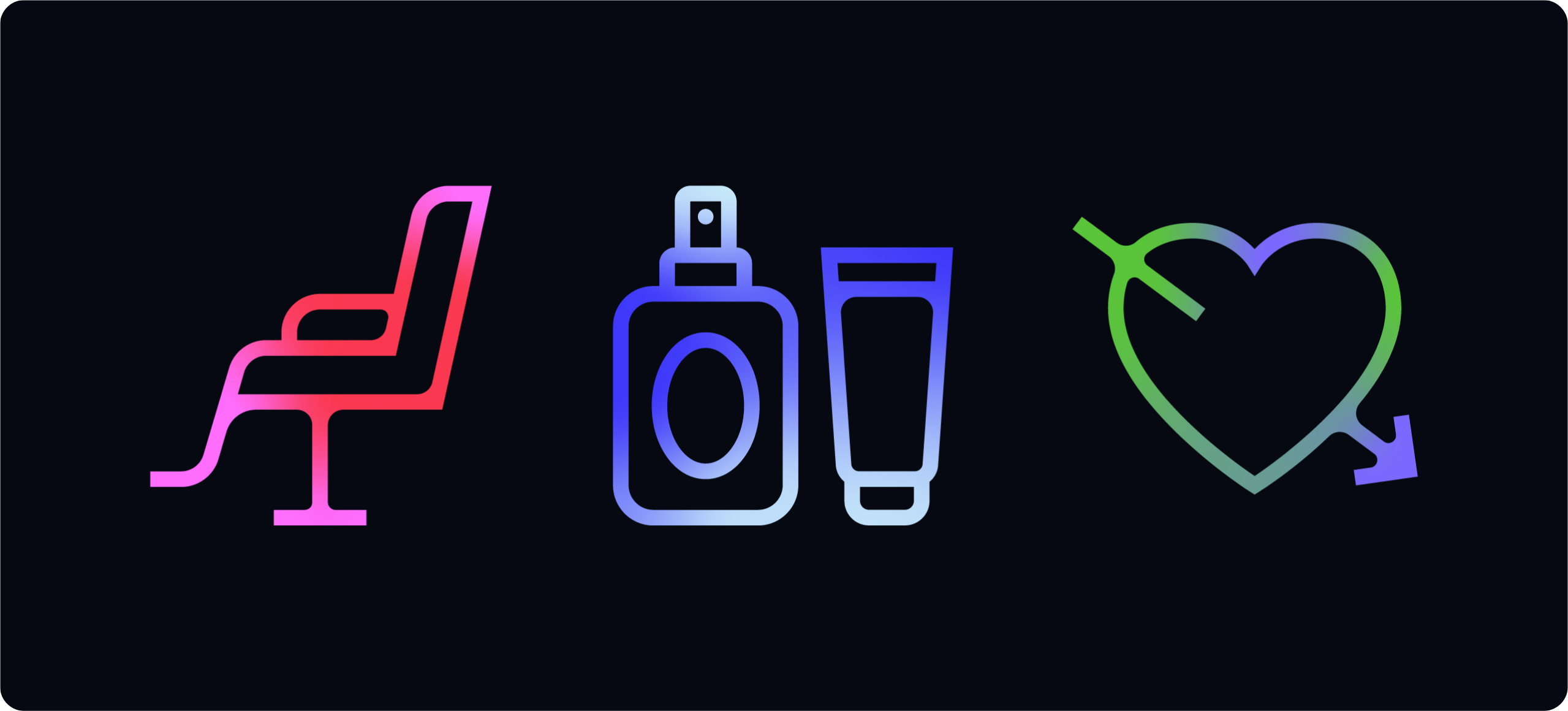
Creating functional icons
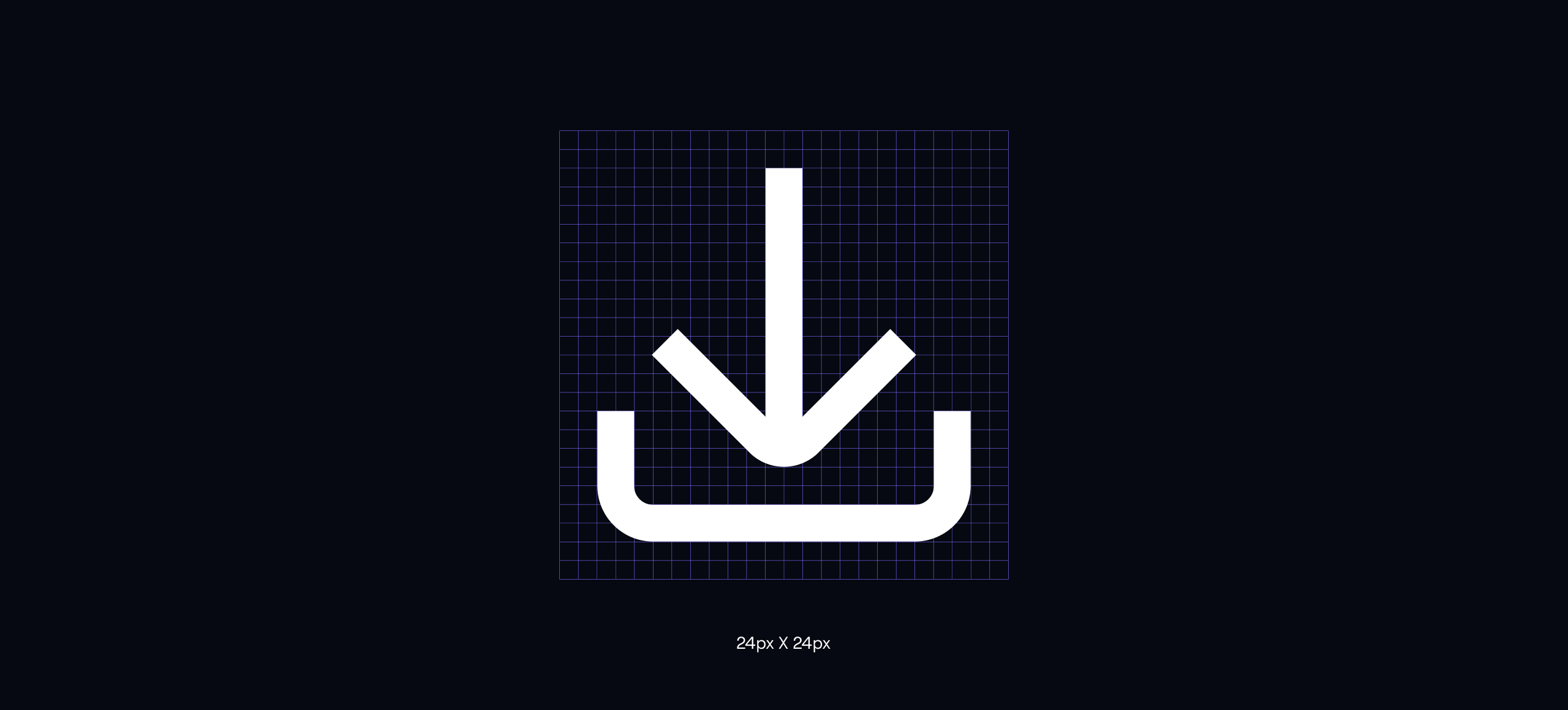
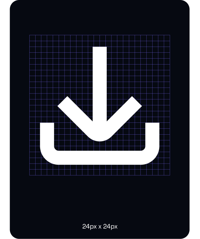
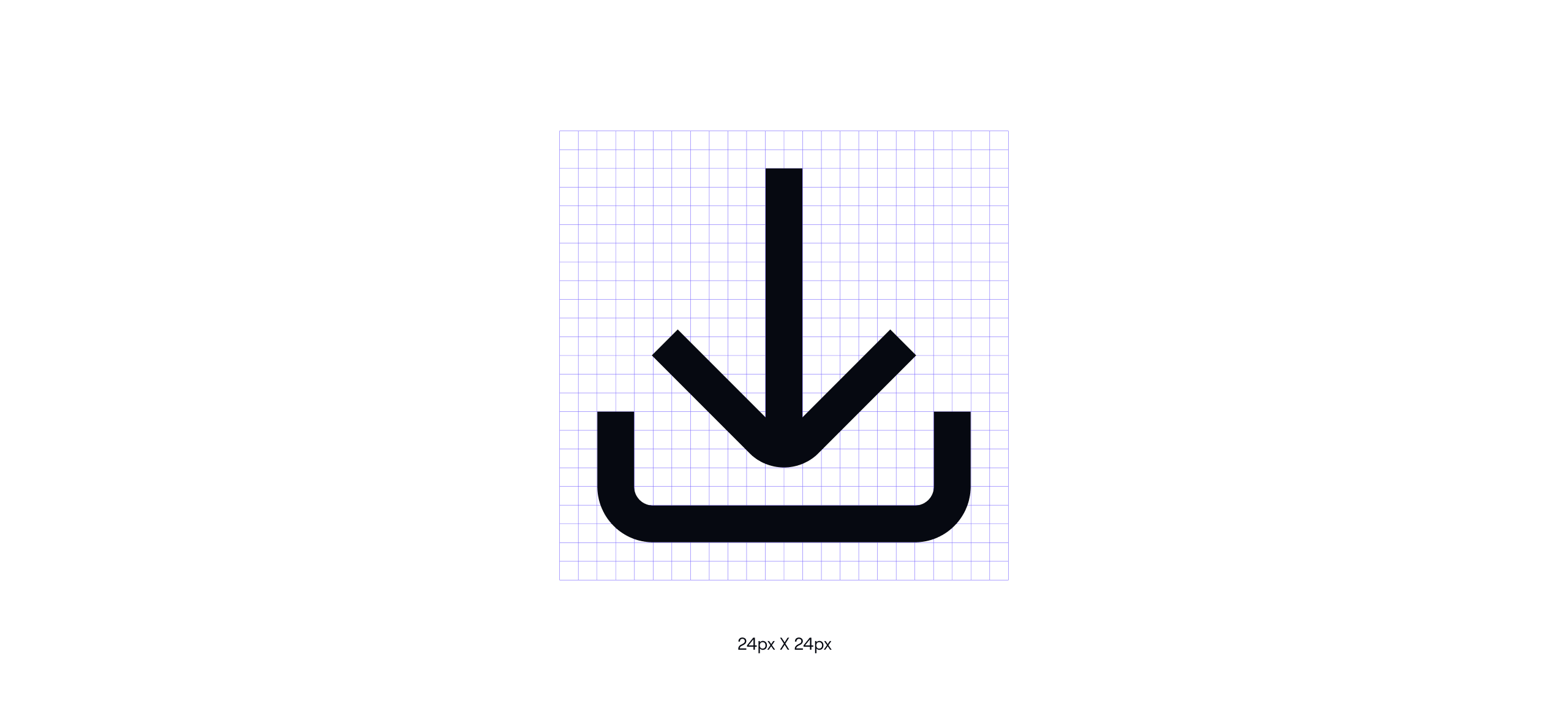
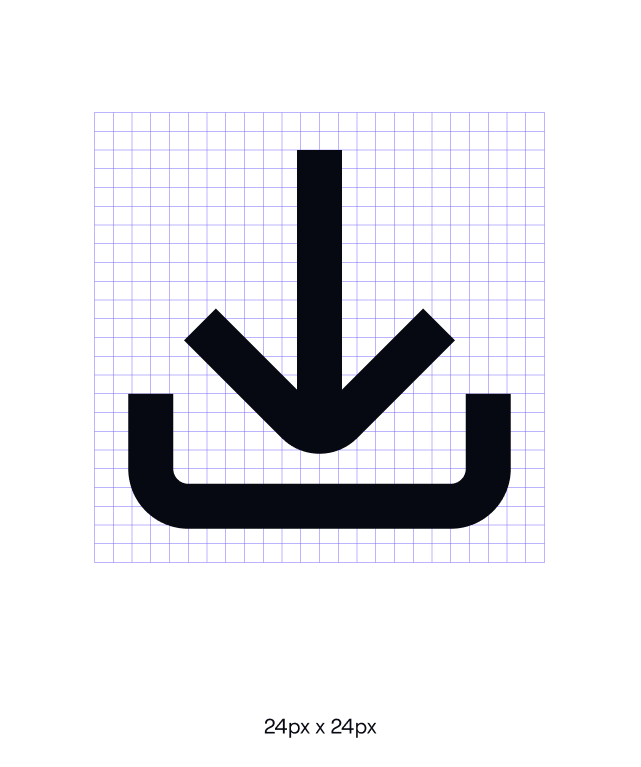
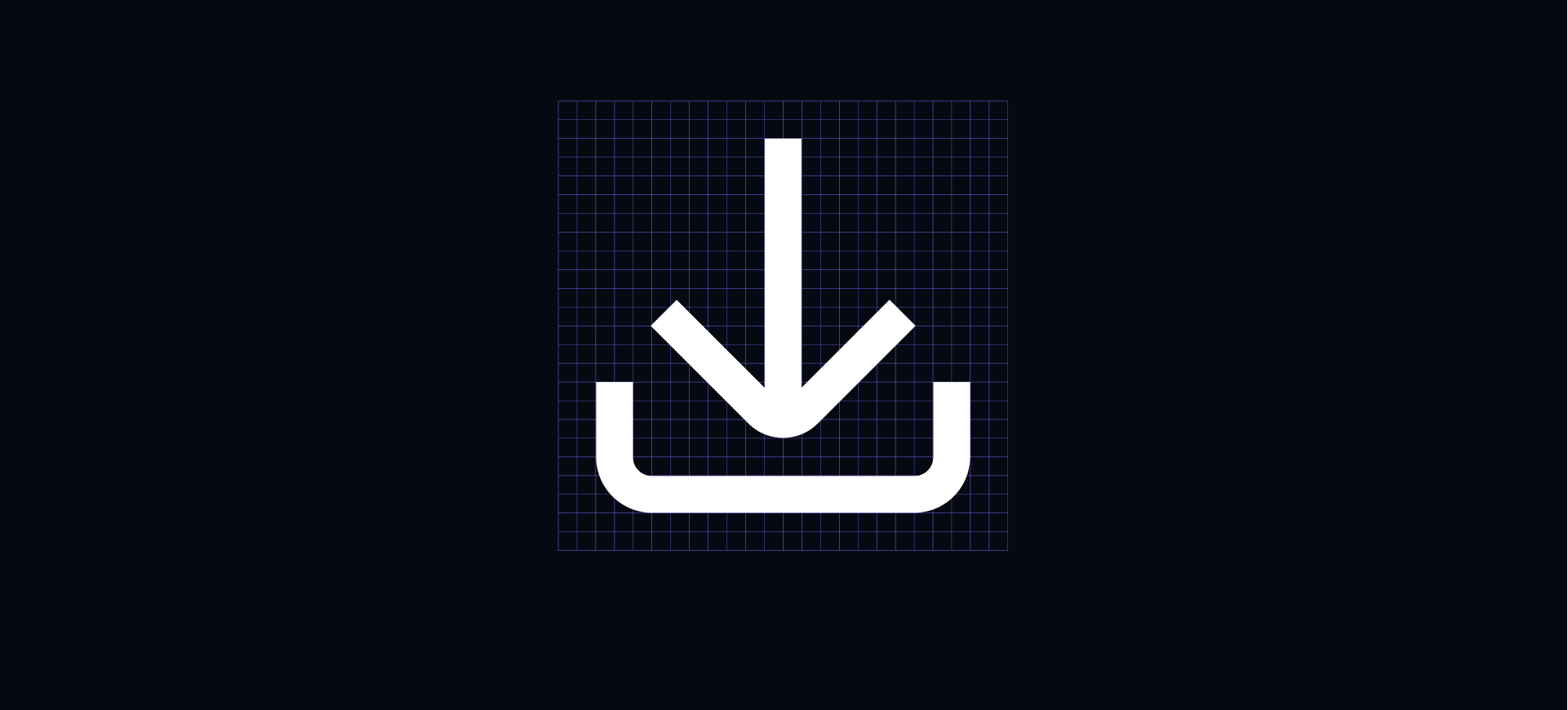
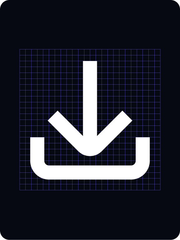
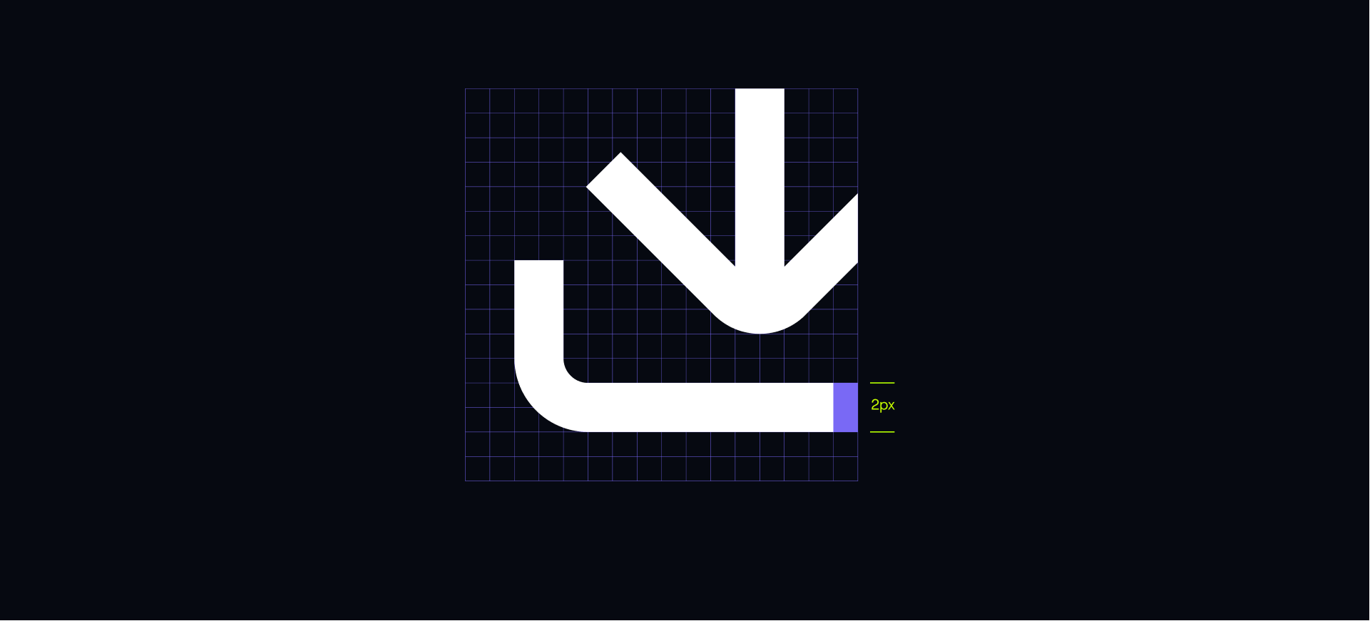
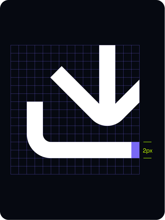
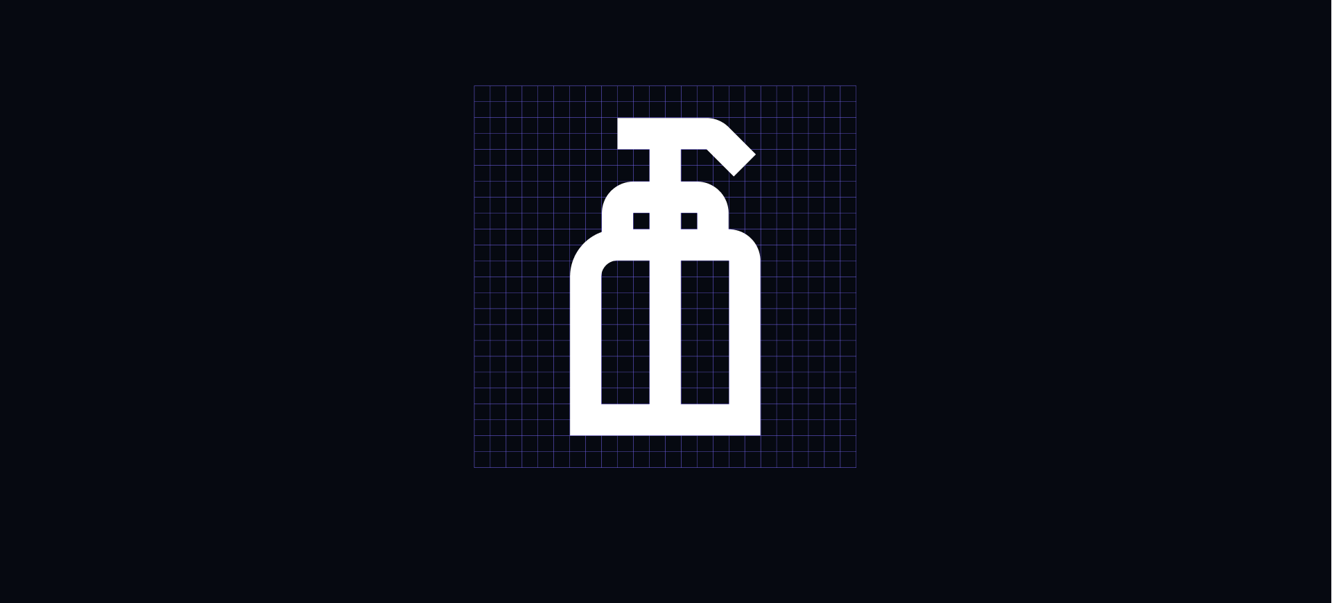
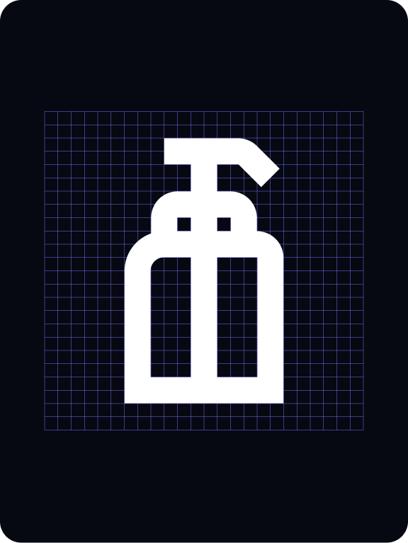
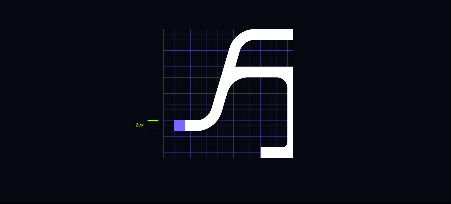
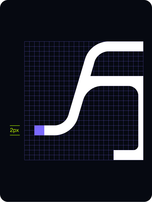
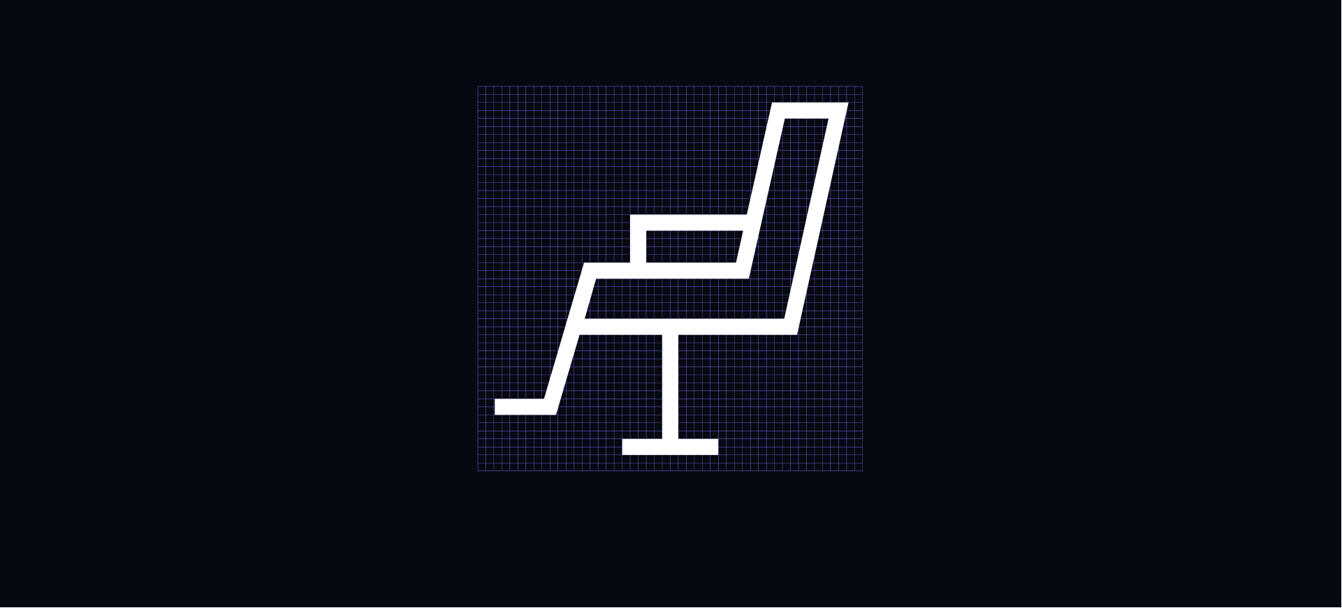
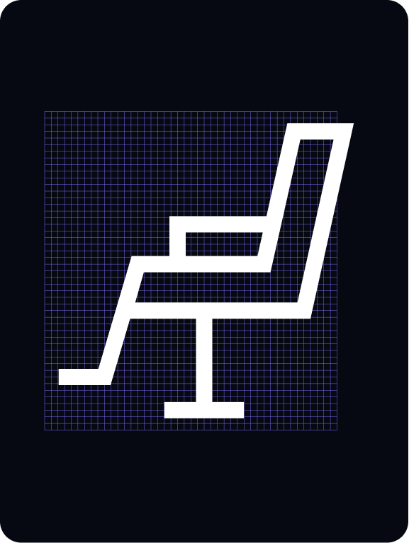
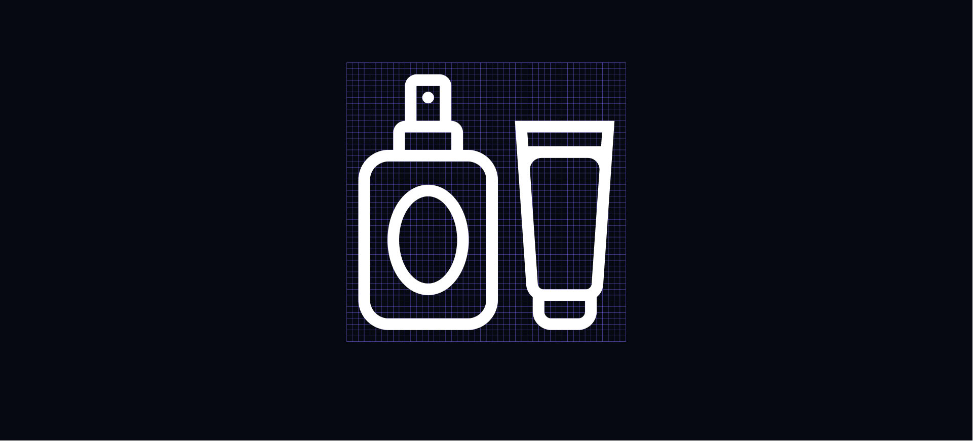
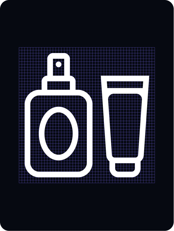
Functional icons are built on a 24x24px grid with a 2px safe space. Designed for use at small sizes, we use a line weight of 2px. Inspired by our secondary typeface (Roobert), they are constructed using a combination of rounded corners and flat terminals.
Built on a 24x24px grid with 2px padding in order to ensure their desired scale and surrounding clear space.
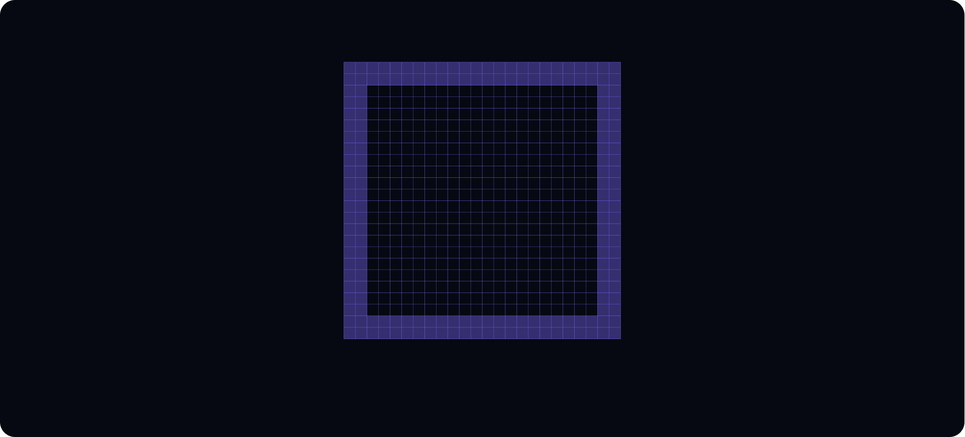
Our functional icons are built on a 24x24px
grid with a 2px padding.
We use a line weight of 2px. This ensures clear
visibility when used at a small scale.
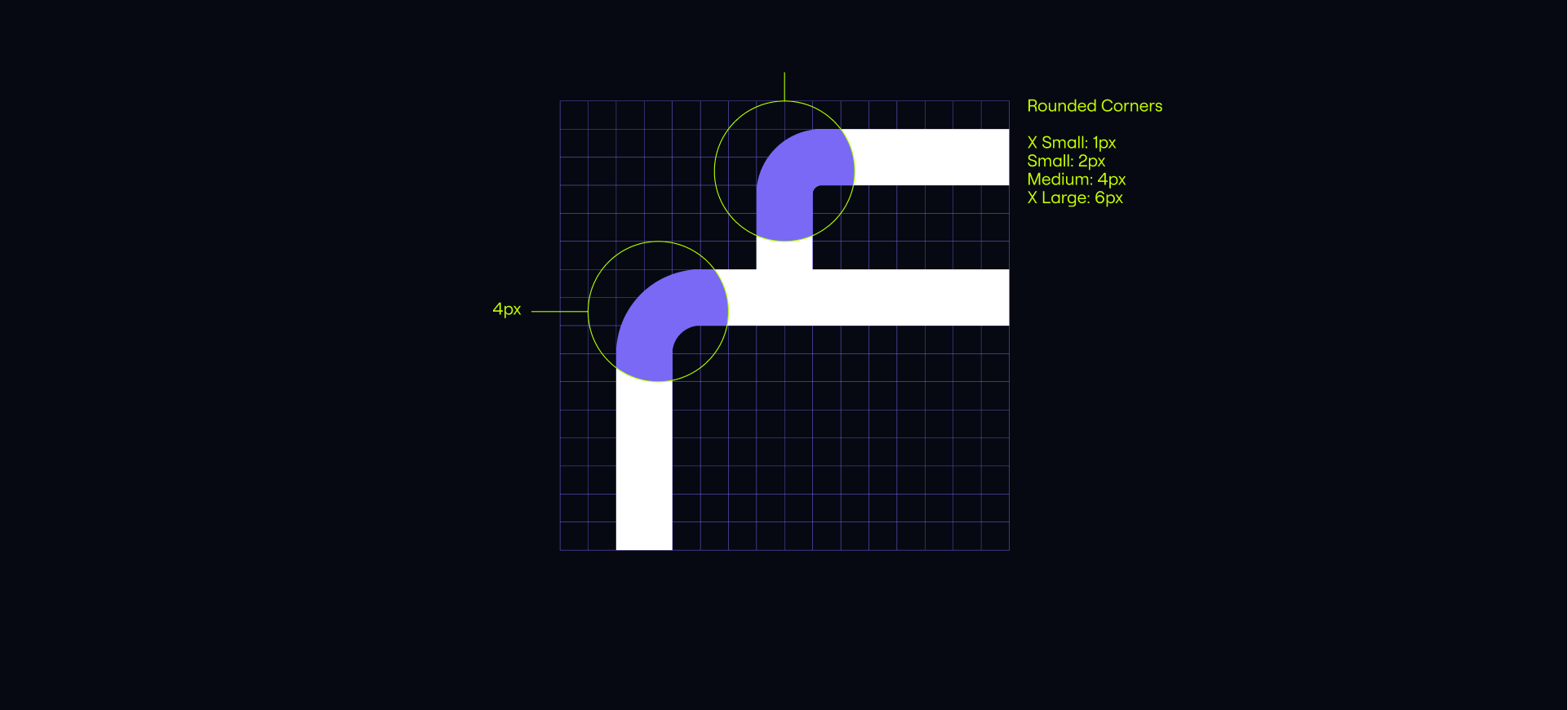
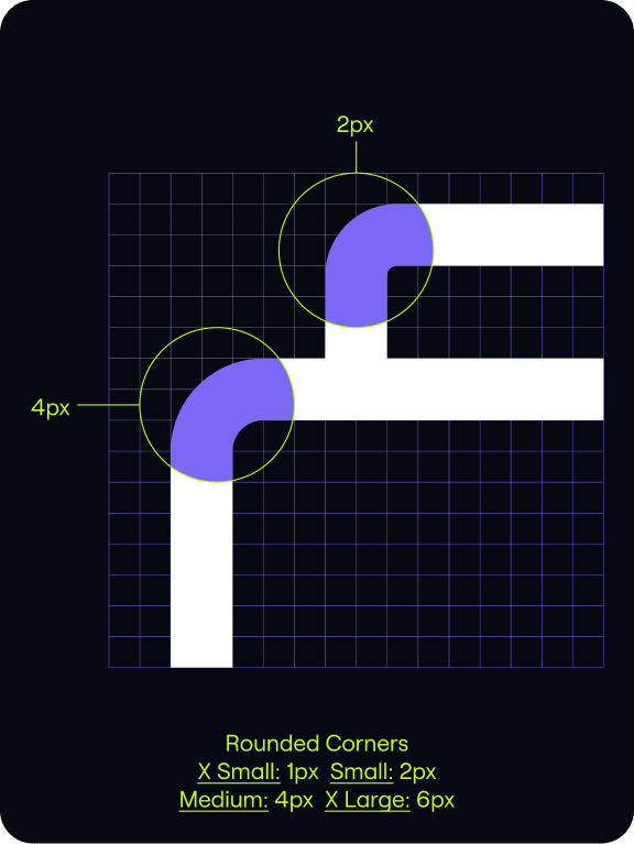
Where appropiate our corners use rounded edges.
As a general rule these are set at either 1px or 2px in radius.
Applying a mixture of rounded corners and flat terminals gives our icons a distinct and ownable style.
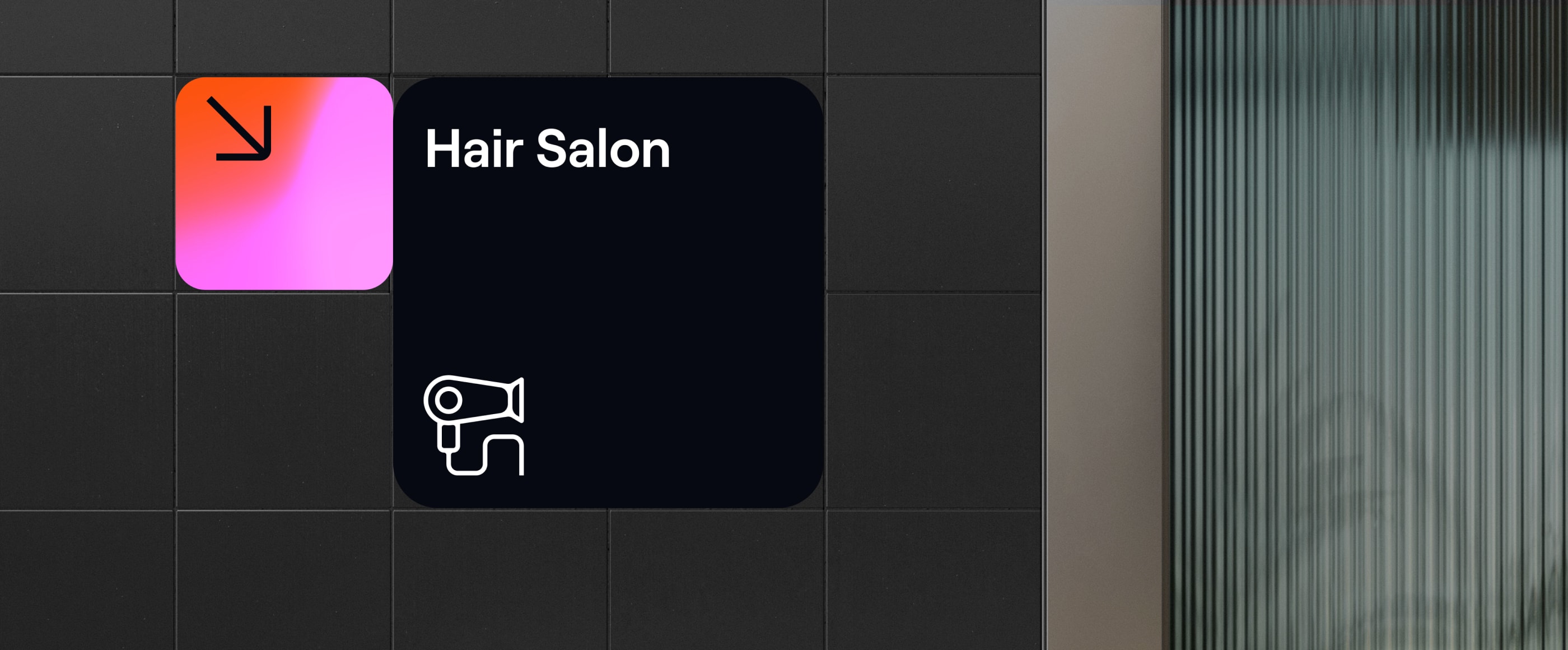
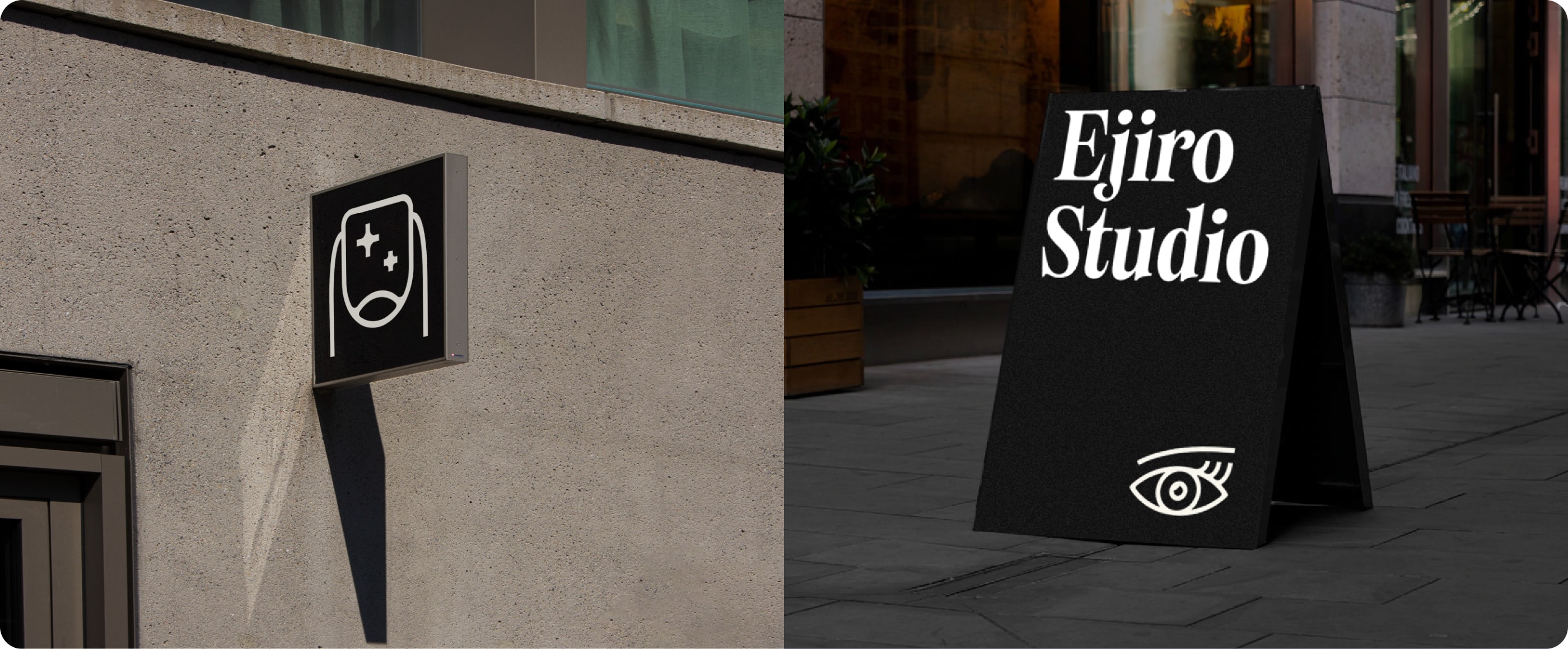
Expressive icons
Overview
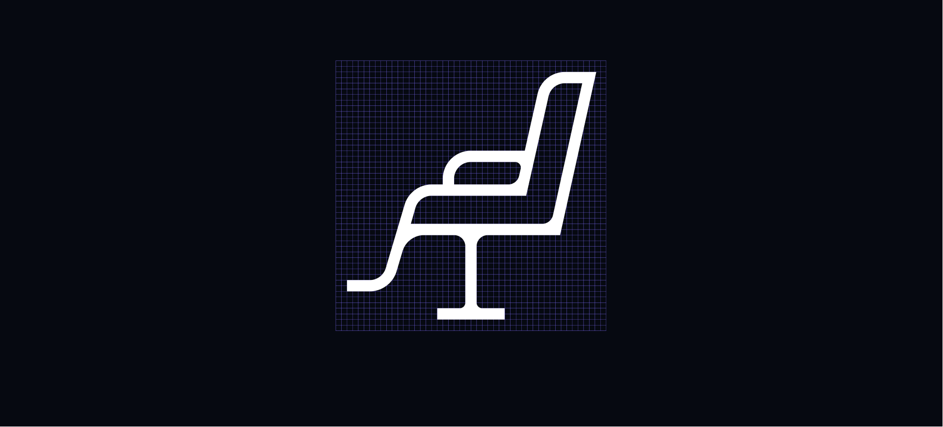
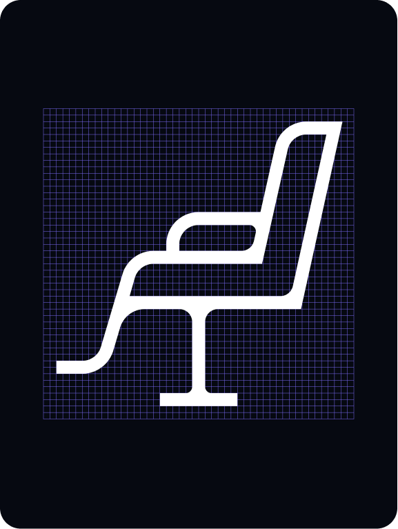
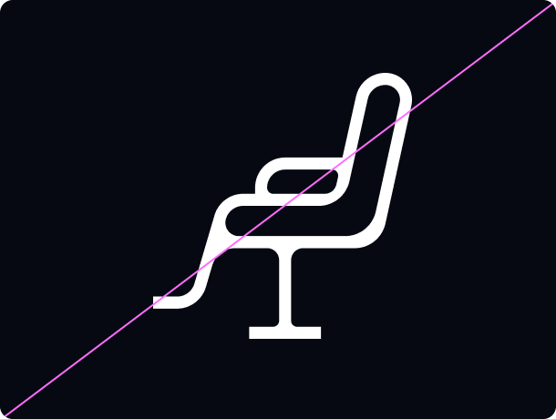
Our expressive iconography is inspired by the flair and sophistication of our primary typeface Tartuffo. These are used for more pictorial usages when we can show more character.
Creating expressive icons
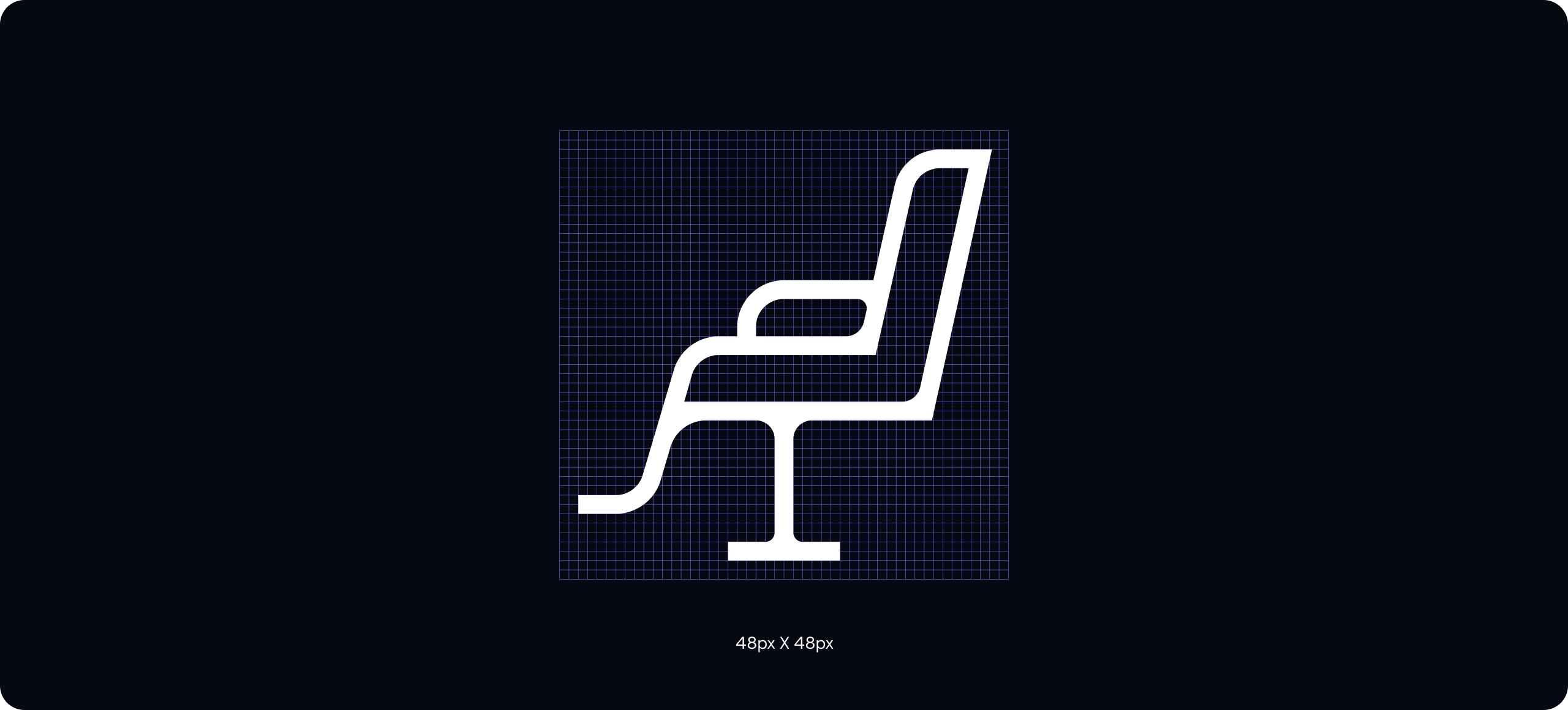
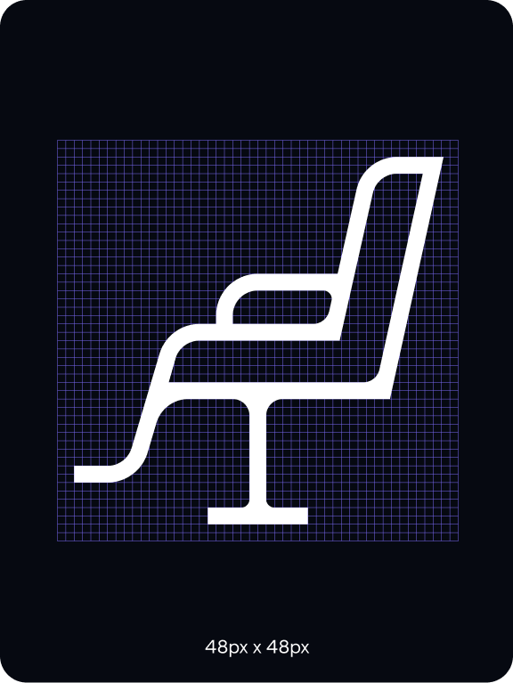
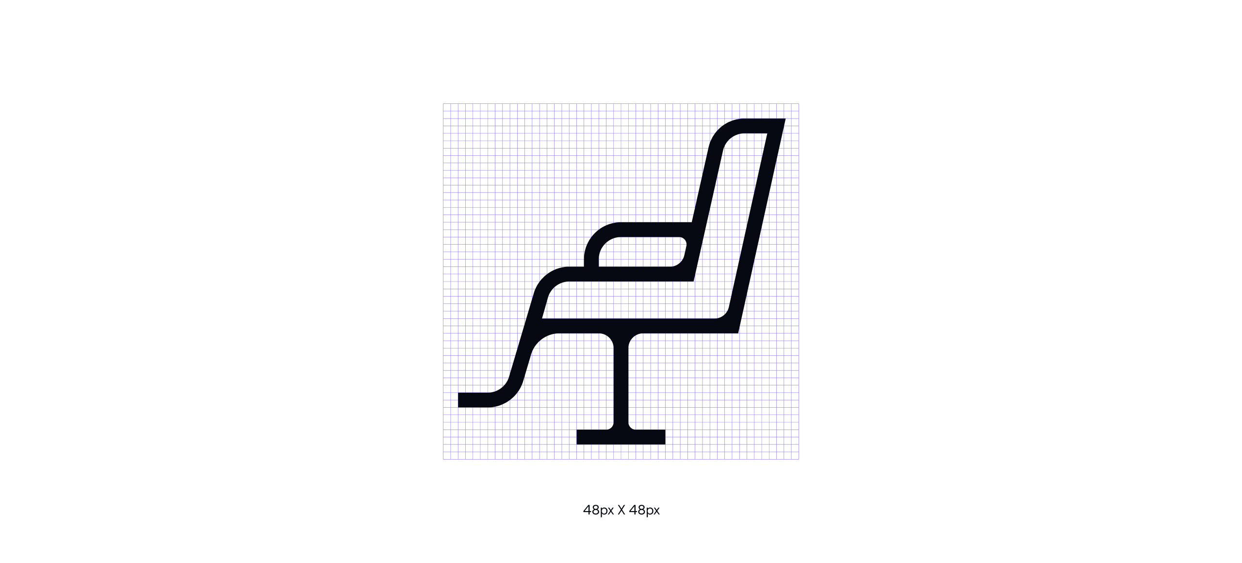
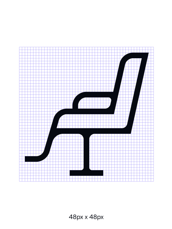
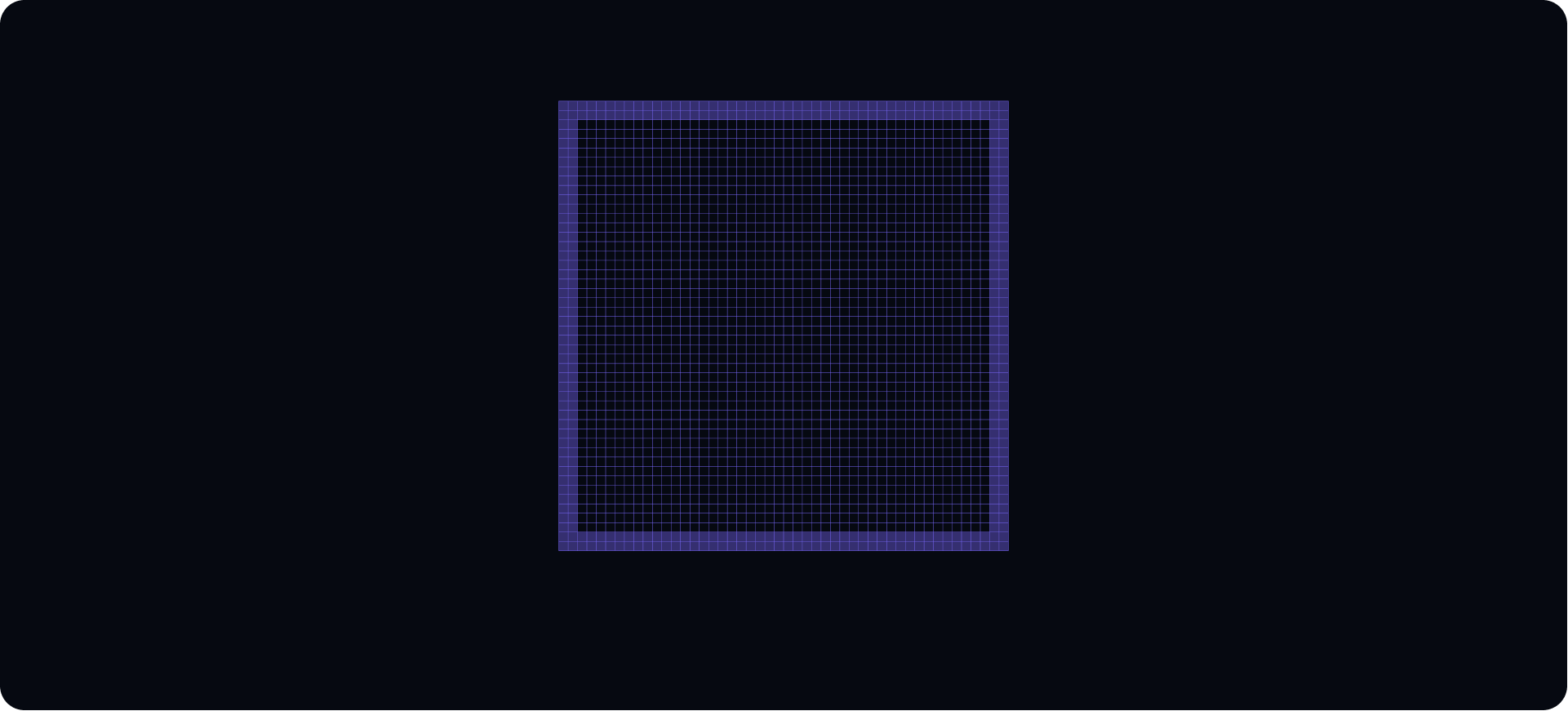
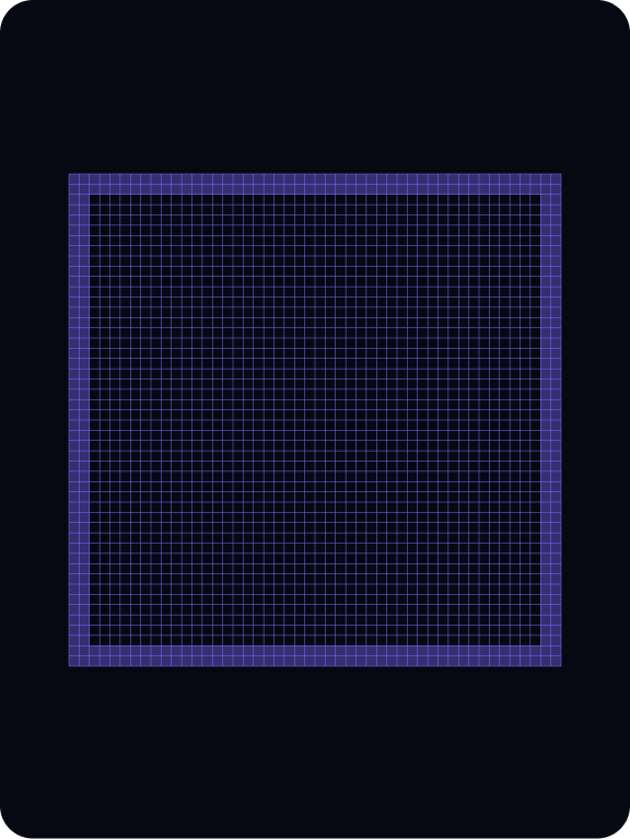
Expressive icons are built on a 48x48px grid with a 2px safe space. We use a line weight of 2px. Inspired by our primary typeface (Tartuffo), they are constructed using a combination of flaired corners and flat terminals.
Built on a 48x 48px grid with 2px padding in order to ensure the desired scale and surrounding clear space.
Built on a 48x 48px grid with 2px padding in order to ensure the desired scale and surrounding clear space.
We use a line weight of 2px.
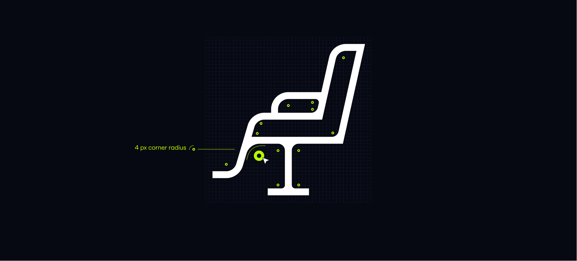
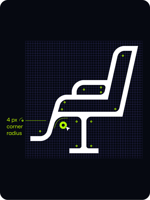
When creating our icons we start drawing them with straight angles, connecting to our grid.
Once drawn, where appropiate we apply rounded edges.
These can vary in pixel size dependent on the part of the illustration.
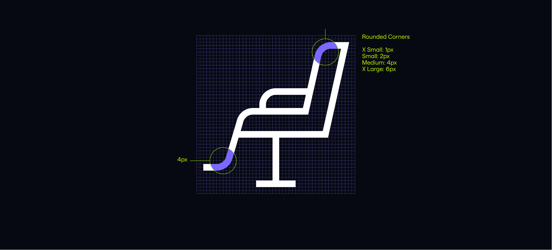
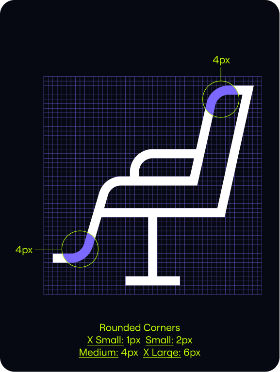
Our icon is then outlined and expanded. We can then curve some of our inside and outside corners to give our icons a distinct and ownable style.
We can apply this process to other items to make
our iconography feel unified.
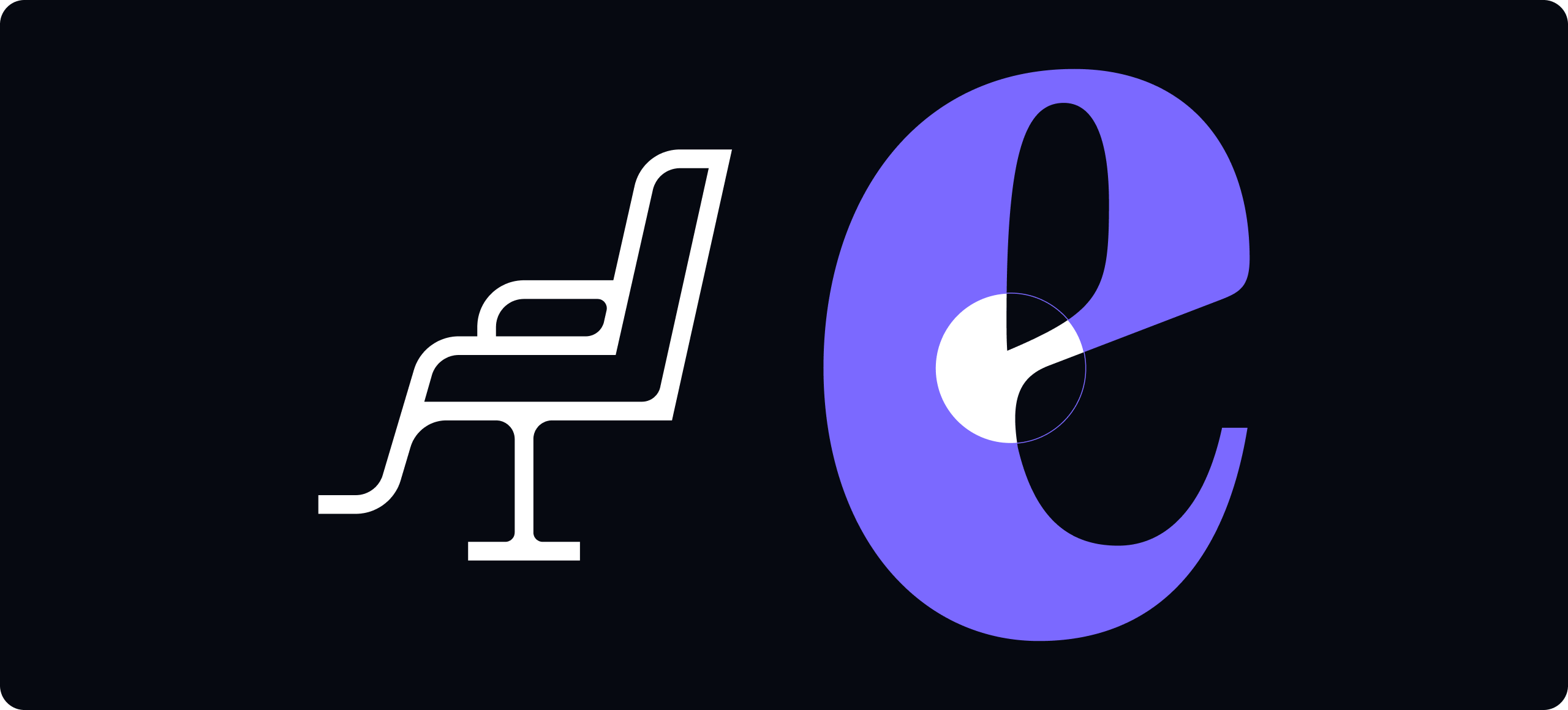
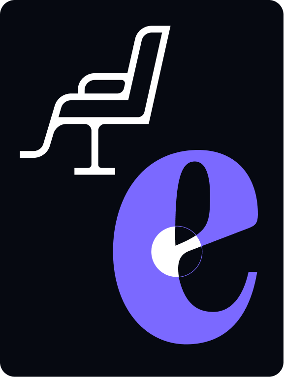
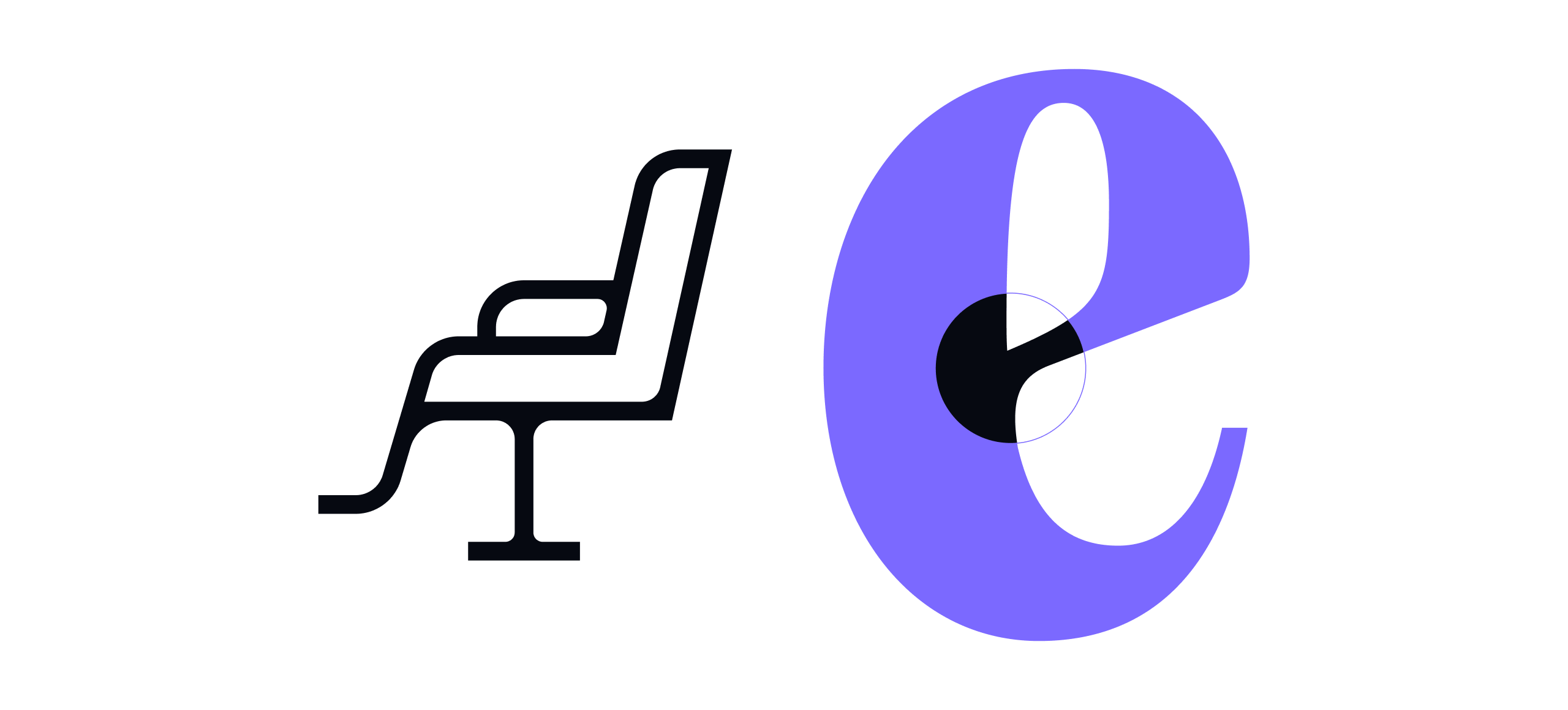
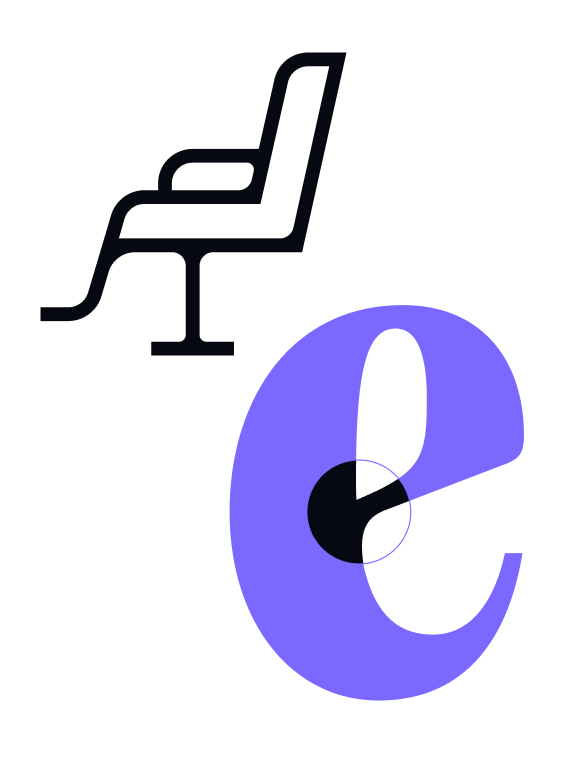
Spotlight within icons
Spotlights can be used within our iconography for interactive moments on UI, for example a roll over state. They should be used sparingly and strategically.

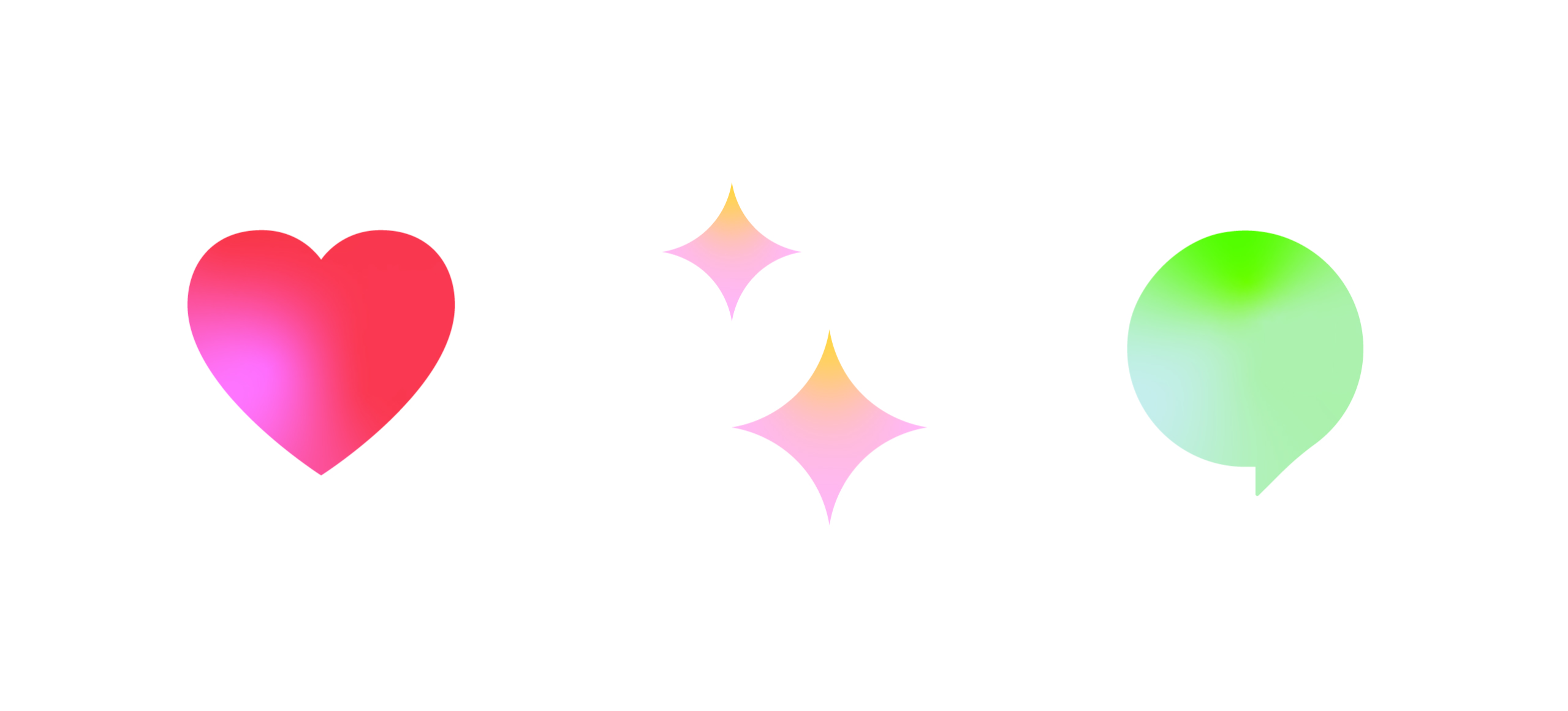
Emoji & stickers
Overview
Our Emoji & Stickers add a sense of play to our iconography.
They should be used infrequently, for social applications such as Instagram posts or filters. They can be built outside our grid, but should feel aesthetically similar to the rest of the set.
Things to avoid
01
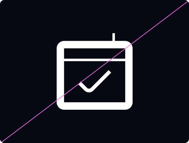
Don’t change, alter or mix the line weights.
02
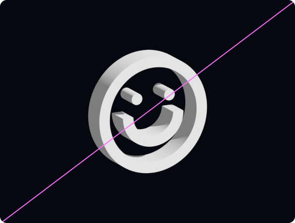
Don’t tilt, rotate, or make icons appear three-dimensional.
03
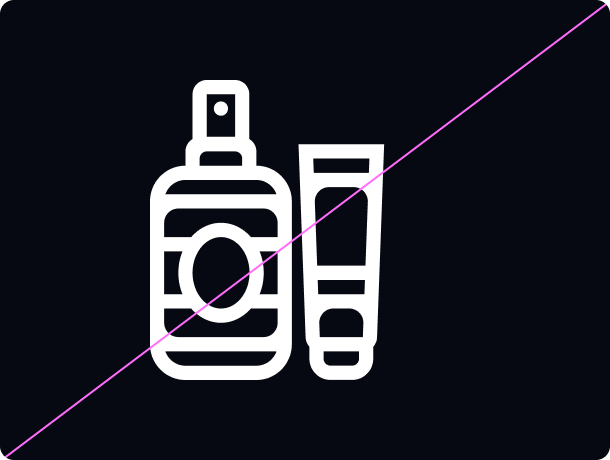
Don’t be overly complicated or add too much detail
04
Don’t go overboard with the rounded edges, and instead strike a balance.
Inspiration
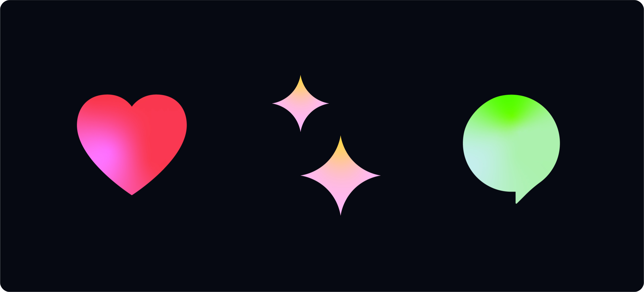