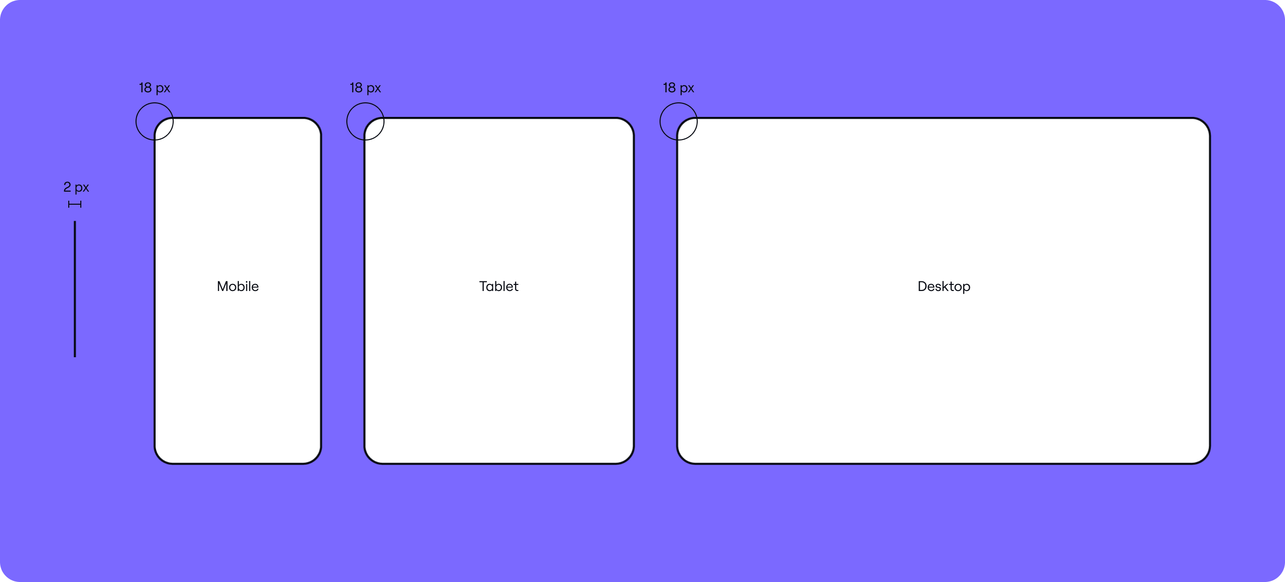
Art direction

Introduction
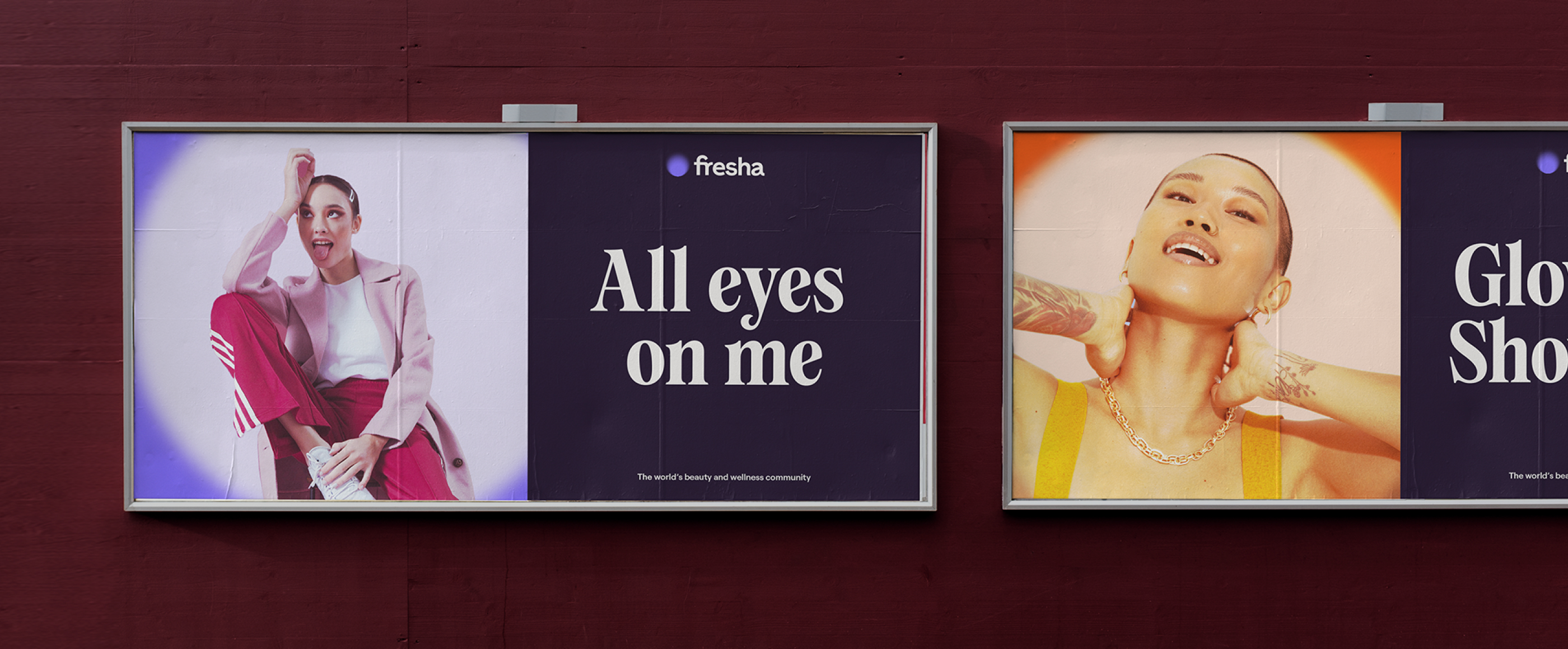
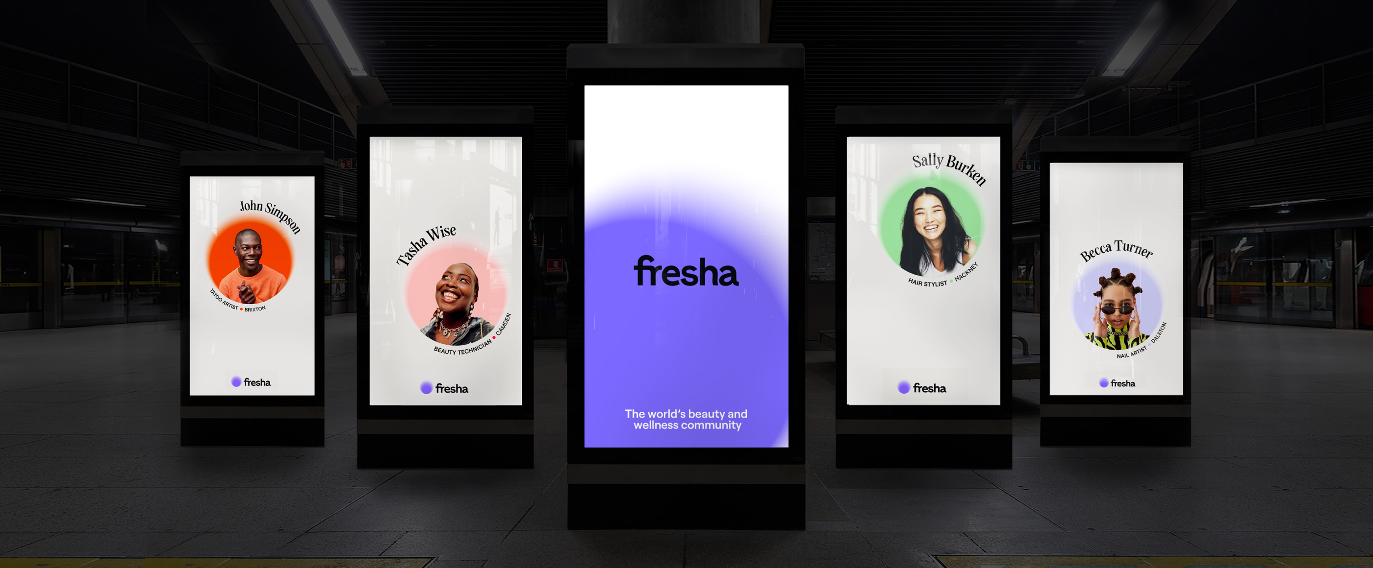
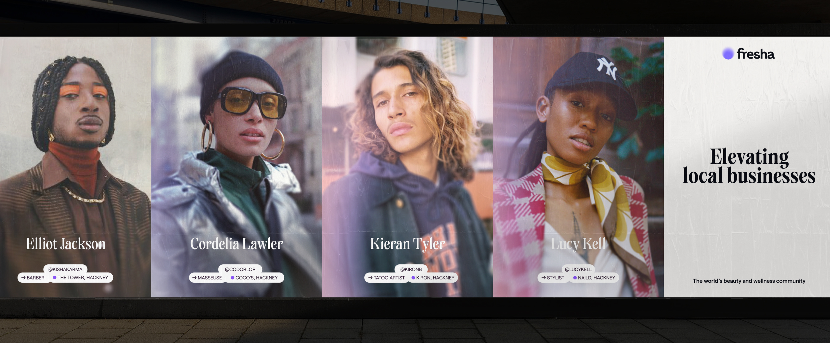
Our art direction allows us to show the aspirational side of Fresha. We show a broad range of people that convey the diversity and distinctiveness of people who use our product.
Overview
Principles
Across our art direction styles, we have three guiding principles that
capture the spirit of Fresha.
*Fresha do not own the rights to the photography that is contained on this page.
*Fresha do not own the rights to the photography that is contained on this page.
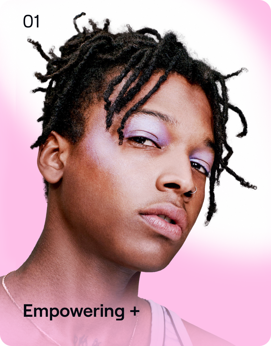

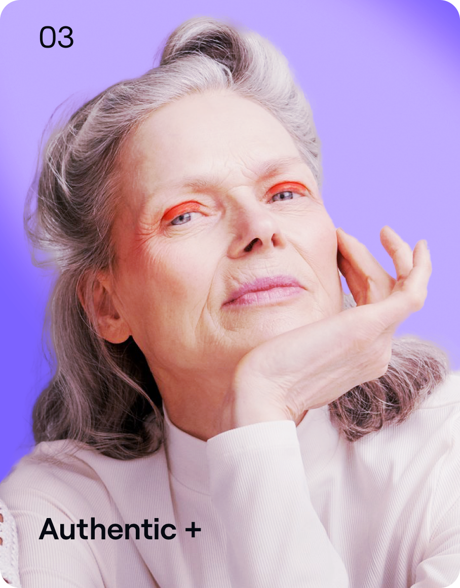
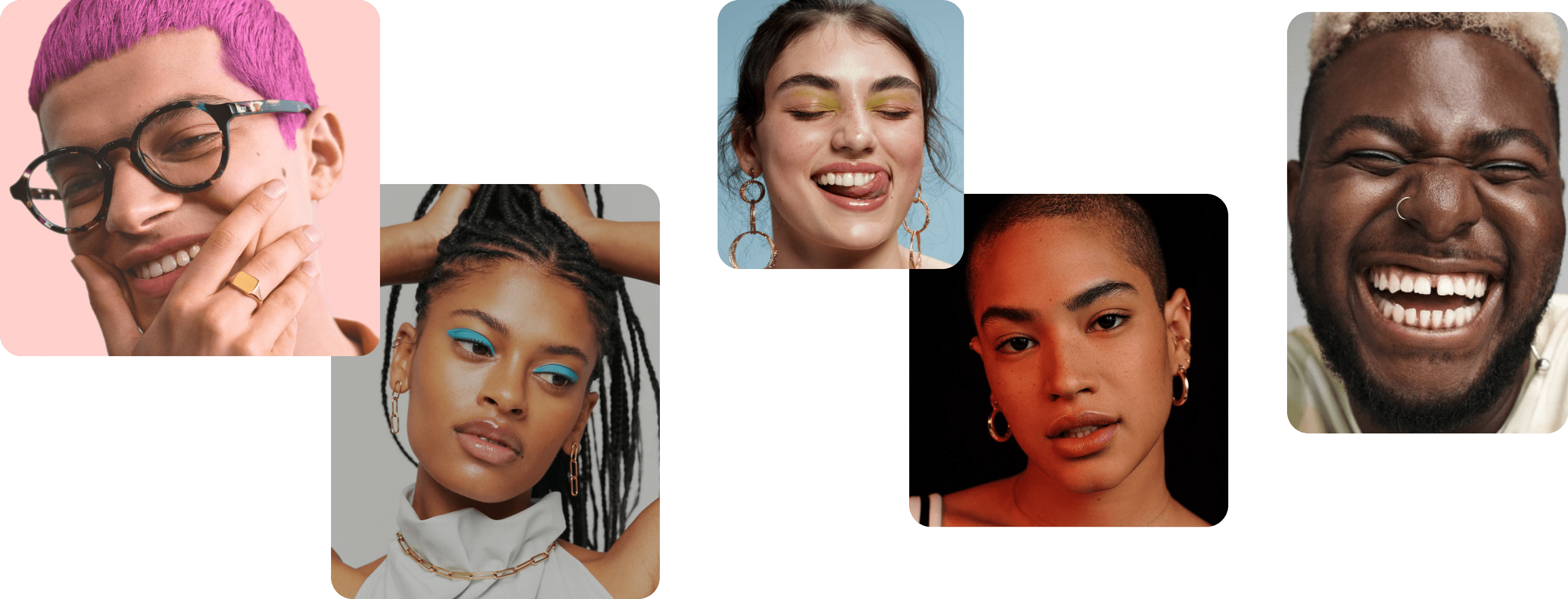
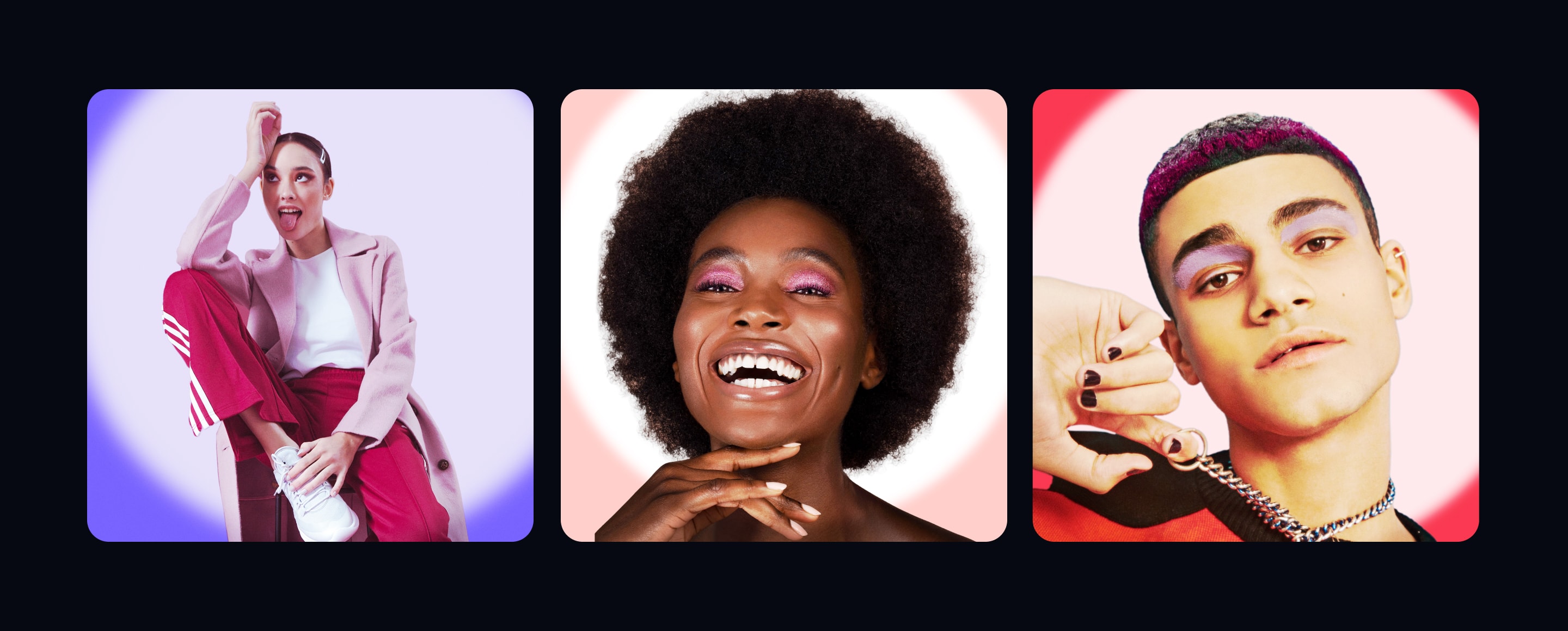
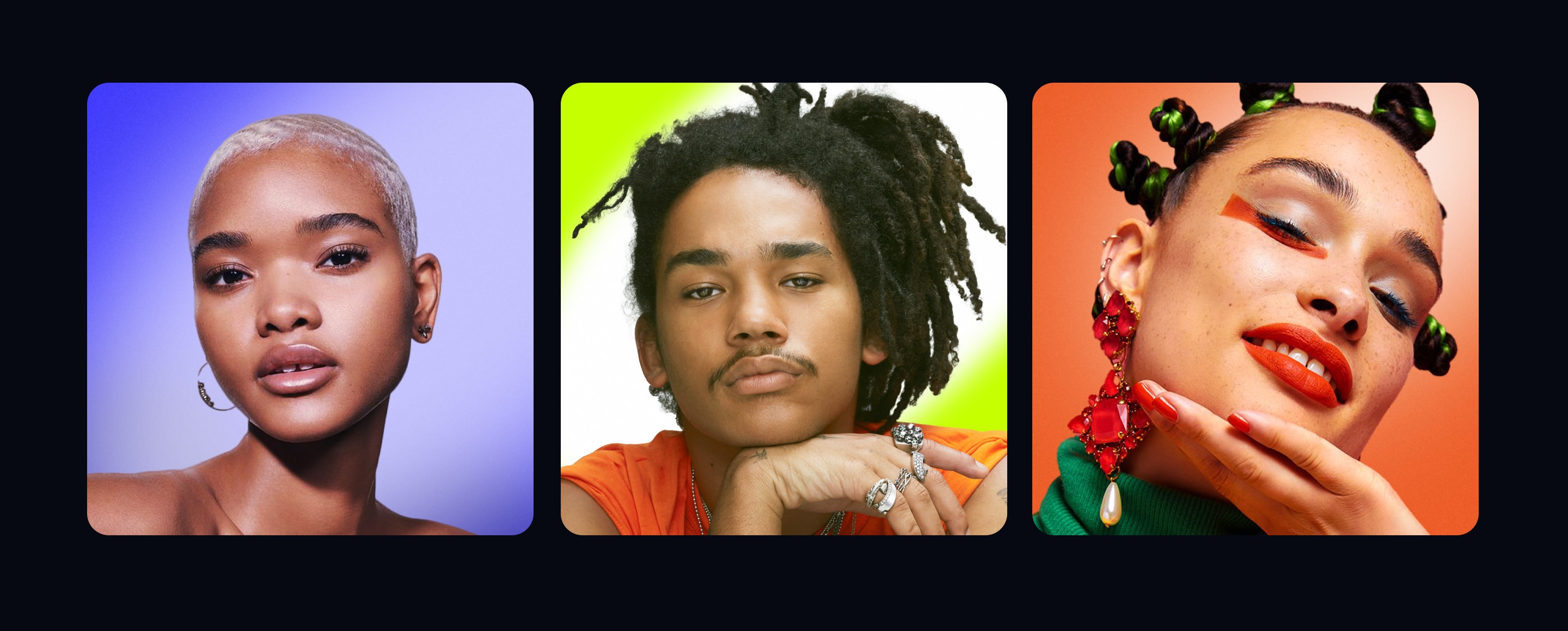
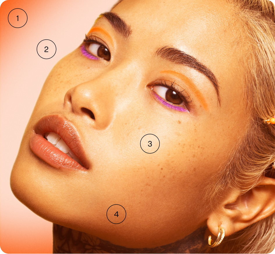
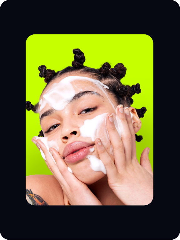
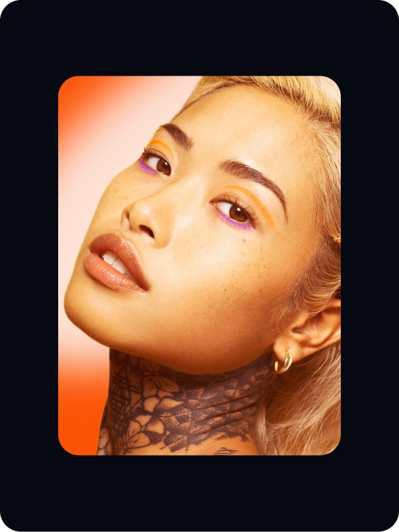
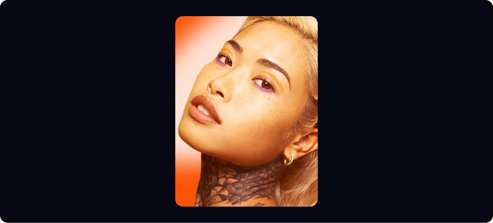
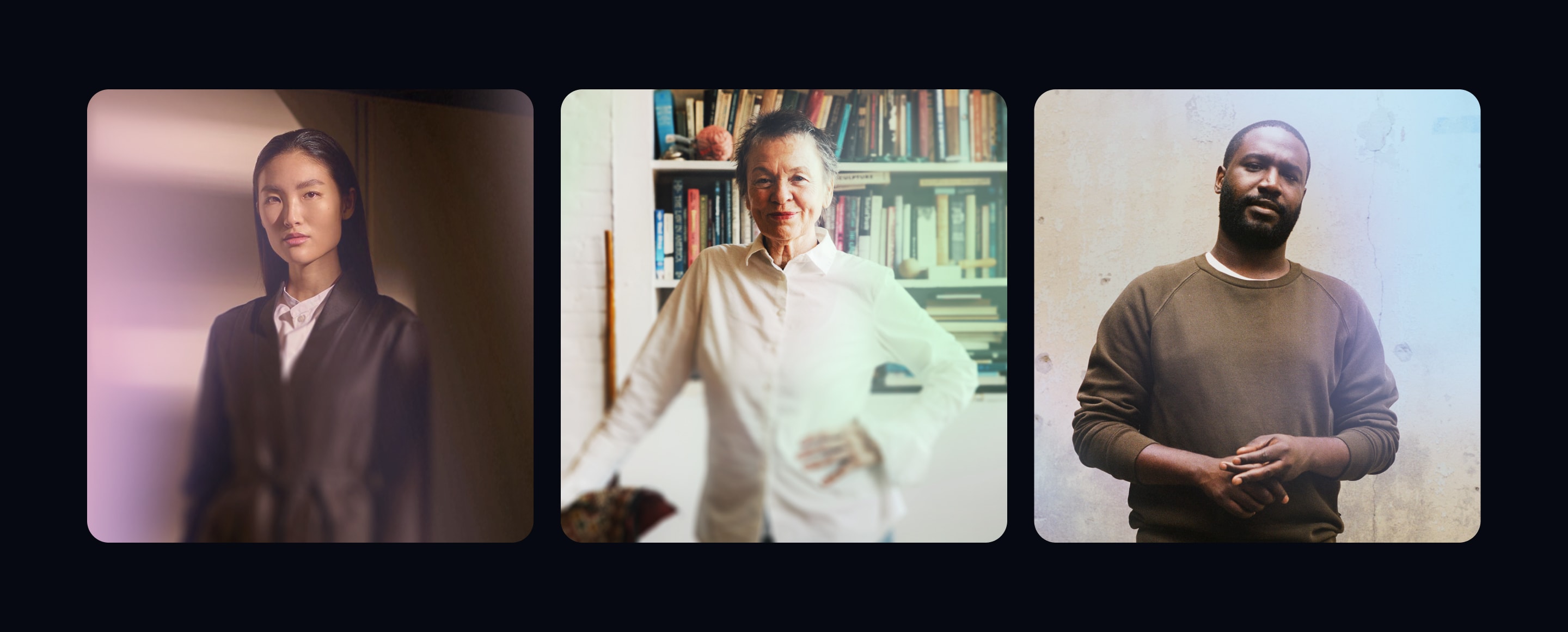
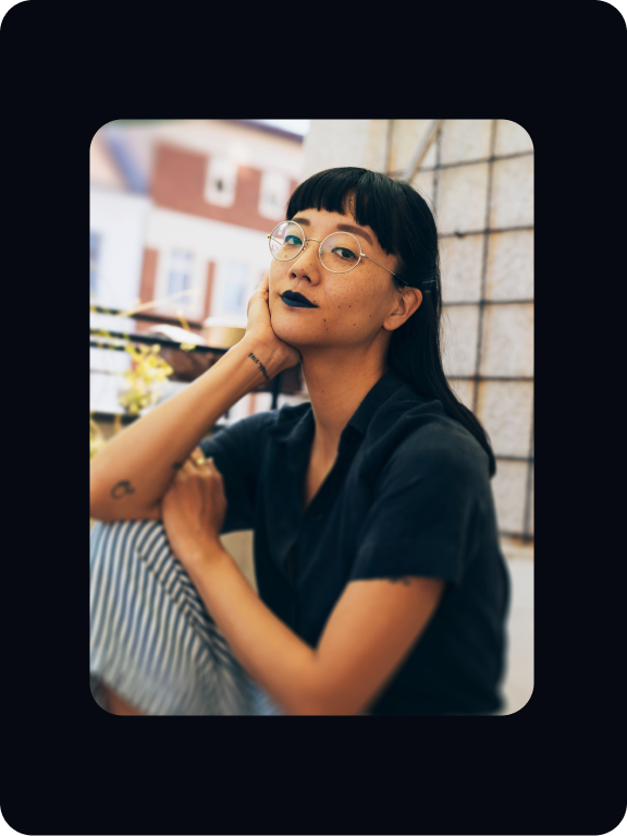
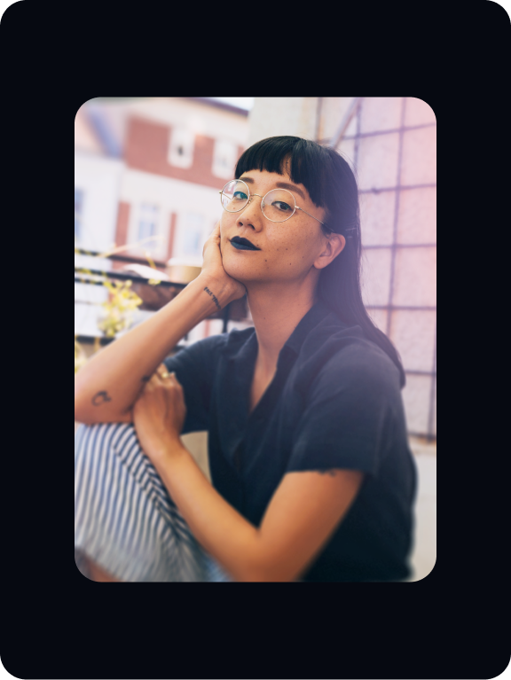
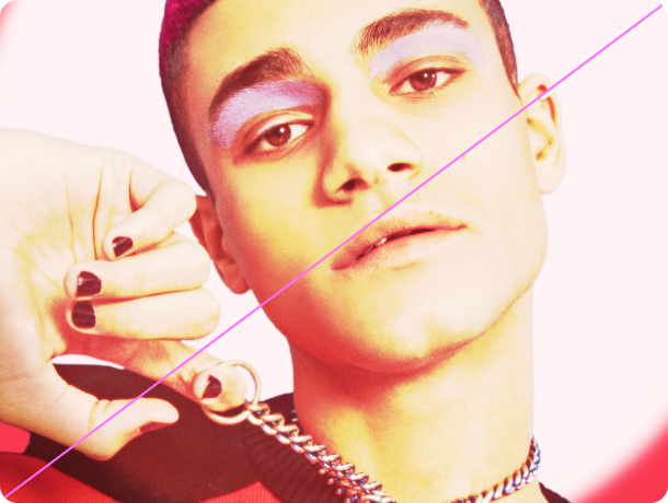
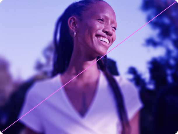
People
When choosing people for our art direction, they need to capture a sense of empowerment and authenticity.

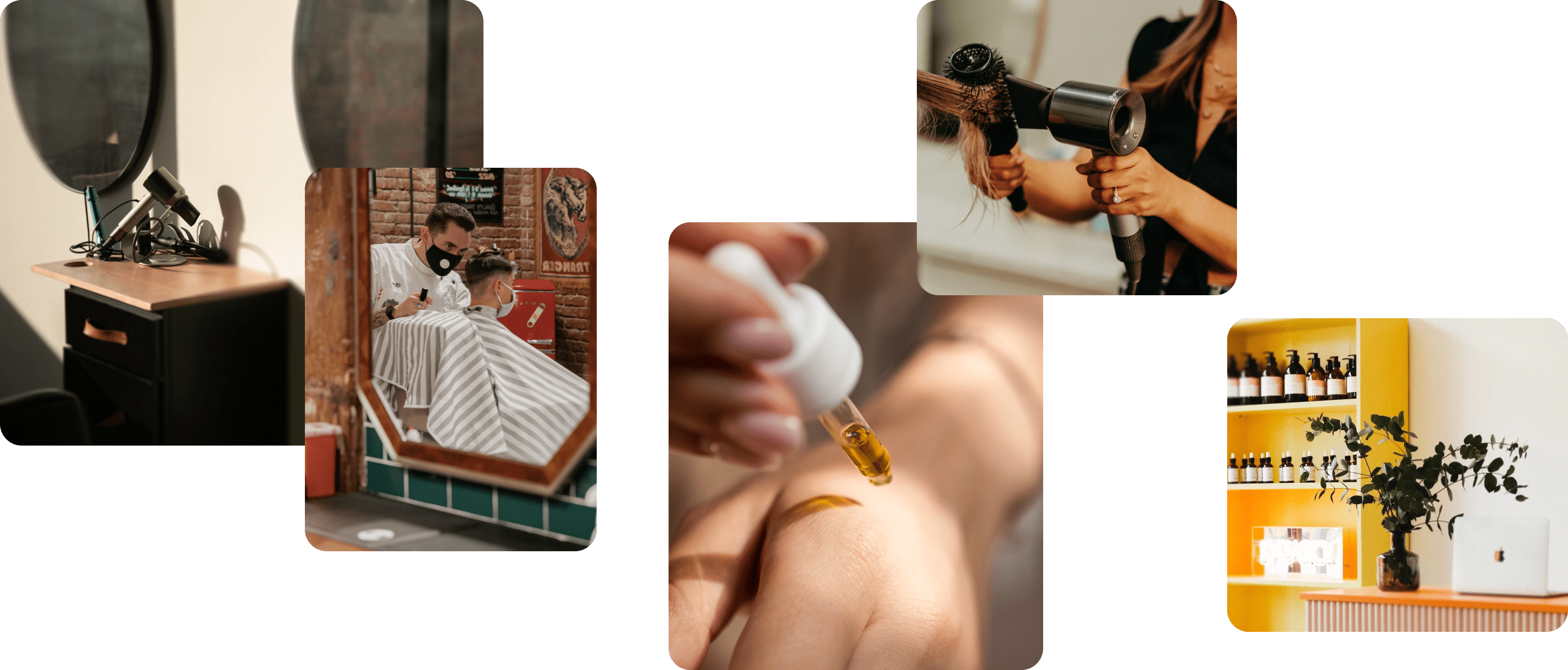
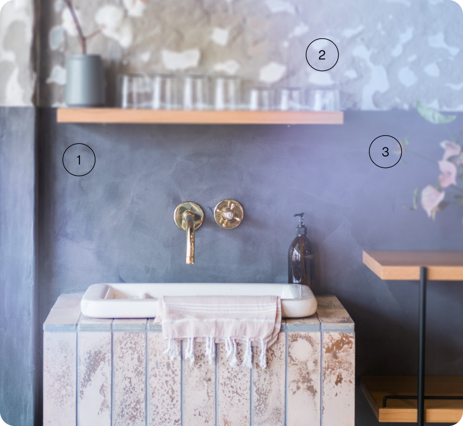
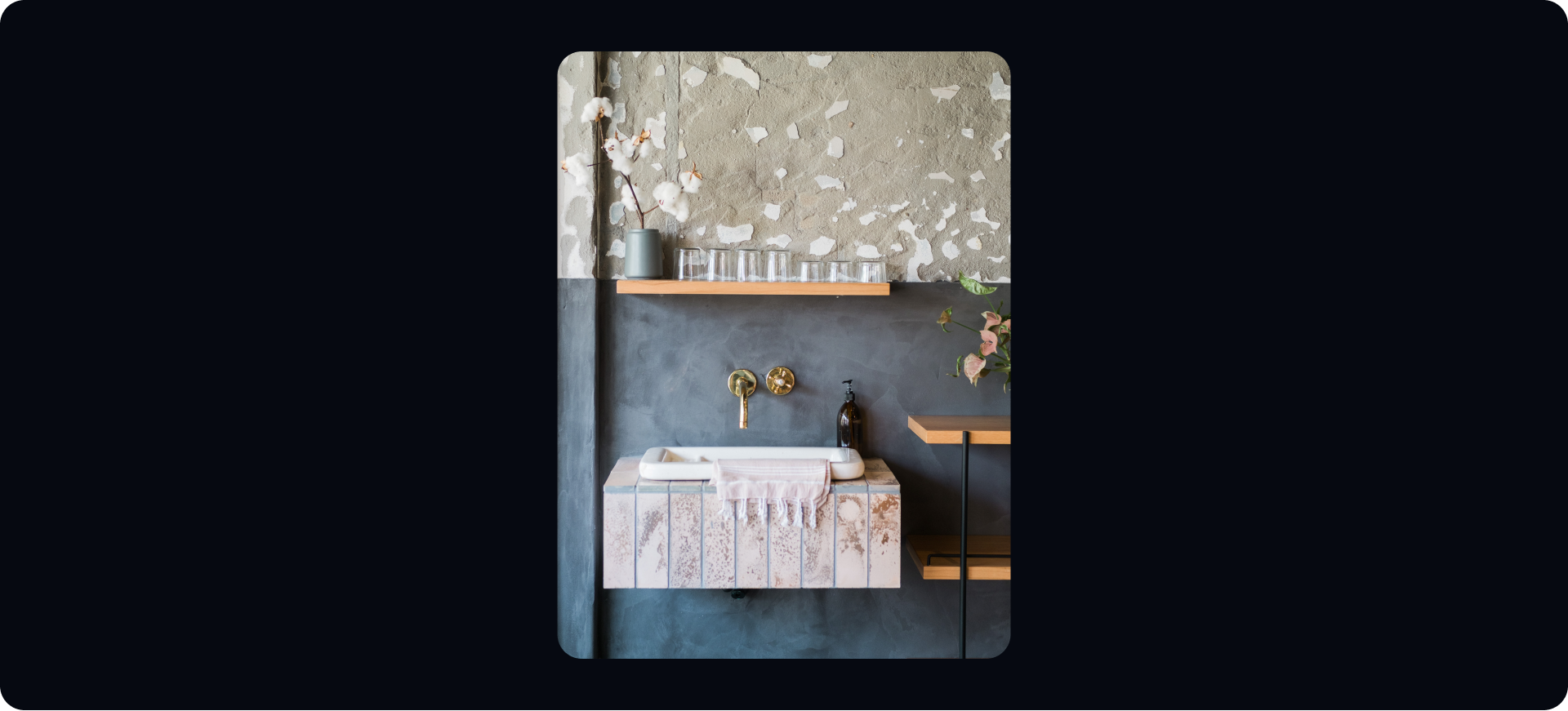
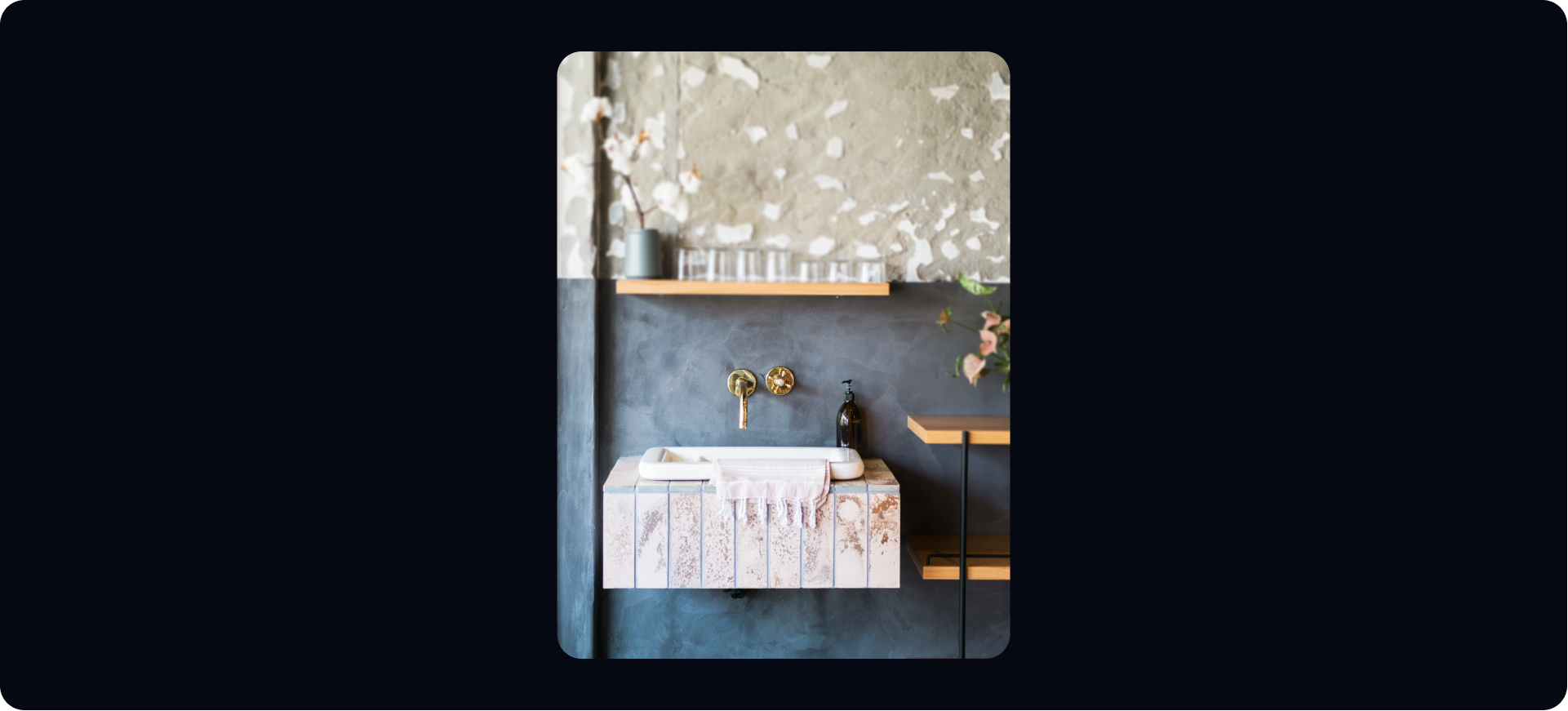
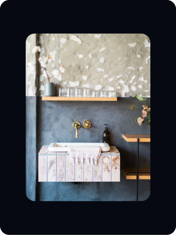
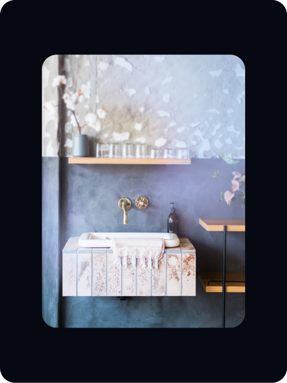
Salons
Our salon photography should show the details of treatments an services that are featured on Fresha.
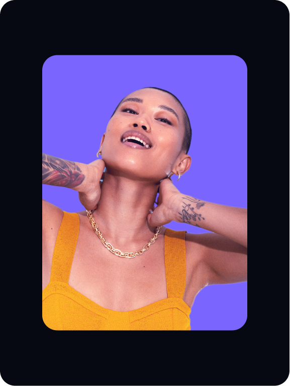
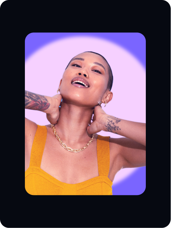
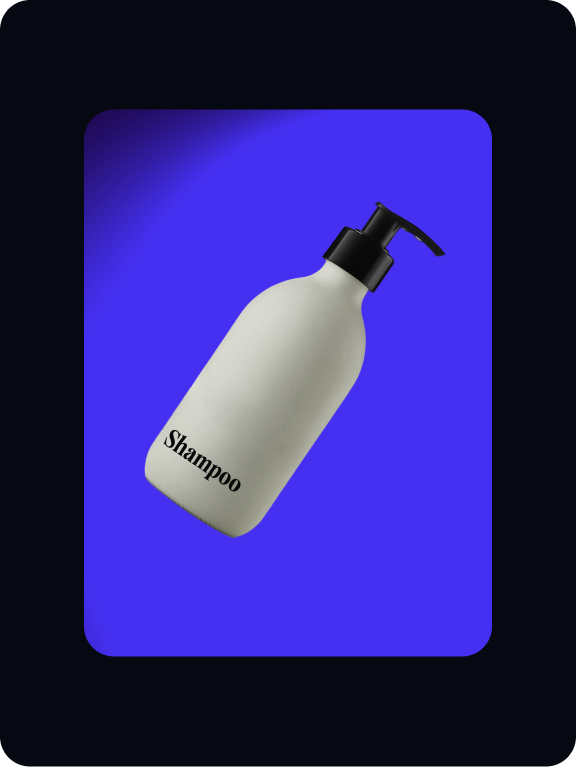
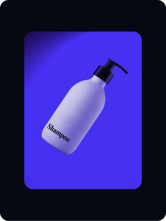
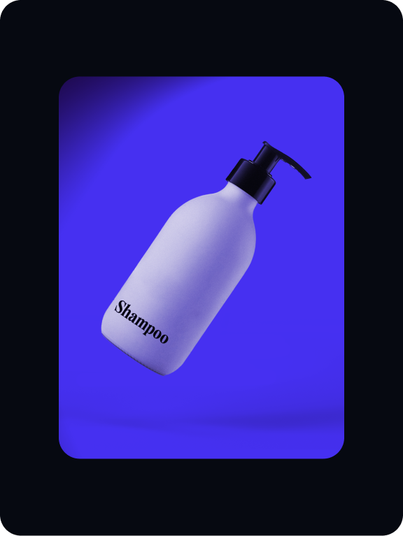
B2C treatment
Treatments
We have three types of treatments which can be used with our B2C
art direction. These styles capture light in distinctive ways.

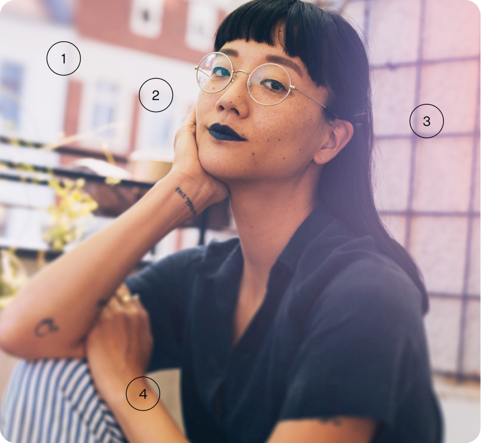
Details
Below are steps showing how each treatment of B2C photography is created. Follow these steps to make sure our styles are consistent.
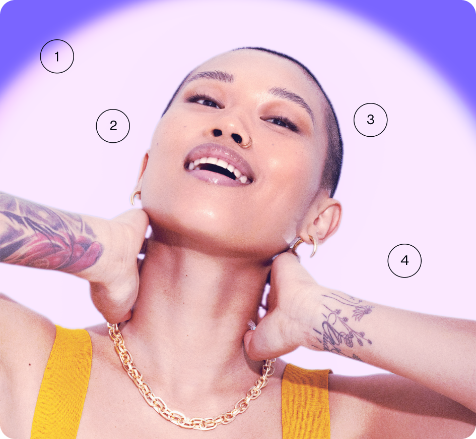
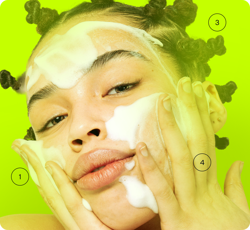
Build
Below are steps showing how each treatment of B2C photography is created. Follow these steps to make sure our styles are consistent.
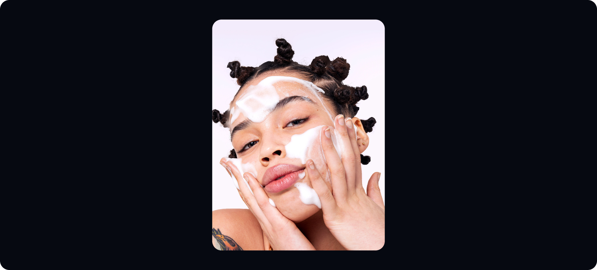
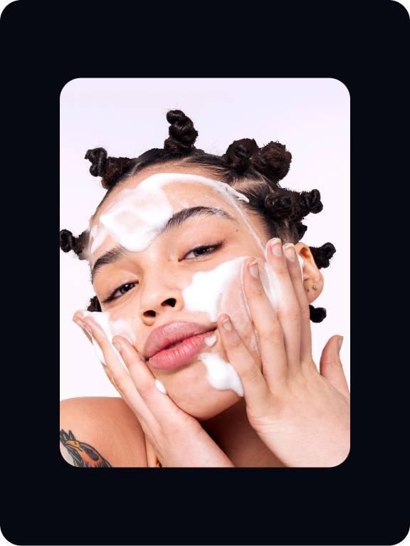
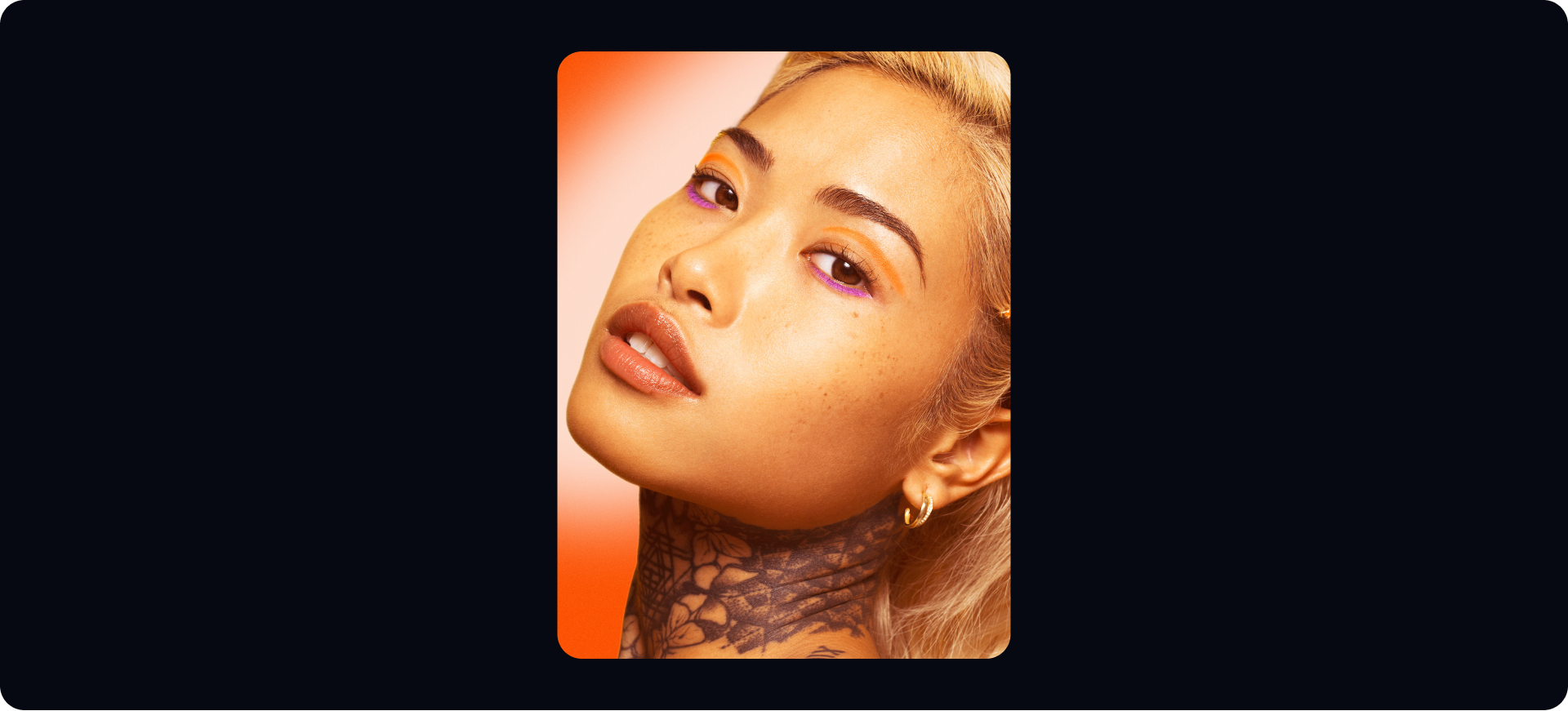
Choose your photograph.

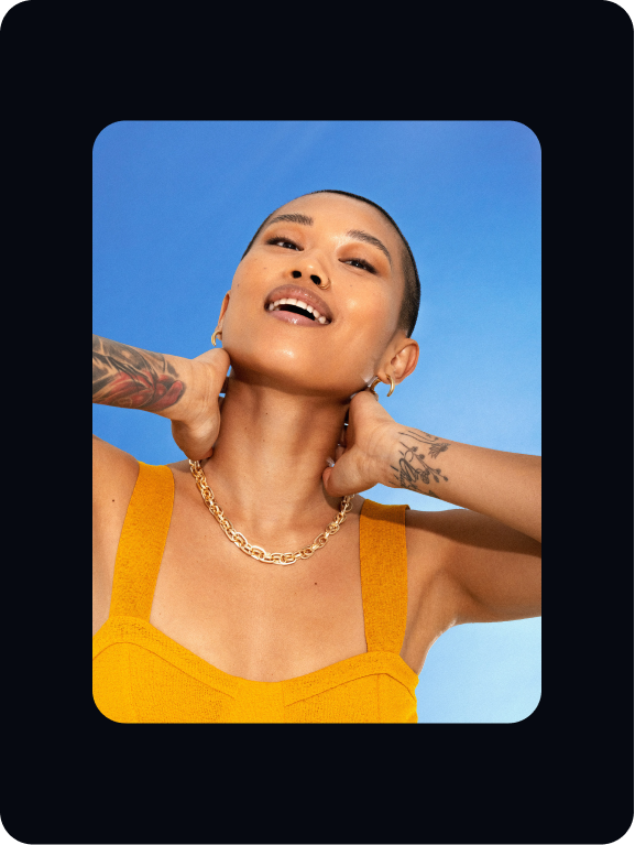
Mask out the model. Place in a background choosing one of brand colours. Add a slight colour overlay to the model.

Add a spotlight to the background. Make sure to use one of our brand colours. A field blur should be applied to make it feel realistic.

Add a light overlay to the model to make the spotlight and model feel more intergrated.

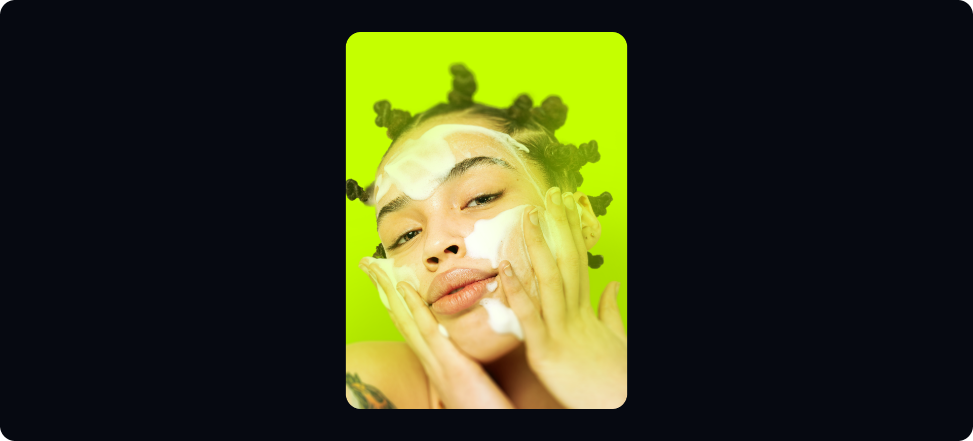
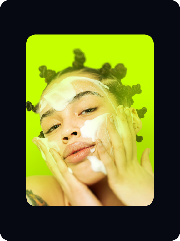
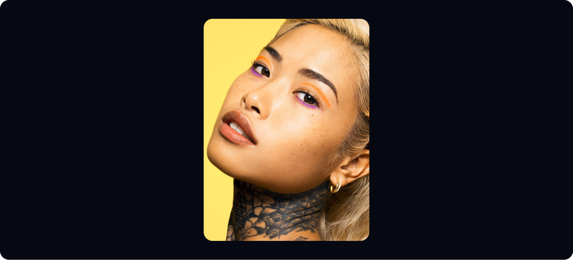
Choose your photograph.
Mask out the model. Place in a background choosing one of brand colours. Add a slight colour overlay to the model.
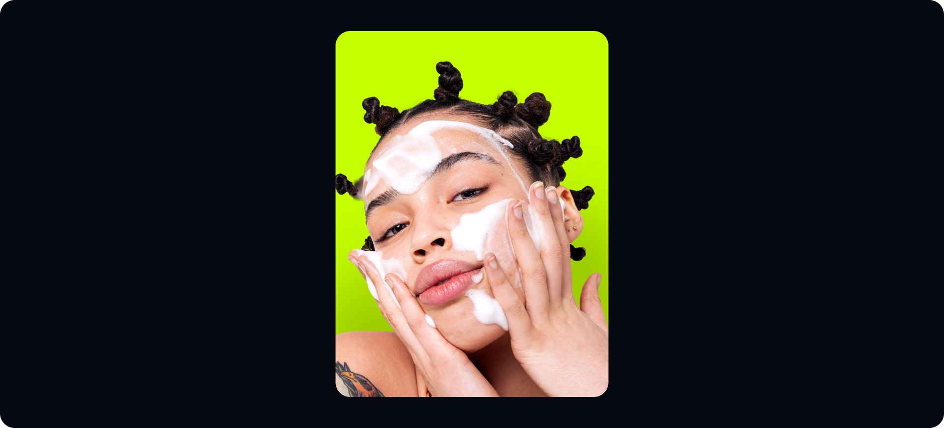
Add a field blur to the model.
It should be subtle and soft.


Create a solid colour overlay and mask out section using a brush at 40%. The image should feel immersive and considered.
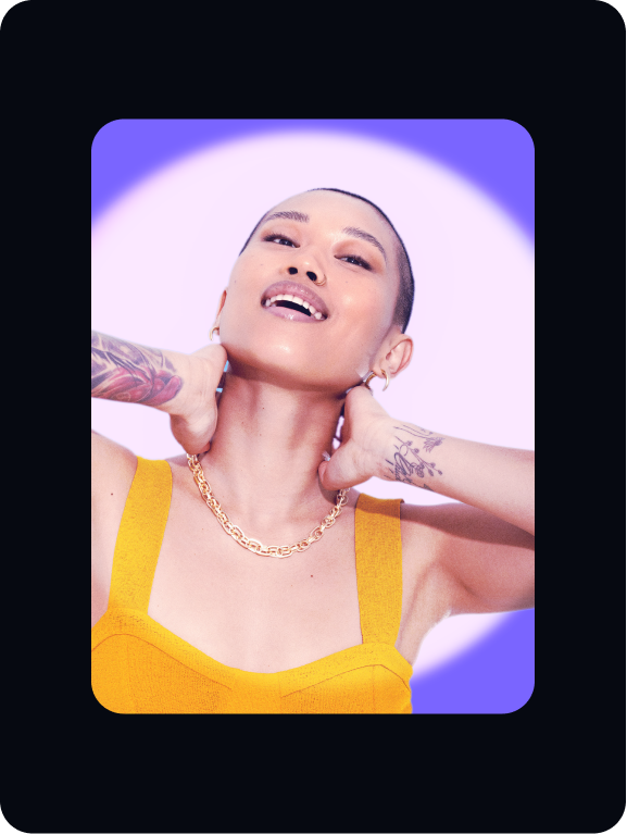
Choose your photograph.
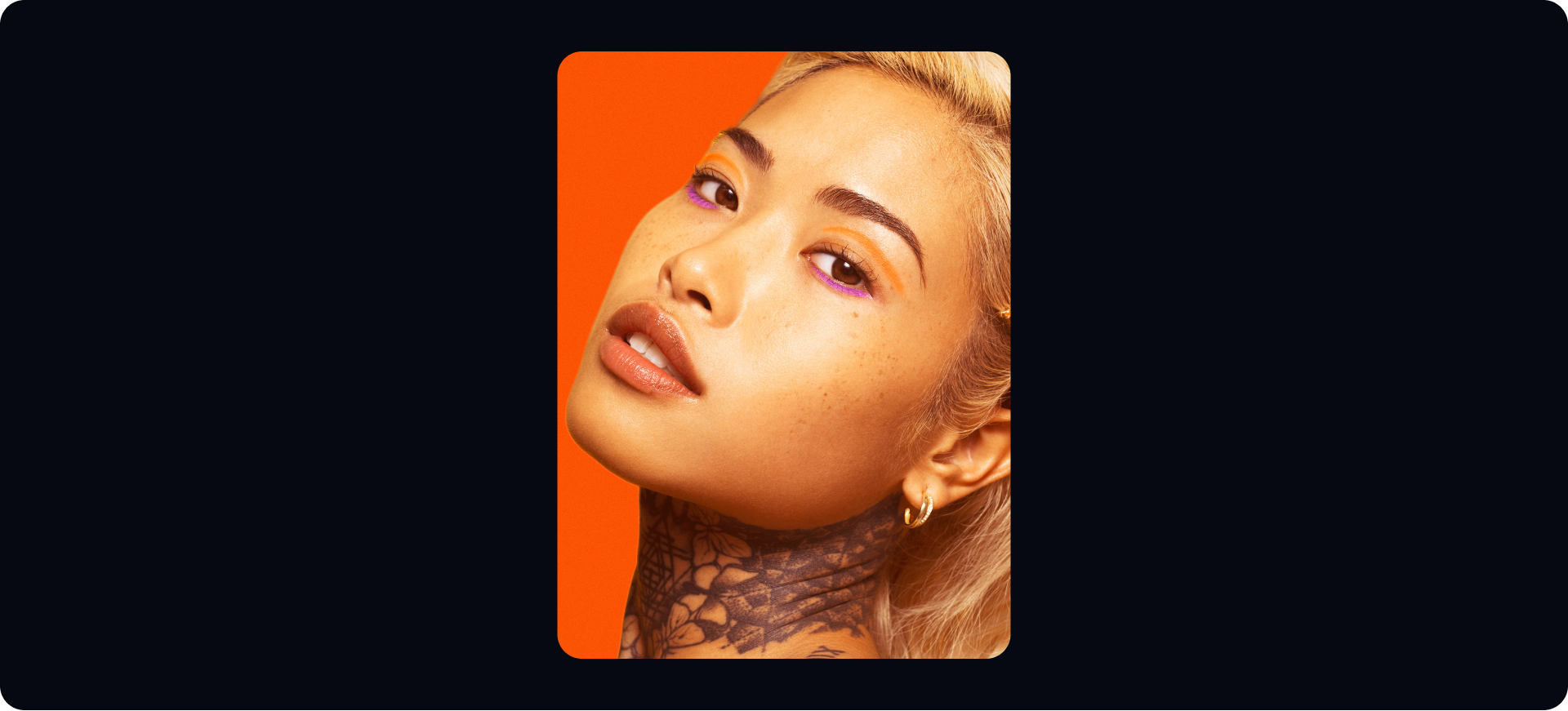
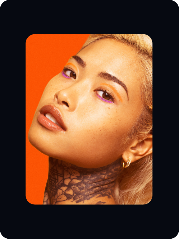
Mask out the model. Place in a background choosing one of brand colours. Add a slight colour overlay to the model.
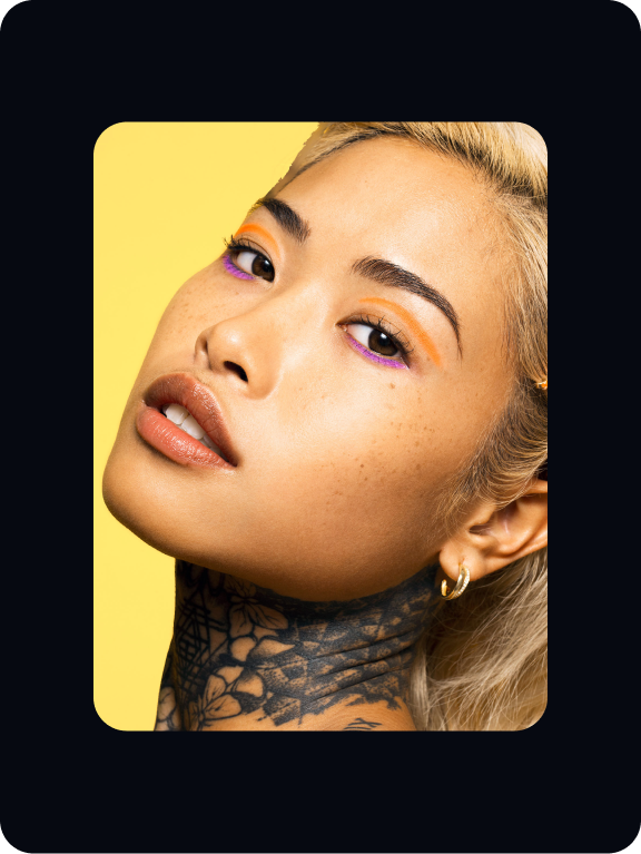
Use a cylindrical shape in the background as a light. It should be either white or the Pastel of the background colour.
Add a slight light overlay to the model’s face.
B2B treatment
Overview
For B2B, we use a light overlay to create a distinctive and immersive photographic treatment.

Details
Below are the features of our B2B art direction. Follow these rules to make sure our photography is consistent and impactful.
Build
Below are steps showing how the treatment of our B2B photography is created. Follow these stops to make sure our
styles are consistent.
styles are consistent.
Choose your photograph.


Lighten up the image if the supplied photograph is quite dark. Our photographs must be light and warm.


Add a subtle field blur to the photograph.
Bring attention to the model within the scene.

Create a solid colour overlay and mask out section using a brush at 60%. The image should feel immersive and considered.

Choose your photograph.

Lighten up the image if the supplied photograph is quite dark. Our photographs must be light and warm.


Add a subtle field blur to the photograph.
Bring attention to the details and moments within the scene.
Create a solid colour overlay and mask out section using a brush at 60%. The image should feel immersive and considered.

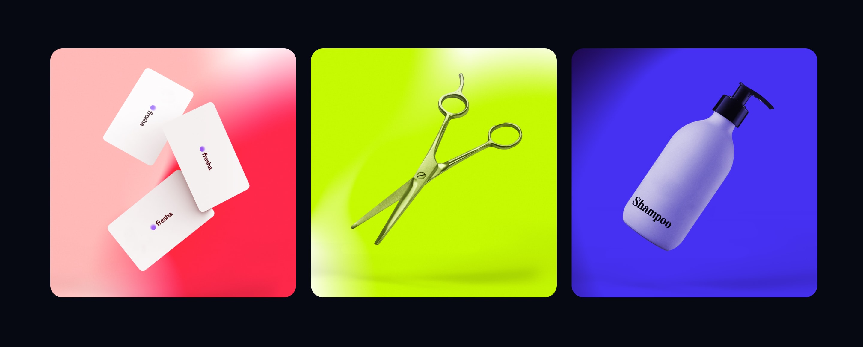
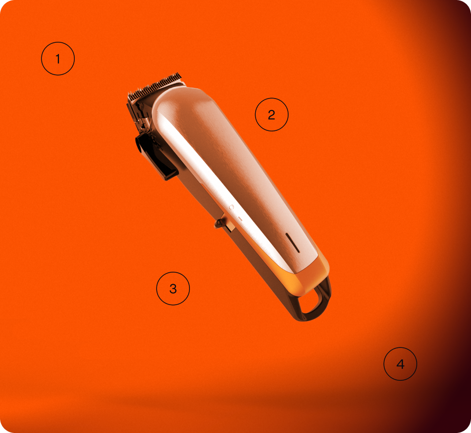
Services
Overview
Our Services art direction illustrates services and treatments which Fresha provides to both businesses and customers.
Details
Below are the features of our Services art direction. Follow these rules to make sure our photography is consistent and impactful.
Build
Follow these build steps to make sure our Services art direction is visually consistent and impactful.
Create a composition with either a Single or Interactive spotlight.


Add an item to the scene. Slant it to make it feel like it’s elevating.

Add a copy of the background as the top layer and set that it to 60% opacity in Overlay.

Add a grounding shadow to situate the scene.

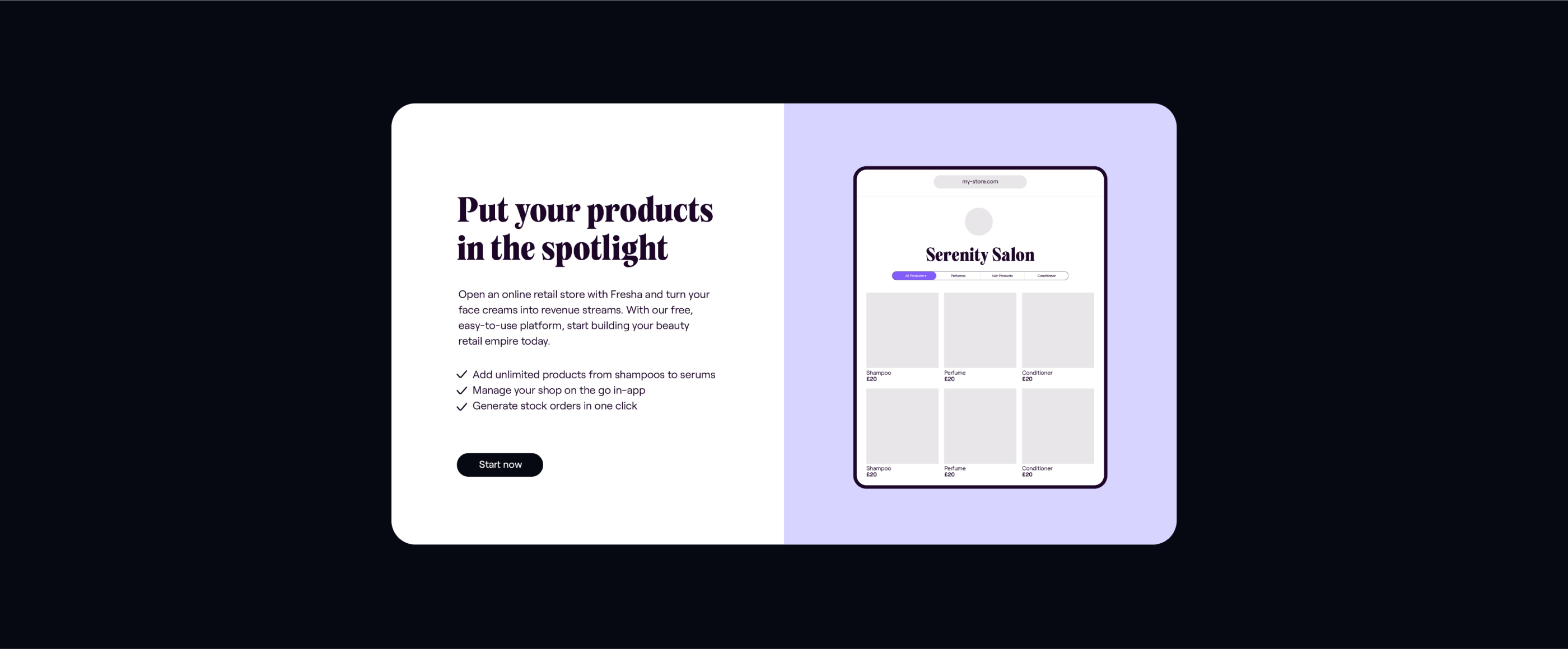
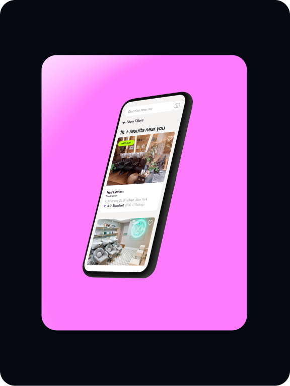
Product
Functional
Our Functional approach to Product art direction is used to illustrate the Fresha product. It can be used on the website when communicated benefits and services.
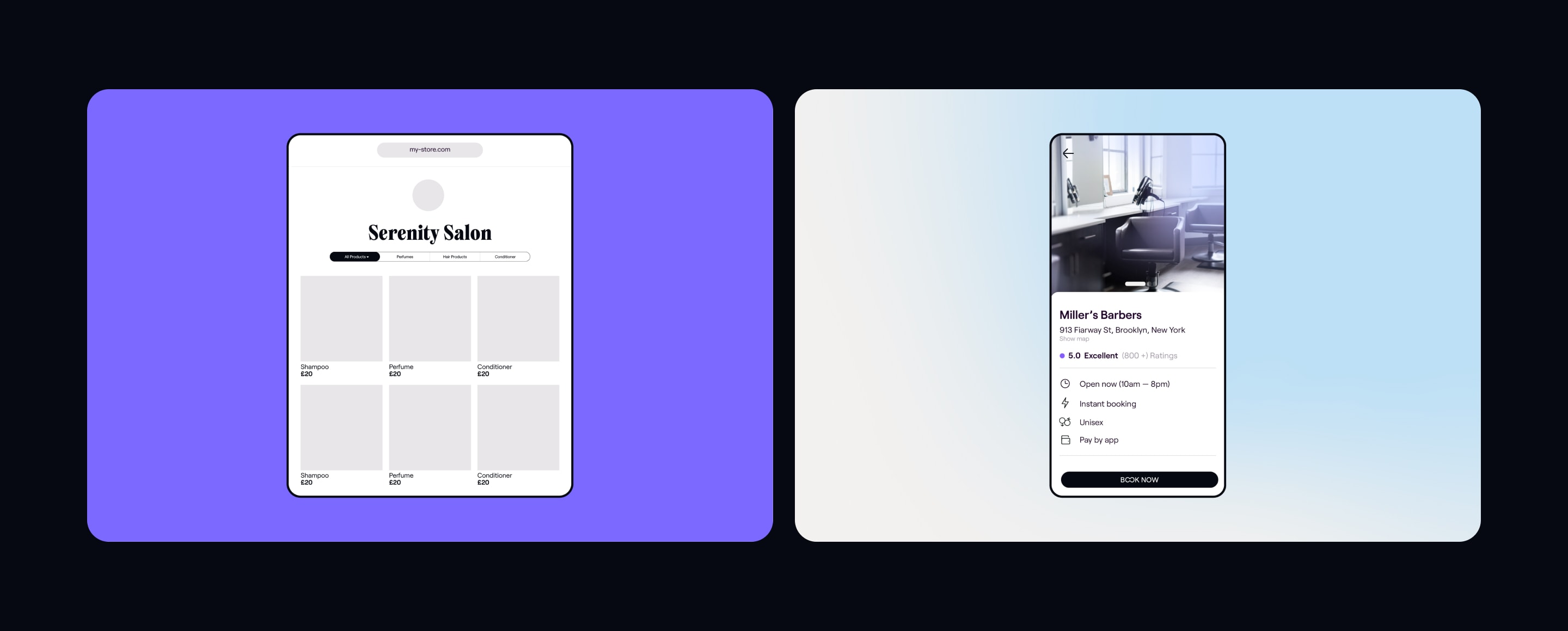
Details
A practical description of what we do and the value it
offers to customers.
Build
The shells of our devices should be as minimal as possible.
They should feature no buttons or design features. `Follow this guidance to make sure the product illustrations are consistent.
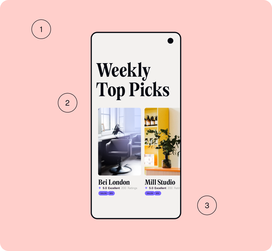
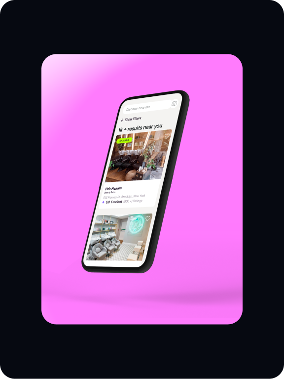
Expressive
Our Expressive product art direction illustrates Fresha’s benefits and services in a dynamic fashion. This type of art direction should be used throughout all our brand communications.

Build
Follow these simple steps to create our Product art direction.
This guidance will help in consistency and impact of the
visual treatment.
Create a composition with either a Single or Interactive spotlight.


Add an device to the scene. The device can either be elevated or be surfaced on the background.


Add a UI design to the screen of the device.

Add a shadow to ground the product.

Things to avoid
01

Make sure light effects do not obstruct models too much.
02
Light overlays should not over expose the subject.
03

Do not overuse the field blur.
04
Do not apply any filters to our art direction.
Inspiration